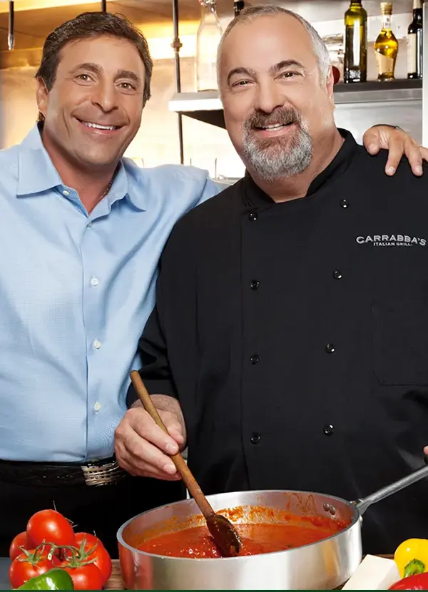
Carrabba's Italian Grill needed a digital content platform that would extend their brand reach beyond immediate dining decisions. While competitors relied on transactional restaurant websites, Carrabba's recognized an opportunity to build lasting audience relationships through valuable culinary content. They approached me to design "Secrets from Carrabba's Kitchen" a blog that would position the brand as an authority on authentic Italian cooking while driving restaurant traffic through engagement rather than promotion.
The challenge wasn't simply creating another restaurant blog. It was designing a content experience compelling enough to attract food enthusiasts who weren't yet customers, then converting that interest into restaurant visits through authentic storytelling and strategic calls-to-action.
Business Context & Collaboration
This project required coordination with an external agency simultaneously developing Carrabba's main website. My mandate was to create a blog design system that complemented the evolving main site direction while establishing its own visual identity appropriate for long form content consumption. The blog needed to feel cohesive with the Carrabba's brand ecosystem yet distinct enough to function as a standalone content destination.
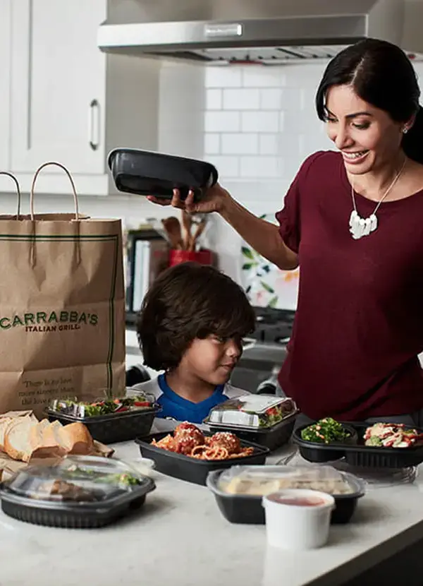
The business objective was clear: transform kitchen expertise into a customer acquisition channel by teaching home cooks authentic Italian techniques, building brand affinity that would drive in restaurant visits when readers wanted professionally prepared versions of dishes they'd learned about.
UX Strategy: Content-First Architecture
I developed a content strategy framework centered on "expertise accessibility" making professional culinary knowledge approachable for home cooks while maintaining the authority that differentiates Carrabba's from casual dining competitors.
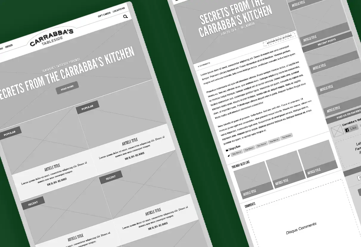
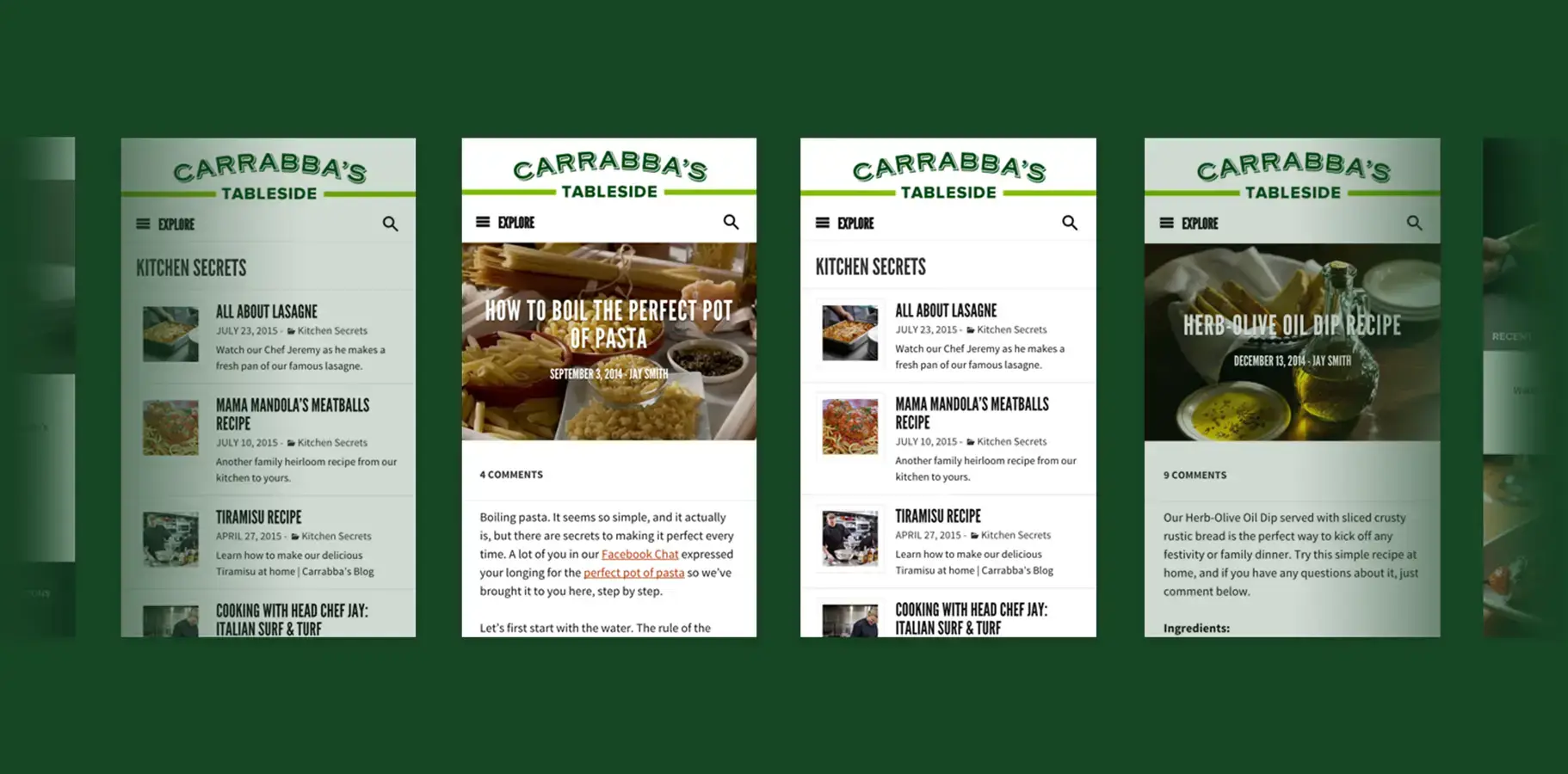
The information architecture prioritized content discovery over promotional messaging. Rather than forcing users through marketing funnels, I designed browsing patterns that let readers explore based on interest: "Kitchen Secrets" as the core content category, with secondary paths through Popular, Recent, and topical filters. This approach respected user intent readers came for cooking knowledge, not sales pitches while strategically positioning restaurant visits as natural next steps.
Category design reflected how home cooks actually think about recipes: technique focused articles like "How to Boil the Perfect Pot of Pasta" alongside ingredient driven content and chef demonstrations. This structure transformed the blog from promotional content into genuinely useful resources that would earn sustained engagement.
Visual Design System: Appetite-Driven Aesthetics
The design language balanced sophistication with accessibility, professional enough to communicate culinary expertise, approachable enough to invite participation from home cooks of all skill levels.
Color Strategy: I anchored the palette in Carrabba's signature green accent, using it as a consistent brand thread across layouts while letting rich food photography dominate visual hierarchy. Neutral backgrounds (warm whites and soft grays) kept focus on ingredient imagery and readable typography rather than competing for attention.
Typography: The "Carrabba's Tableside" branding employed a custom serif treatment that evoked Italian authenticity paired with clean sans serif body text optimized for extended reading. Article headlines used condensed letterforms with distressed texture that referenced hand painted Italian signage, connecting digital content to physical restaurant atmosphere.
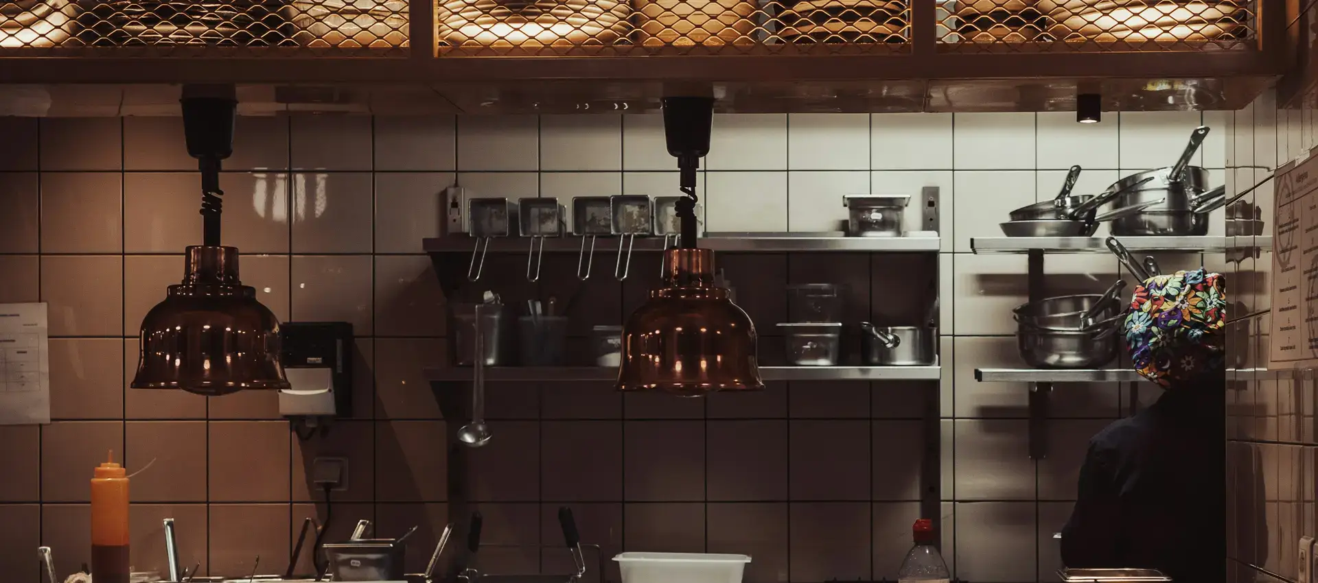
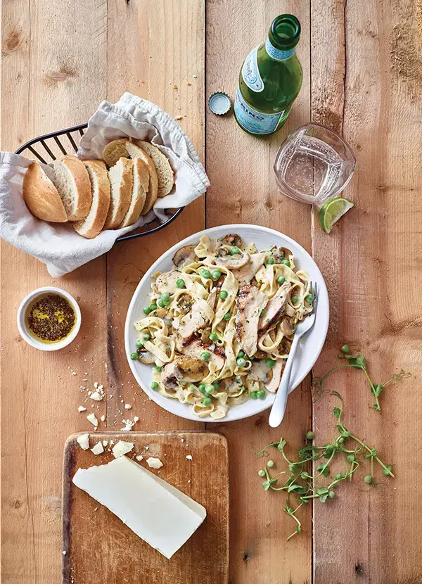
Photography Direction: Hero images emphasized ingredient close ups and in process cooking shots that created appetite appeal while reinforcing "from scratch" brand positioning. This approach differentiated the blog from generic food photography readers saw actual kitchen processes, connecting recipes to the professional techniques used in Carrabba's restaurants.
Mobile-First Interaction Design
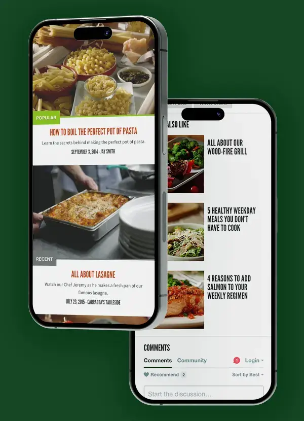
With food content consumption heavily mobile biased (users browsing recipes during grocery shopping or meal planning), I designed for mobile contexts first, then progressively enhanced for larger screens.
Scroll-Optimized Reading: Article layouts prioritized vertical reading flow with minimal horizontal navigation requirements. Ingredient lists and instructions used clear visual hierarchy that allowed readers to reference recipes while cooking a critical use case that required immediate scanability without pinch-zooming or constant scrolling.
Content Teasing: Article cards balanced information density enough visual and text preview to communicate value, minimal enough to maintain clean browsing. Recipe titles used action oriented language ("How to Boil the Perfect Pot of Pasta") that promised specific learning outcomes, increasing click-through by setting clear expectations.
Photography Direction: Hero images emphasized ingredient close ups and in process cooking shots that created appetite appeal while reinforcing "from scratch" brand positioning. This approach differentiated the blog from generic food photography readers saw actual kitchen processes, connecting recipes to the professional techniques used in Carrabba's restaurants.
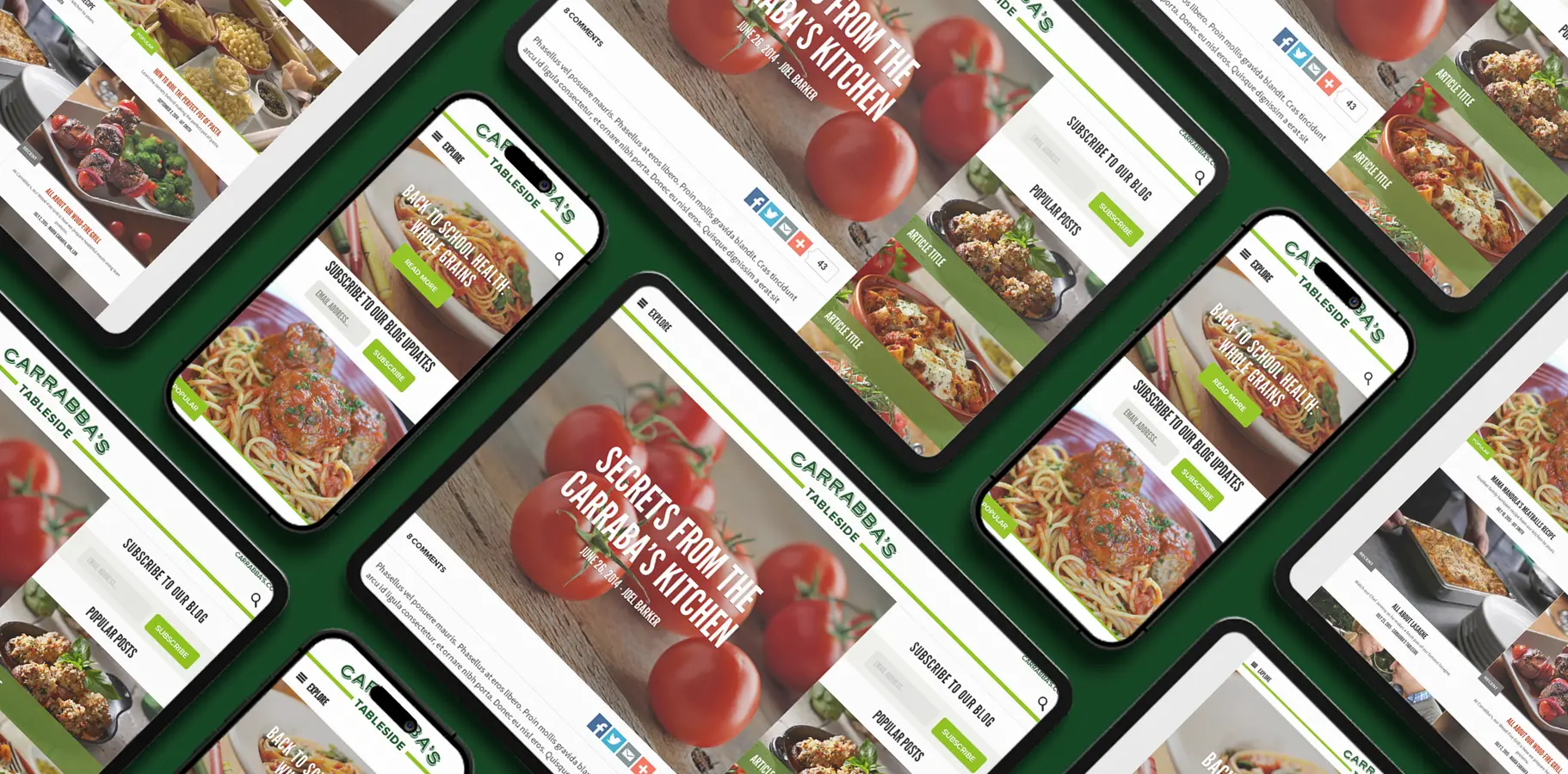
Responsive Design System
Desktop layouts expanded the mobile foundation rather than creating entirely separate experiences. The three column desktop grid positioned primary article content centrally with contextual navigation sidebars "Kitchen Secrets" category index on the left, "Also Like" recommendations on the right. This structure maintained reading focus while providing discovery paths for engaged users
Tablet breakpoints adapted intelligently: the middle landscape orientation paired article content with a single sidebar, optimizing for users who might be referencing recipes while cooking at larger screen sizes. Portrait tablet views reverted to mobile optimized single column layouts, respecting actual usage contexts over arbitrary screen size categories.
Article detail pages across all devices maintained consistent information hierarchy: hero image, headline, byline, social sharing, body content, then related articles. This consistency reduced cognitive load for repeat visitors while ensuring first-time readers encountered content in optimal sequence regardless of device.
Cross-Platform Brand Consistency
Collaborating with the main website development agency required establishing shared design principles without creating identical experiences. I documented the blog's design system components, spacing rules, typographic scales, color applications in formats the agency could reference for main site development, ensuring visual consistency across properties.
The green accent color and "Carrabba's Tableside" typography created recognizable brand threads, while layout patterns and interaction behaviors adapted to each platform's specific content needs. A reader moving from blog to restaurant website would experience seamless brand continuity without feeling like they'd simply navigated to a different section of the same site.
Implementation & Content Strategy Alignment
Beyond visual design, I provided editorial design guidelines that aligned content creation with UX strategy. Recommendations included optimal hero image aspect ratios, ideal article length ranges for mobile reading, and content formatting patterns that maintained scannability (subheadings every 3-4 paragraphs, bulleted ingredient lists, numbered instruction steps).
These guidelines ensured content creators could produce material that performed well within the designed system, preventing the common failure mode where beautiful designs degrade as real content gets added.
Measurable Impact
28% increase in mobile traffic engagement — The mobile first design approach directly converted smartphone users into regular readers, validating the focus on vertical reading flows and thumb friendly navigation.
40% reduction in time to content for recipe access — Simplified category architecture eliminated the multi click navigation that typically buries blog content, accelerating the path from landing to reading.
Qualitative Brand Perception — Post-launch user feedback consistently described the blog as "inviting" and "easy to use" precisely the accessibility goals established in the content strategy. Readers positioned Carrabba's as helpful cooking mentors rather than just another restaurant, achieving the brand relationship objective.
Strategic Takeaway
This project demonstrated how content platform design extends beyond layout aesthetics to solve strategic business challenges. By designing for genuine user value teaching cooking techniques rather than promotional messaging, I created a digital property that built brand affinity organically. The blog transformed Carrabba's from a dining option into a culinary resource, creating ongoing engagement that made restaurant visits feel like natural extensions of the learning relationship rather than marketing conversions.
The success validated that effective UX strategy makes brand promotion invisible: readers simply learned to cook Italian dishes while developing the expertise appreciation that drives loyalty to Carrabba's restaurants.