Sketch, Adobe Creative Suite, Google Analytics, Heatmap testing tools
Project Overview
Led strategic redesign of Walt Disney World's Public Affairs digital presence, transforming how the organization communicates community impact to media, stakeholders, and the public. My role encompassed comprehensive UX research, information architecture redesign, and visual interface design for a complex content ecosystem.
The Challenge
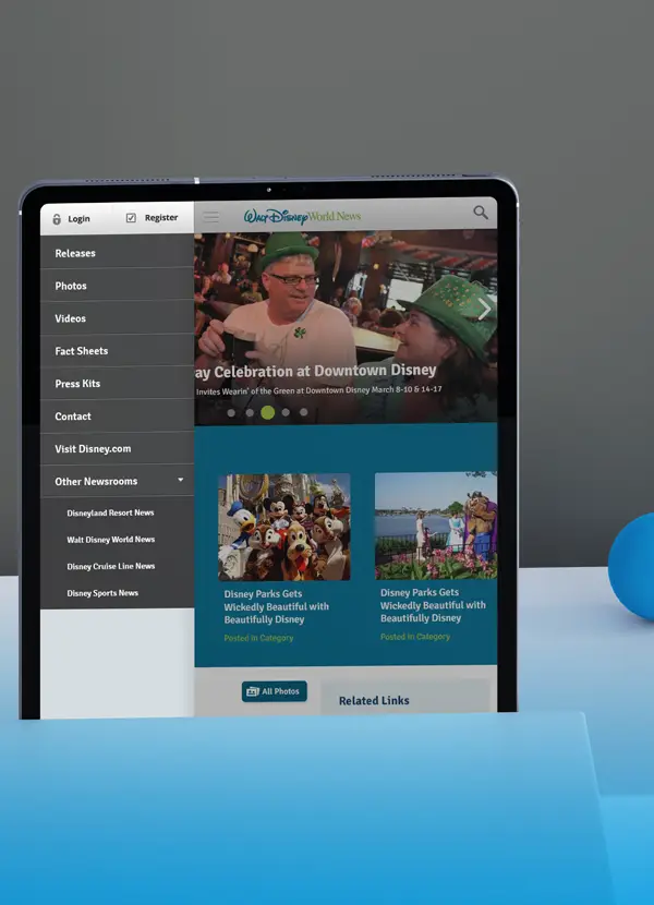
Disney's Public Affairs site struggled with fragmented content across multiple domains, unclear navigation hierarchies, and an outdated interface that obscured rather than highlighted their substantial community contributions. The existing system made it difficult for journalists and stakeholders to find relevant information, while donation requests a critical conversion point, were buried in dense content structures.
Research & Discovery
Conducted competitive analysis across Fortune 500 companies and Orlando theme parks, revealing successful patterns in public affairs communication. Heatmap analytics of the existing site showed users gravitating toward donation requests and community content but abandoning due to navigation confusion. User testing revealed visitors couldn't distinguish between resort information and public affairs content, with many believing the site was single page due to hidden navigation.
Key findings:
77% bounce rate on category pages due to overwhelming mixed content structure
Users seeking donation information made up 43% of engaged traffic
Mobile experience essentially non-functional
Information Architecture Strategy
Restructured content hierarchy around three core user journeys: media seeking press materials, community organizations requesting support, and stakeholders tracking impact. Separated static informational pages from dynamic press releases, creating clear content types with distinct navigation paths. Introduced consistent taxonomy across sections, replacing the confusing mix of "Stories," "News," and "Releases" with unified nomenclature.
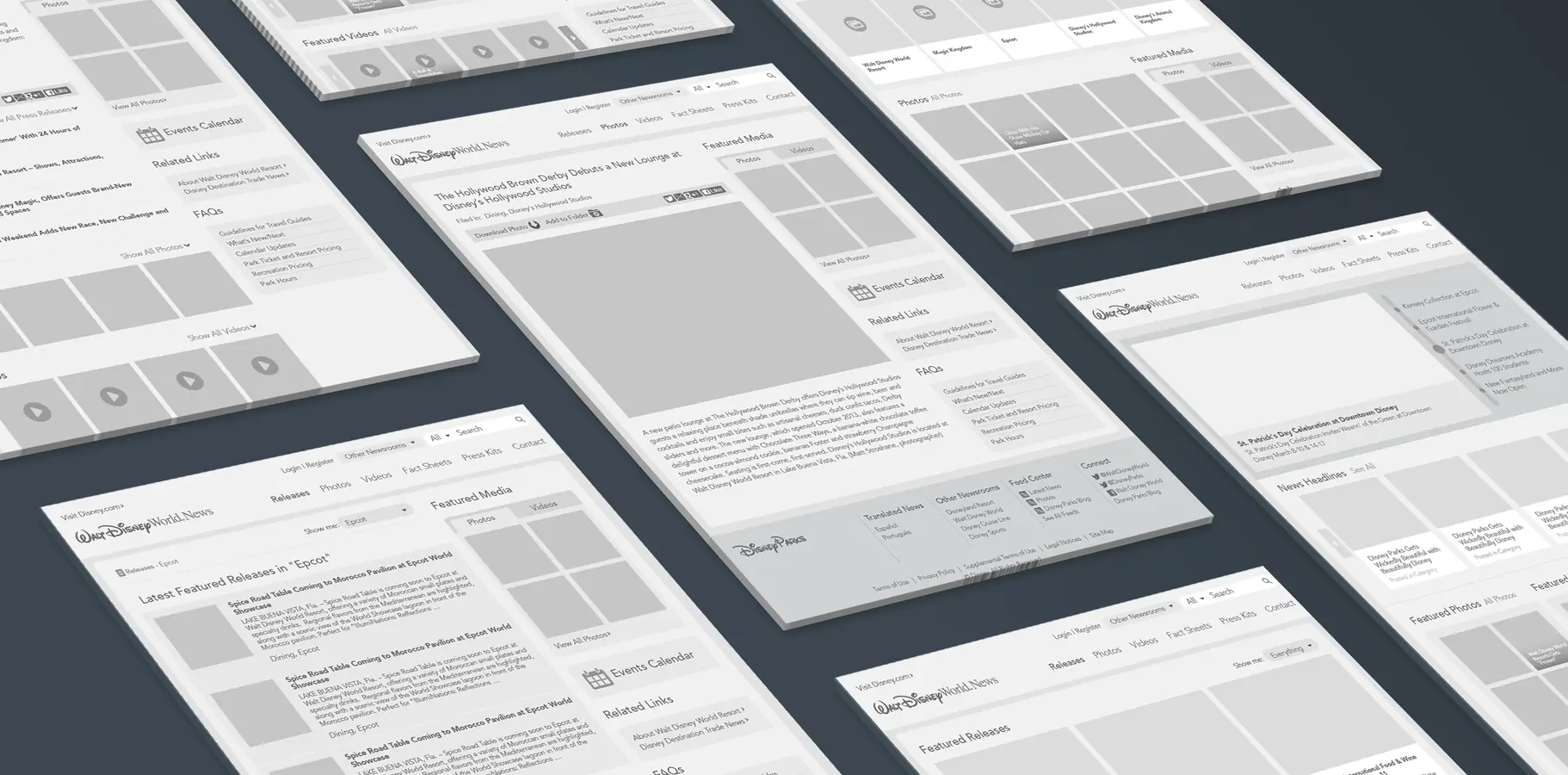
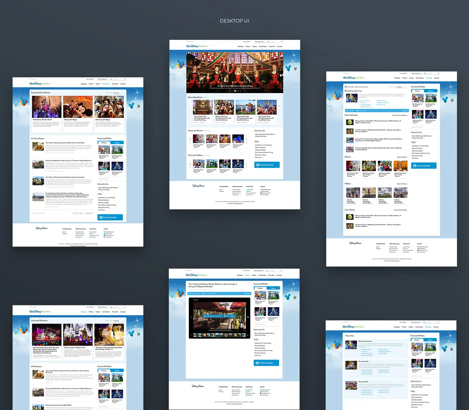
Wireframes & Flow Optimization
Restructured content hierarchy around three core user journeys: media seeking press materials, community organizations requesting support, and stakeholders tracking impact. Separated static informational pages from dynamic press releases, creating clear content types with distinct navigation paths. Introduced consistent taxonomy across sections, replacing the confusing mix of "Stories," "News," and "Releases" with unified nomenclature.
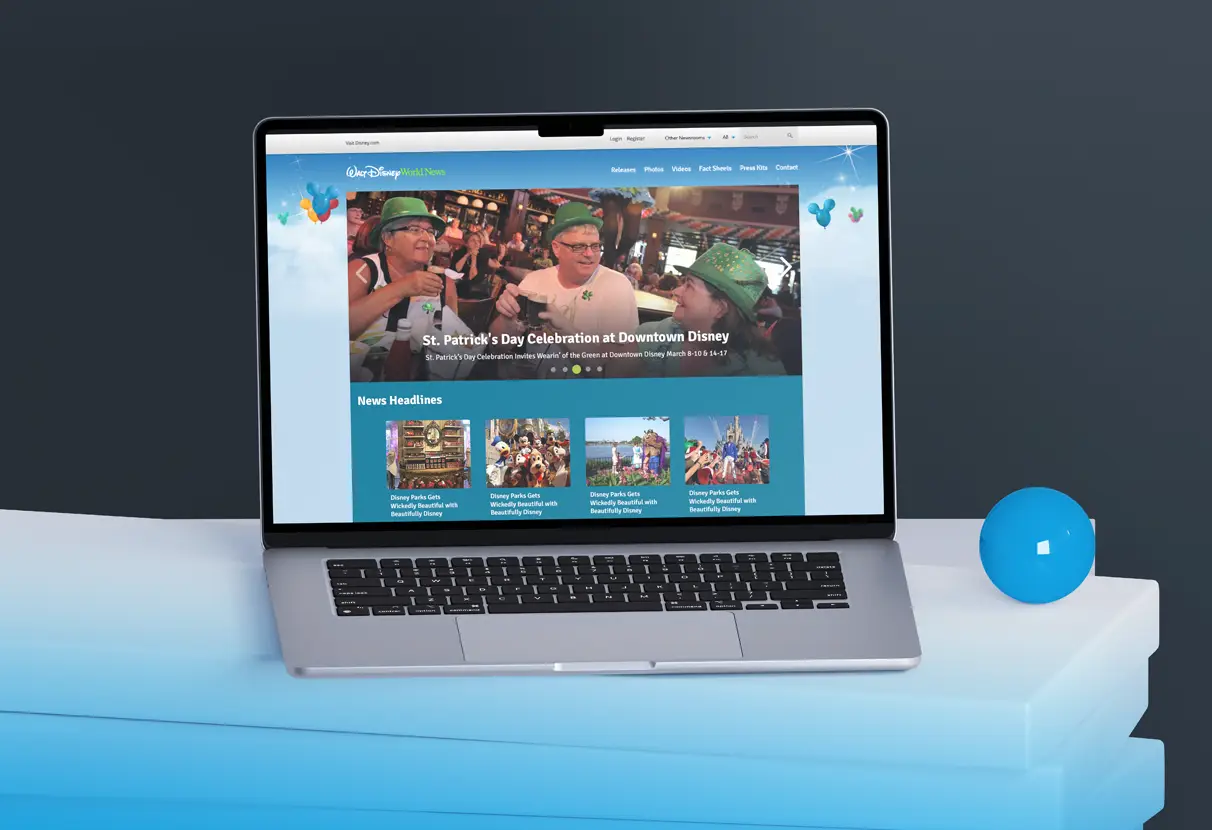
Visual Design & System Thinking
Developed a design language inspired by Disney Parks' PEP guidelines while establishing public affairs as its own distinct voice professional yet approachable. Implemented generous whitespace, refined typography hierarchy, and strategic photography placement to let community impact stories breathe. The carousel redesign transformed from cluttered information overload into focused storytelling moments.
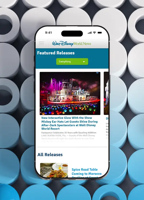
Responsive Implementation
Architected fully responsive layouts that adapted intelligently across desktop, tablet, and mobile viewports. The mobile experience prioritized donation requests and featured stories, acknowledging that community partners often browse while in the field. Navigation compressed into intuitive menu structures without sacrificing depth or discoverability.
Results & Impact
44% decrease in average exit rate
24% decrease in average bounce rate
26% increase in session duration
Donation request completion improved significantly through clearer pathways
Mobile usability transformed from essentially broken to fully functional
Reflection
This project reinforced that even mission driven organizations need strategic UX thinking to communicate their impact effectively. The challenge wasn't Disney's incredible community work, it was making that work visible and accessible. By applying structured research, clear information architecture, and thoughtful design, we transformed a fragmented digital presence into a cohesive platform that serves journalists, partners, and the community with equal clarity.