Content strategy & UX architecture
From table
to kitchen.
A restaurant brand became a practical cooking resource—built for the moment someone needs to make dinner, not make a reservation.
- Role
- Senior UX Strategist
- Result
- 40% faster time-to-recipe
01 / Reframing the job
Teach the technique.
Earn the return visit.
Testing with home cooks showed two distinct mindsets: experienced cooks looked for techniques and ingredients; novices looked for a successful outcome. Neither group needed a promotional maze.
The platform separated discovery from execution, organizing content around how people actually cook.
02 / Content architecture
Many ways in.
One clear way through.
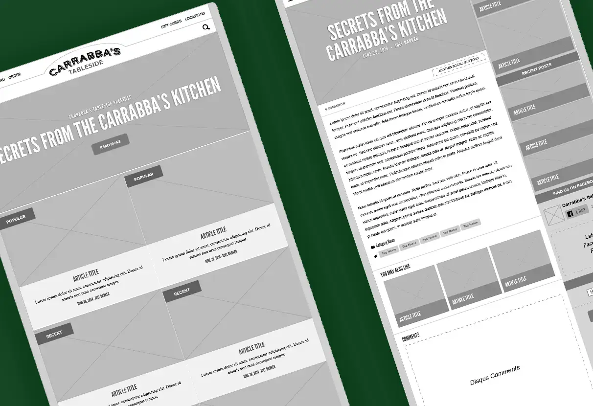
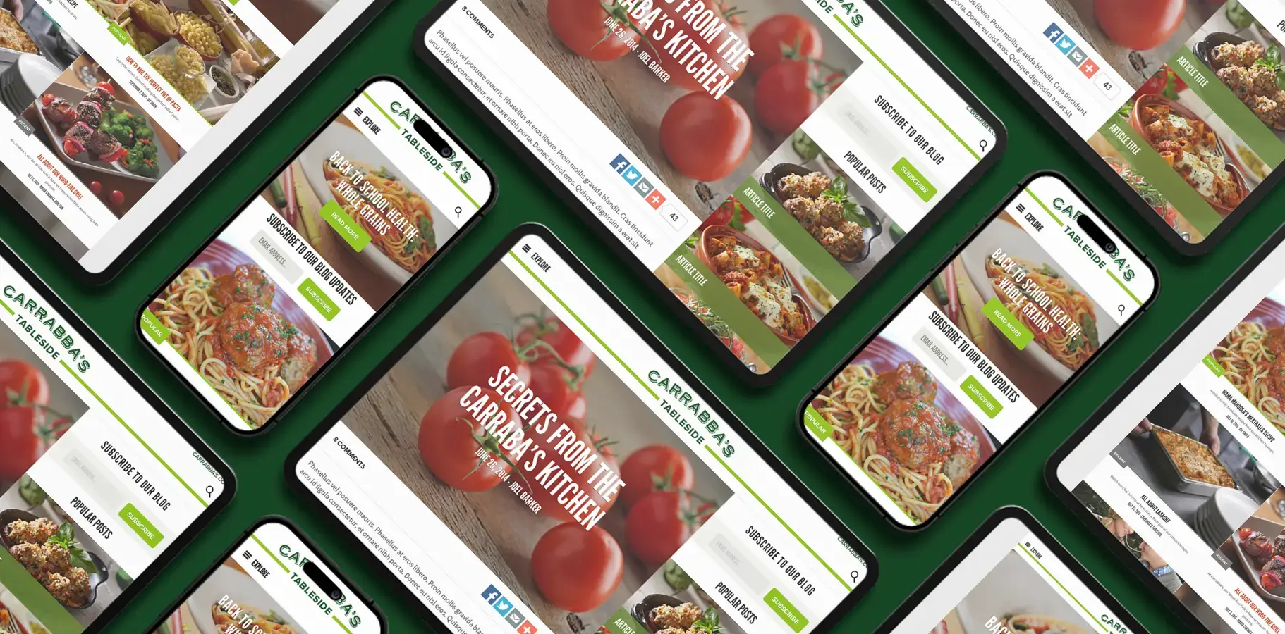
Popular, recent, and topic-led paths made discovery feel open without forcing a linear journey. Action-led titles set a practical expectation before the first tap.
03 / Made for the kitchen
Read, cook,
look back.
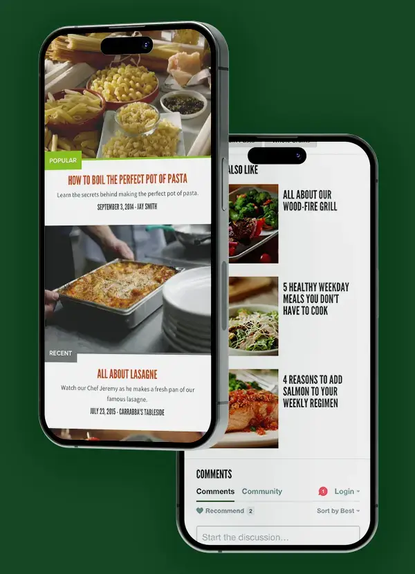
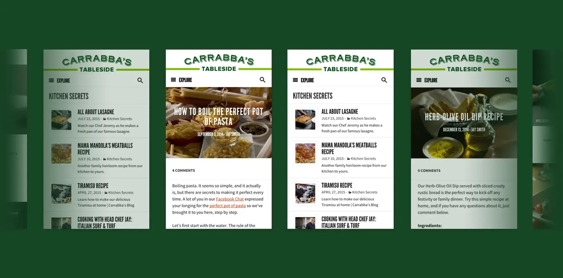
Recipe pages used a vertical, scroll-optimized flow with large targets, clear ingredient hierarchy, and minimal chrome—so the interface stayed useful with one hand occupied.
04 / Brand in the details
Warmth without clutter.
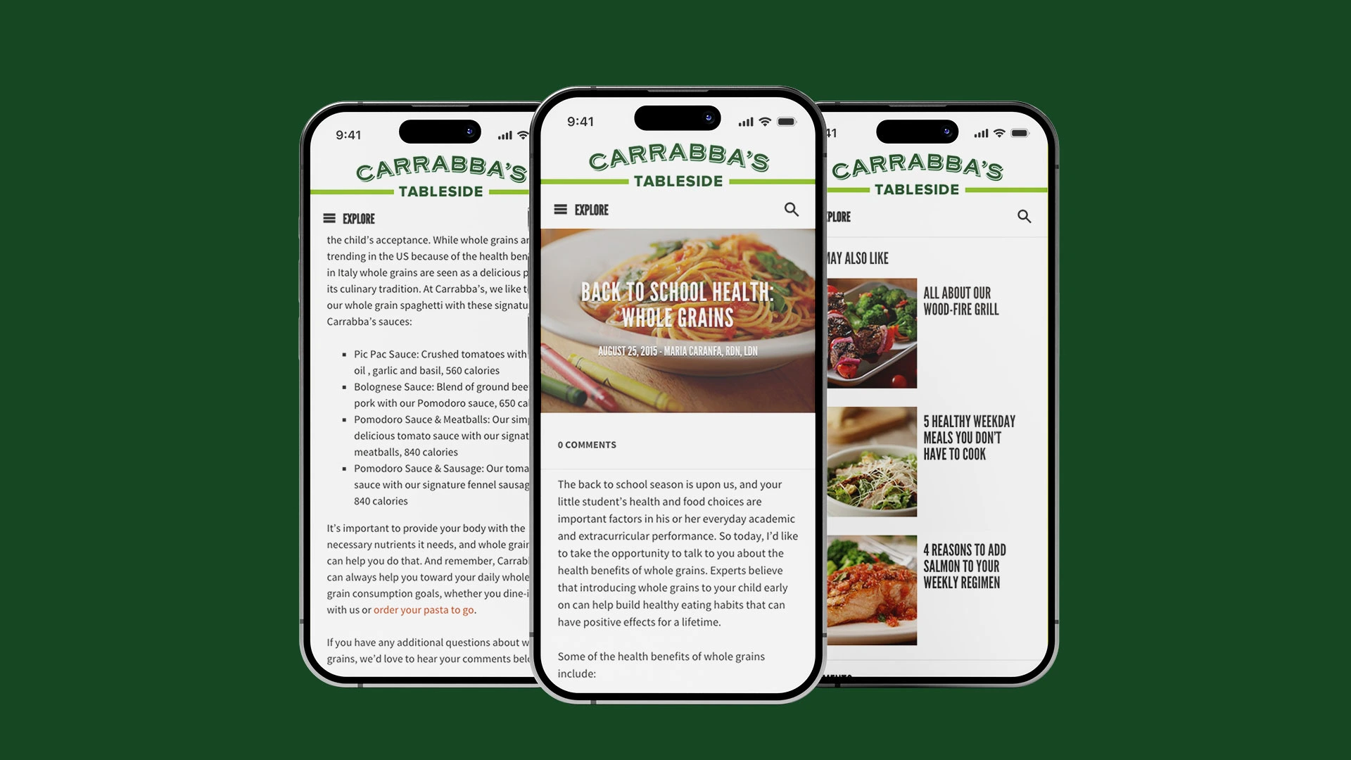
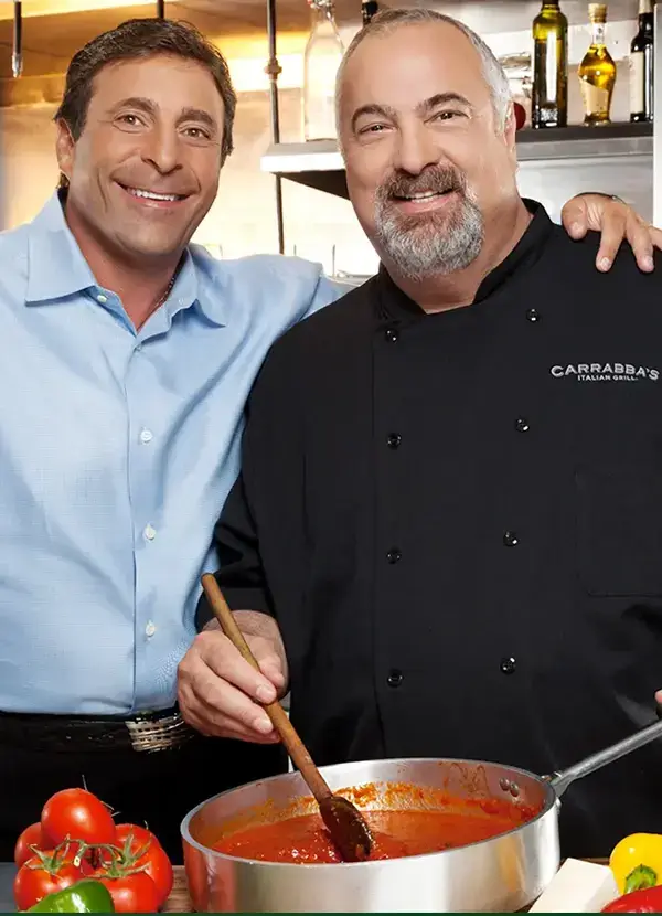
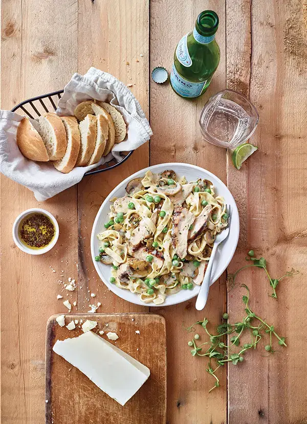
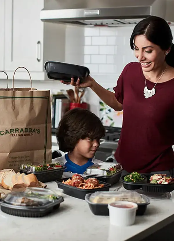
Food photography carried the appetite appeal. Carrabba’s Tableside type handled the brand moments; clean, legible body type did the practical work. The result felt unmistakably Carrabba’s—and still easy to use at a glance.
05 / Outcome
A system the
content team could keep cooking with.