Senior UX Strategist — research, IA, and interface design
Client
Walt Disney World Public Affairs
Agency
Voce Communications / Porter Novelli
Technology
Sketch, Adobe Creative Suite, Google Analytics, heatmap testing
The Problem
Disney's Public Affairs site had a real visibility problem. Community organizations seeking donation support made up 43% of all engaged traffic, but the donation request flow required more than five steps and was buried inside a navigation structure that users routinely failed to find. Heatmap data showed users scrolling past the primary nav without registering it as clickable. A 77% category-page bounce rate confirmed what testing made obvious: people were giving up.
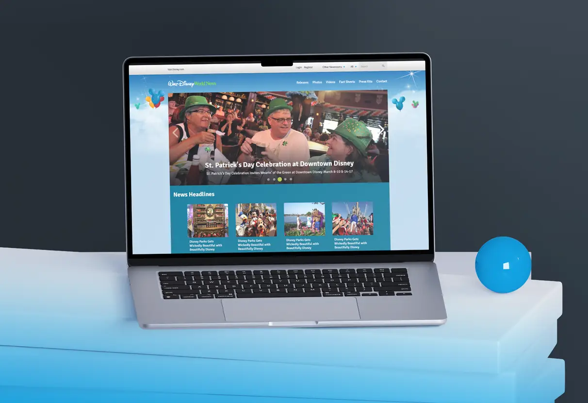
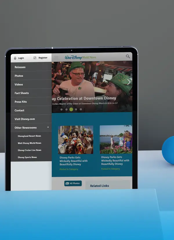
Journalists had a separate but related issue. Press releases, photos, and videos lived in a single undifferentiated feed. Reporters on deadline couldn't filter by content type, so they left. The site was doing real community work. It just couldn't show anyone.
Research & Discovery
I ran a competitive audit across 12 Fortune 500 Public Affairs sites and three Orlando theme park digital properties, looking specifically at how organizations communicate community impact to three different audiences simultaneously: press, community partners, and the public. The gap between Disney's current structure and the field standard was significant.
Heatmap analysis across 90 days of traffic identified the navigation invisibility issue and confirmed the donation-seeker concentration. I ran moderated usability sessions with eight participants across the three target user types. The sessions surfaced a critical finding: users couldn't distinguish Public Affairs content from the main resort site. Several participants described the navigation as appearing to be a single page because nothing visually signaled that the content had changed.
The 43% donation-seeking traffic figure became the organizing insight for the redesign. That user group had the highest intent and the worst task success rate. Fixing their journey first would move the most meaningful metric.
Strategic Approach
Information Architecture
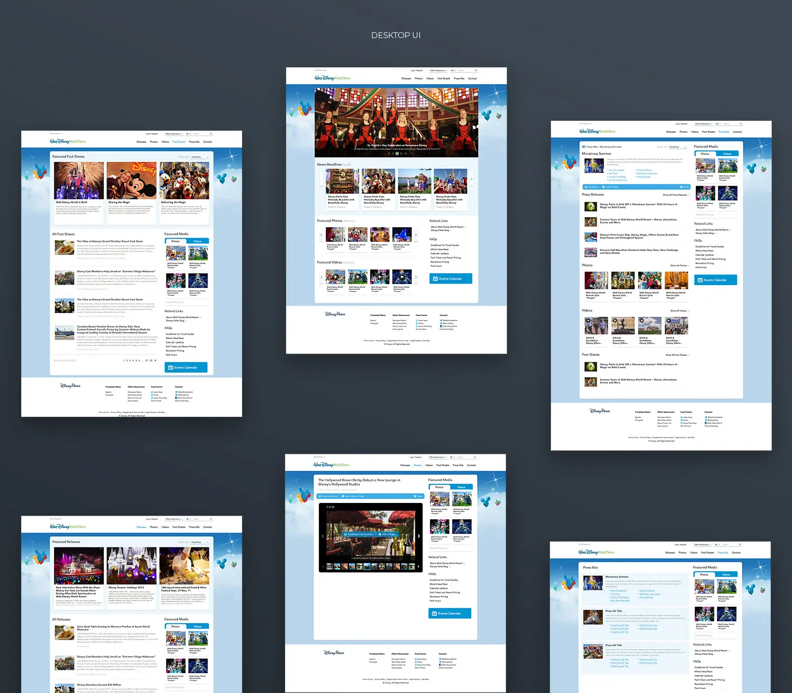
I restructured the content hierarchy around three clearly separated user journeys: media seeking press materials, community organizations requesting support, and stakeholders tracking impact. The existing structure mixed all three into a single undifferentiated stream. The new architecture separated static informational pages from dynamic press releases and introduced consistent taxonomy across sections, replacing the confusing mix of 'Stories,' 'News,' and 'Releases' with unified nomenclature that matched how each audience thought about content.
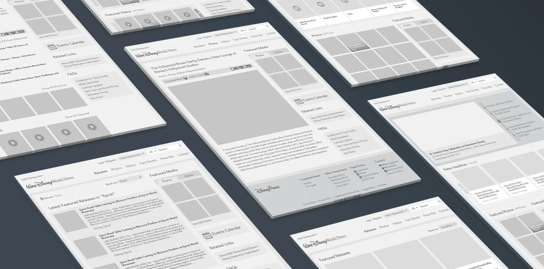
Wireframes & Flow Optimization
The donation request flow went from more than five interactions to two. I tested the reduced flow with five participants from the original research cohort before finalizing the wireframes. All five completed the task successfully on first attempt, compared to two of eight in the initial testing round. Category browsing was redesigned to separate content by type rather than mixing it in a single chronological feed. Modular homepage blocks were built to adapt to current priorities without losing visual hierarchy.
Visual Design & Responsive Implementation
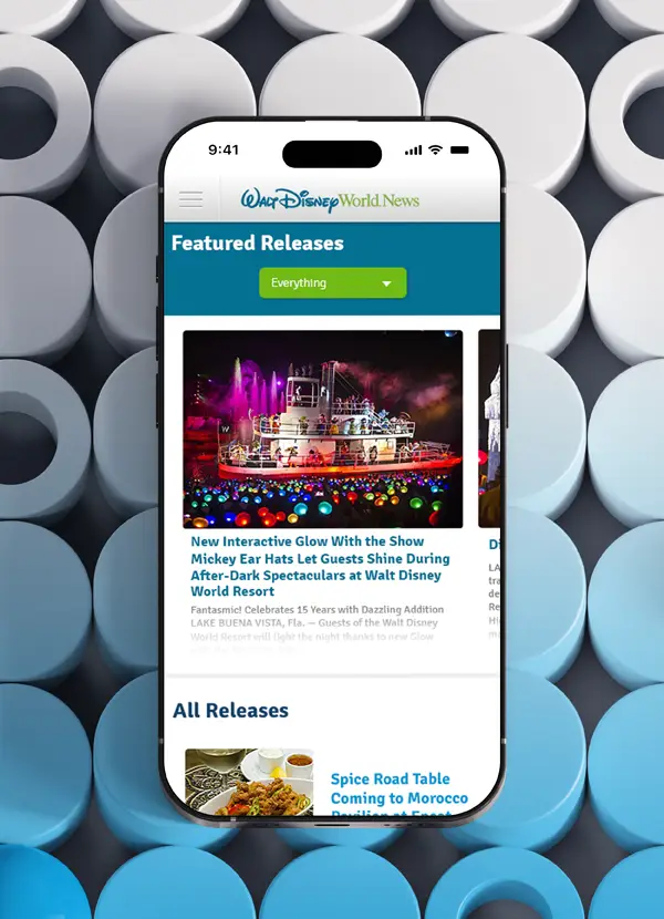
I developed a design language that drew from Disney Parks' internal brand guidelines, positioning Public Affairs as a distinct but recognizably Disney voice: professional, approachable, community-focused. The mobile experience was rebuilt from scratch. The original mobile version was functionally unusable. The redesign prioritized donation requests and featured community stories at the top of the mobile hierarchy, reflecting actual field usage patterns from community partners who frequently browse on phone.
Results & Impact
Exit rate - 44% decrease site-wide following launch
Donation flow - Reduced from 5+ steps to 2, 5/5 task success in post-launch testing
Mobile usability - Rebuilt from non-functional to fully operational across all breakpoints
My Contribution
I led the full UX scope on this engagement: the research plan, usability sessions, IA restructure, wireframes, and visual design system. The development team handled front-end implementation; I provided design specifications and reviewed builds against the design intent. If I were to revisit this project, I'd push for a second round of usability testing specifically with community partners in a field context, since their mobile usage pattern was something we inferred from analytics rather than observed directly.