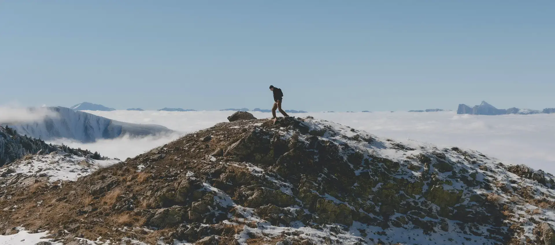
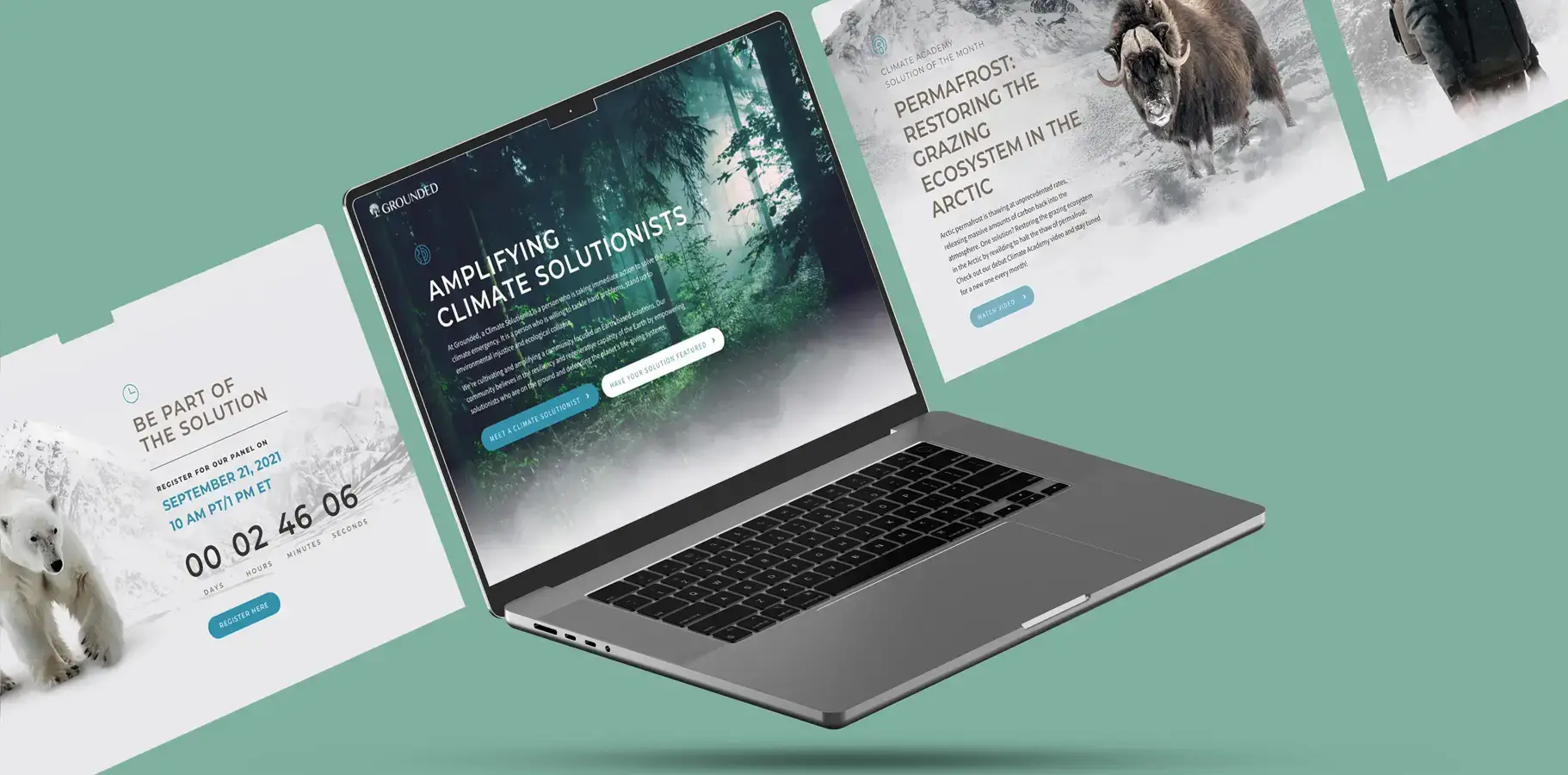
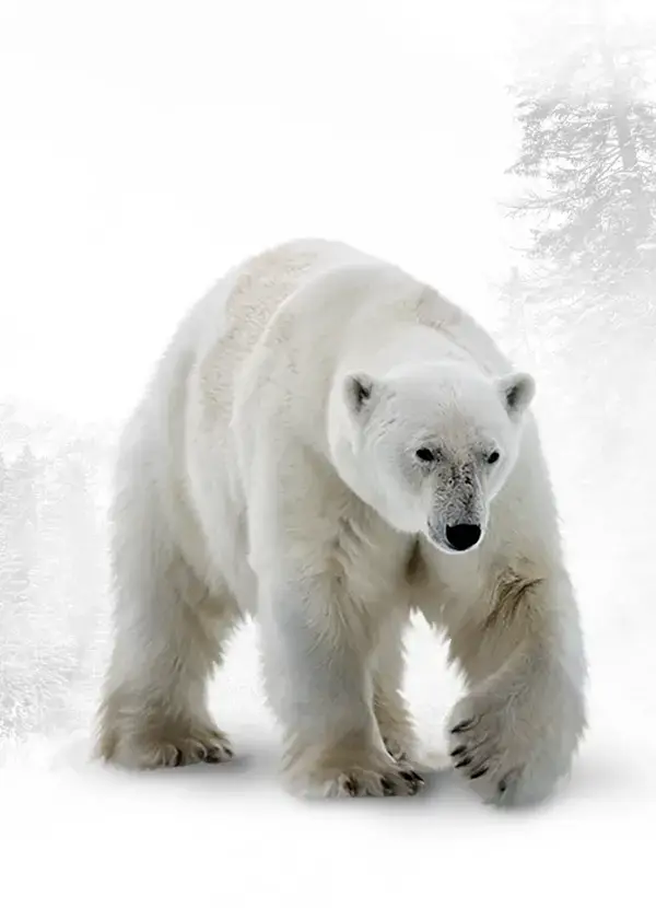
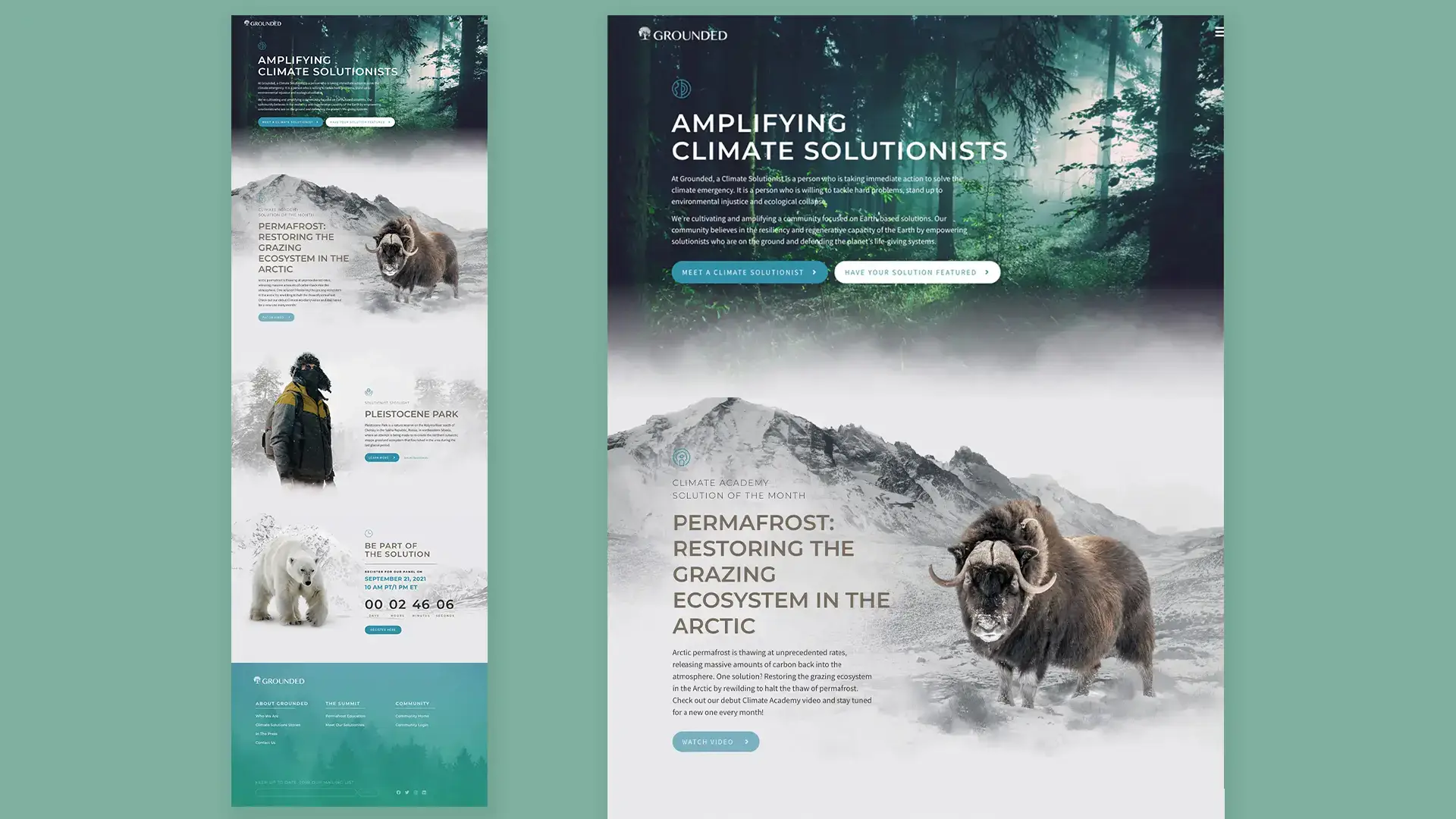
Our design focused on creating an immersive atmosphere by blending Arctic textures, ethereal photography, and calm typography. This approach aimed to give a sense of grounded serenity and a global perspective.
Visual Language
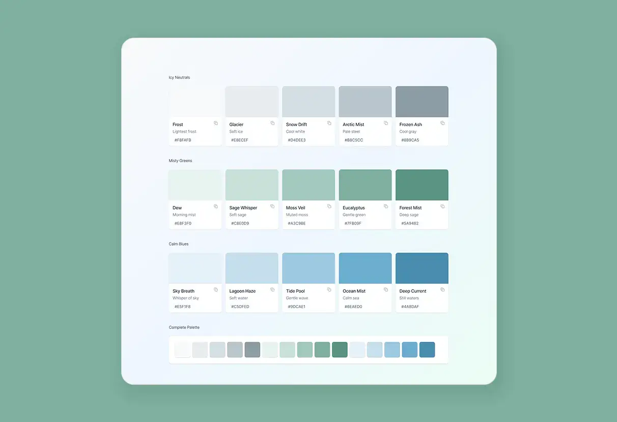
This visual identity was developed for an environmental awareness campaign, prioritizing emotional impact before delivering information. Each image, from polar bears to ancient forests, was chosen to convey endurance and renewal instead of crisis. The color palette features icy neutrals, misty greens, and calm blues, reflecting the Earth's most fragile ecosystems and emphasizing their value. Minimalist, open sans-serif typography ensures clarity and allows the photography to stand out. Transparent layers, parallax fades, and slow scroll animations add depth and stillness, encouraging thoughtful reflection.
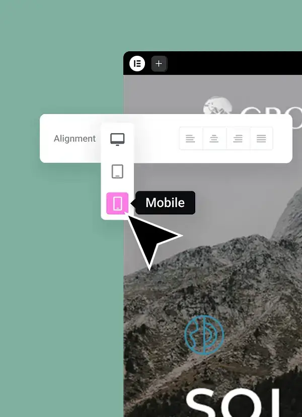
UX System