Managed the UX strategy and visual design for both experiences, including cross-platform user journeys, dark mode brand evolution, and content-centric architecture that made sleep content an interface rather than a feature.
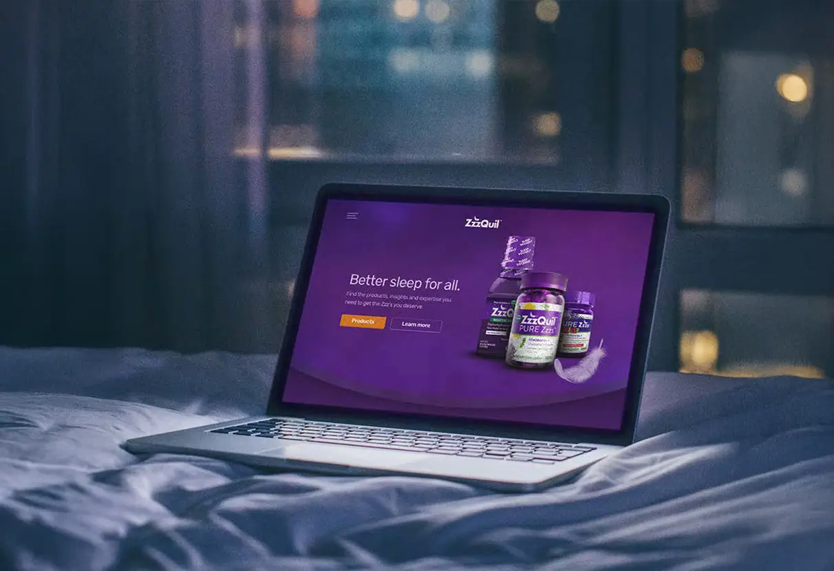
ZzzQuil, a product of P&G, wanted to become a part of people’s nightly routines, not something used only when sleeping was a challenge. In order to do this, we created a digital ecosystem, including a mobile app and a new e-commerce website, in order to provide value at all touchpoints.
As a Senior UX Strategist, I was responsible for designing both platforms, determining the user journeys, adapting the brand for dark mode, developing the app’s feature set, and creating a design system.
The project presented several interconnected challenges that required strategic design thinking beyond aesthetic solutions.
Brand Translation Without Dilution
The purple color scheme used in ZzzQuil is effective in retail environments. However, in digital media, especially in low-light environments before bed, the color scheme must be adjusted differently. I redesigned the color scheme to be used in dark mode while still maintaining the recognition built up by P&G.
Cross-Platform Continuity
The users were able to transition smoothly between the website and the app, where they browsed products, made purchases, downloaded, and used nightly. The platforms posed unique challenges and user needs. The design system had to bring the brand together while avoiding sameness between the two platforms.
Feature-Rich Without Feeling Heavy
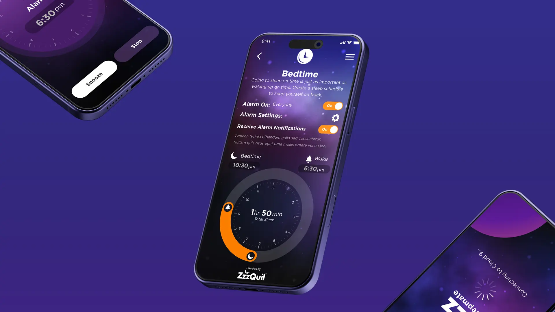
The app was to include support for meditations, soundscapes, sleep stories, sleep insights, bedtime routines, and smart alarms. Each of these six features was to be supported by a unique user experience pattern. The architecture was to accommodate the complexity of the app without overwhelming users who wanted a simple user experience.
Rather than approaching this as separate app and website projects, we developed an integrated strategy that treated both platforms as complementary components of a single user journey.
Brand System Evolution for Digital
We started by examining what this existing ZzzQuil brand would need to shift for a digital space. The iconic purple color scheme was recolored for digital viewing, not only thinking about contrast ratios, eye strain, and readability in a dark environment, but also not simply "making things darker." It meant rethinking the entire color scheme so that it worked well in dark mode while also continuing to maintain equity for the brand. We created new considerations for how this branding would function in different screen environments and lighting states.
User Journey Mapping Across Touchpoints
We also developed extensive user flows to understand the journey from product discovery to post-purchase app engagement. This helped us identify critical handoff points where users were transitioning between platforms, such as post-purchase app download prompts or product replenishment notifications from the app to the website. These transition moments were also design considerations to ensure seamless continuity rather than disconnection between platforms.
Content-First Interface Design
For the app, we also knew that the content, such as the soundscapes, the soothing stories, and the gentle meditations, had to be the driver of the interface, rather than the interface being a framework for the content. We created a new type of interface that minimized navigation as users engaged with the sleep content, with the experience itself taking center stage. The interface elements only appeared when necessary, and then disappeared again to allow users to focus on their pre-sleep rituals.
Modular Design System Development
To be able to achieve this consistency while still being able to cater to the specific needs, we developed a comprehensive design system. The design system included various components like buttons, cards, navigation, and other interactive elements, which were designed to be flexible while being consistent in look and feel.
Asynchronous Collaboration Protocols
With the distributed team being in different time zones, we introduced structured design sharing and feedback cycles. Detailed design documentation was included in all deliverables to allow stakeholders to review the design independently and provide consolidated feedback on the same. Regular synchronous meetings were arranged to facilitate strategic discussions while allowing day-to-day communication to happen asynchronously.


The solutions addressed each challenge through intentional design choices based on user needs and business goals.
Adaptive Brand Expression
The evolution of the digital brand maintained ZzzQuil’s brand identity while adapting it for the digital screen. The purple color scheme was further refined with adjustments in terms of saturation and contrast to minimize eye strain while maximizing brand recognition. Gradients, which referenced the liquid-like product, were adapted to create a soothing background. Typography was also optimized for easy reading in any size. The brand was now adapted well for late-night use.
Comprehensive App Feature Set
The mobile application offered a comprehensive set of sleep-supporting features, each designed with a thoughtful user experience:
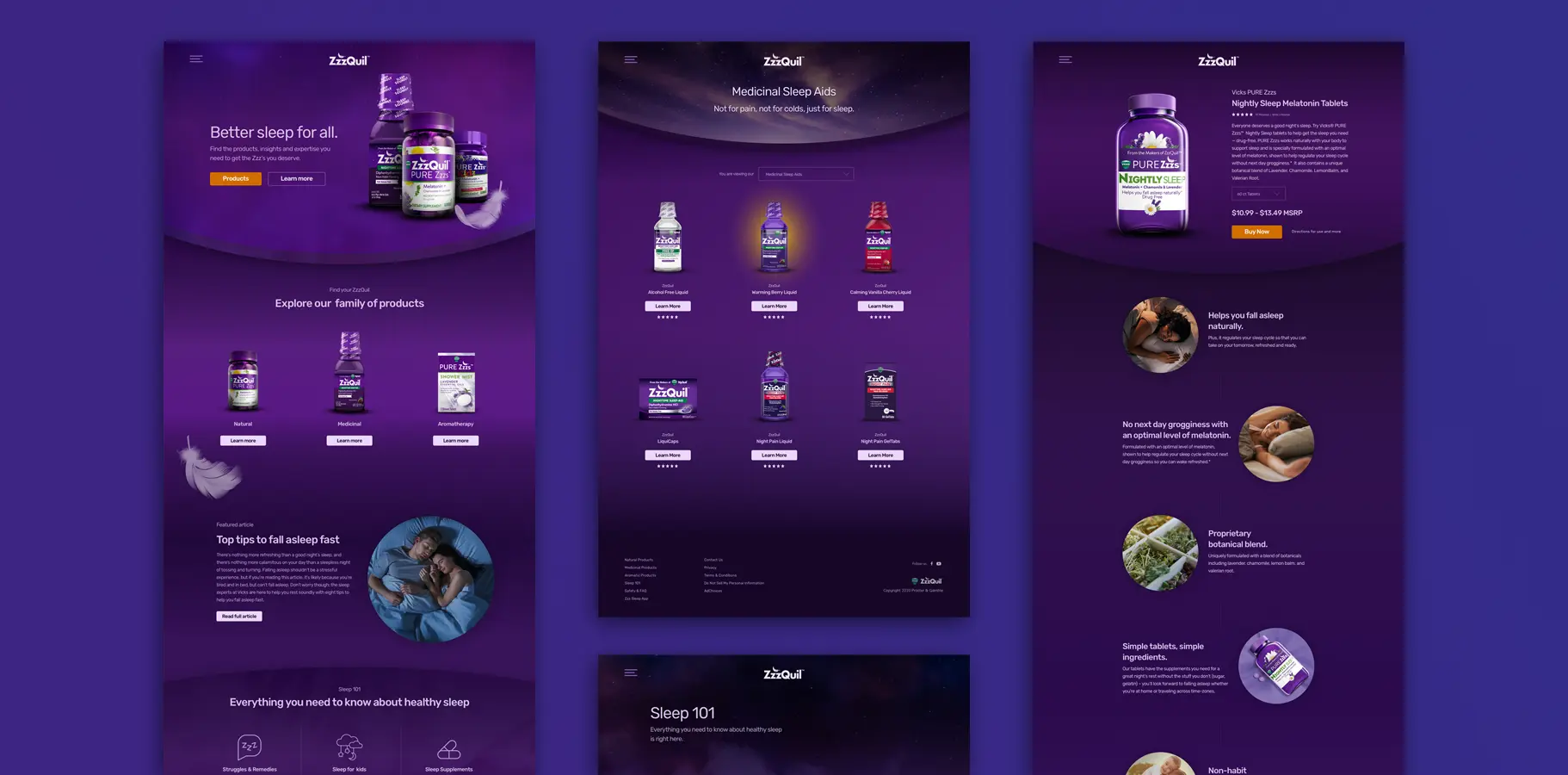
E-Commerce Website Redesign
The website was designed to not only inform potential customers about ZzzQuil products but also to aid in the purchase process. We reorganized the content to be more suitable for research and purchase. Product pages contained detailed information regarding the products, ingredients, and benefits, which were all clearly displayed. Educational content regarding sleep health was also included to establish ZzzQuil as an educational source. The checkout process was also made efficient by using effective form design. Product images were used to convey premium and approachable qualities, focusing on comfort rather than design.
Cross-Platform Design System
The design system made sure that users had a consistent experience with the brand, both in terms of design and interaction patterns. The design was responsive, meaning it was able to adapt to different screen sizes, maintaining the essence of the component. There was proper documentation, which assisted the development team.
Dark Mode as Design Philosophy, Not Aesthetic
The project proved that designing for dark mode is not just about contrast, but rather about inverting colors correctly. Good dark mode designs reduce eye strain and are still highly readable and usable. ZzzQuil was successful in dark mode because we approached it from the perspective of design philosophy in creating an environment that is soothing and free from stimulation.
Content Quality Drives Interface Simplicity
If the content is valuable, like soothing sounds or sleep-related information, then the interface should not compete with it but support it instead. The most successful features of the app were those that removed clutter and trusted that good content was enough to engage users on its own. This led to an effortless experience that supported the app's purpose.
Cross-Platform Consistency Requires Systematic Thinking
Therefore, cohesive experiences across different platforms stem from good design principles rather than trying for pixel-to-pixel similarity. The strength of the ZzzQuil design system was realized by focusing on design principles rather than rules, providing clear and flexible guidelines for each platform.
Distributed Teams Benefit from Over Communication
Working in different time zones also taught us one thing: documentation and communication processes are not something to be skimped on or viewed as additional overheads, but rather something essential to the process. By documenting decisions, justifying why these decisions were made, and illustrating the dependency of tasks, we were able to achieve a common understanding, regardless of whether everyone was not online simultaneously. What seemed to be additional overheads in the end proved to be time-savers and avoided confusion.