Friction Points Eliminated47Identified and addressed issues throughout the member lifecycle using journey mapping, heuristic audits, and behavioral analytics.
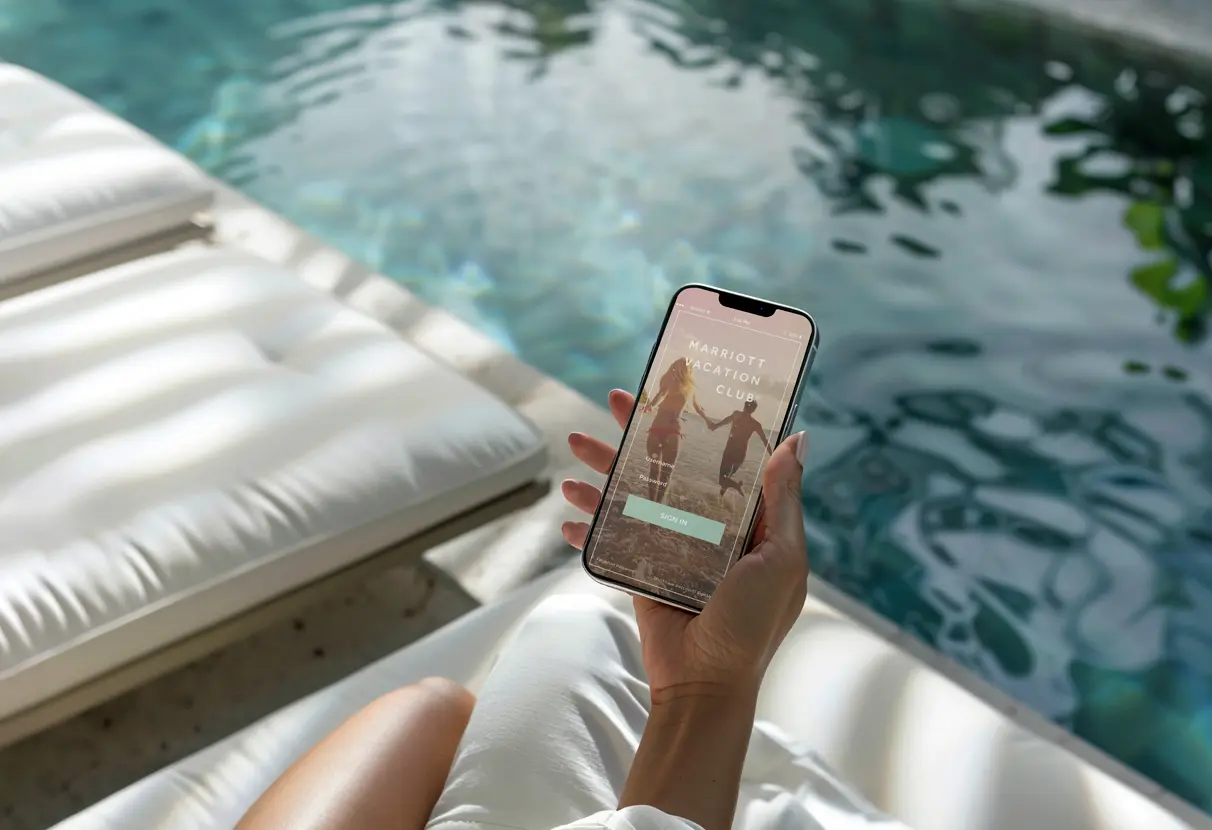
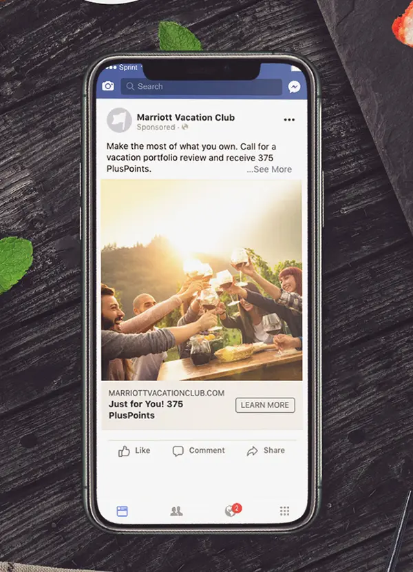
Mobile Conversion Gap40%Mobile accounted for 60% of sessions but had a 40% lower conversion rate than desktop. I rebuilt the experience as a native mobile solution rather than adapting the desktop layout..
Strategic EngagementMulti-YearCo-authored a 5 year digital transformation roadmap with C-suite stakeholders spanning 4 brands: Marriott, Pulse, Marriott Vacation Club, and ILG.
My Contribution
I led UX strategy, information architecture, and the development of a comprehensive visual design system. My responsibilities included facilitating C-suite workshops, mapping 47 friction points, delivering native iOS and Android specifications, and training internal teams on the new design system.
The Challenge
Marriott Vacation Club's digital ecosystem had become fragmented across properties, platforms, and user journeys due to years of siloed development. Members struggled to access their benefits, mobile conversion rates declined, and the four brands—Marriott Vacation Club, Hyatt, Sheraton, and ILG—lacked a unified design language.
I was brought in as Lead UX Brand Strategist to address these challenges.
The Strategic Question:
How can we transform a transactional booking platform into an aspirational lifestyle ecosystem that drives acquisition and retention globally?
Strategic Approach
Digital First Business Architecture – Establish a new business unit focused on digital growth, online customer experience, and business intelligence.
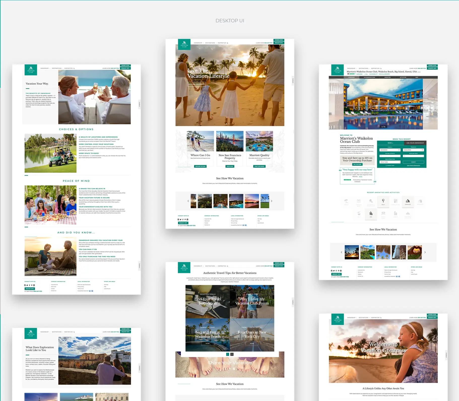
Unified Brand Strategy – Create visual and experiential consistency across Marriott Vacation Club, Hyatt, Sheraton, and ILG brands.
Experience Driven Commerce – Redesign booking and reservation systems to prioritize clarity, confidence, and emotional resonance.
Strategic Work Streams
01 — Information Architecture & User Journey Mapping
Transforming Complexity Into Clarity
Strategic Insight
Analytics identified a key issue: users did not understand their membership benefits, resulting in underutilization and more refund requests. The existing information architecture prioritized organizational structure over user intent, requiring customers to adapt to the business rather than the business meeting customer needs.
Visual Strategy
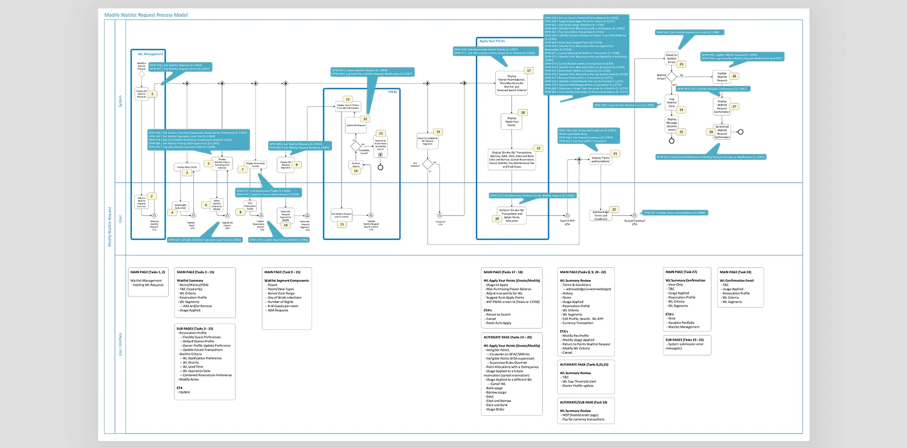
User Flow Reconstruction: Mapped the entire member lifecycle from initial research to booking confirmation, identifying 47 friction points across key journeys.
Process Model Development: Created detailed swimlane diagrams documenting each decision point, system interaction, and cross-functional handoff (see detailed process maps).
Navigation Simplification: Reduced primary navigation from 12 categories to three core paths: Explore Destinations, Manage Membership, and Book Your Stay.
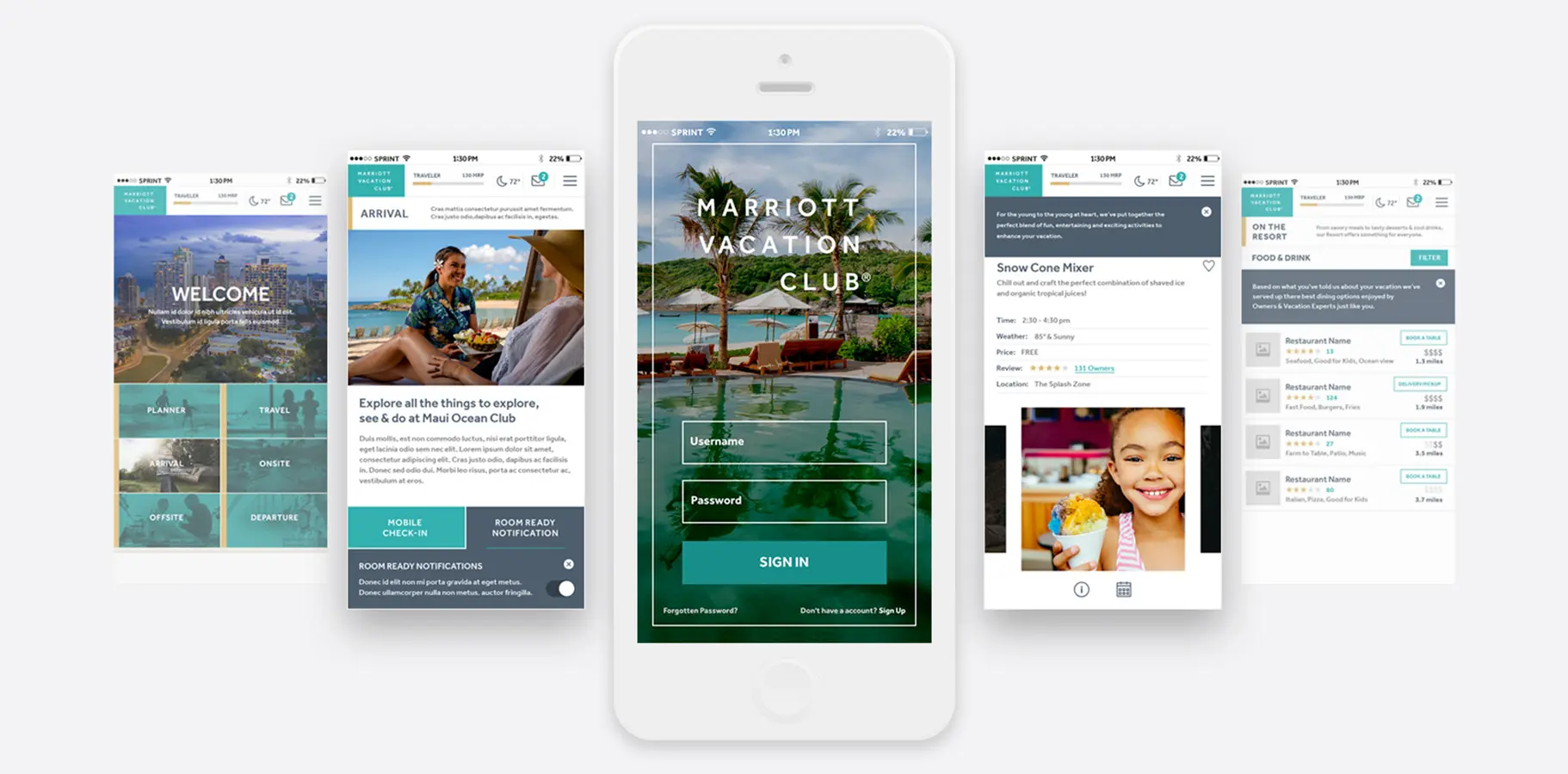
02 — Mobile-First Experience Design
Meeting Travelers Where They Are
Strategic Insight
Over 60% of browsing sessions occurred on mobile devices, yet mobile conversion rates were 40% lower than desktop. The previous mobile experience relied on compressed desktop layouts, which frustrated users instead of supporting them.
Visual Strategy
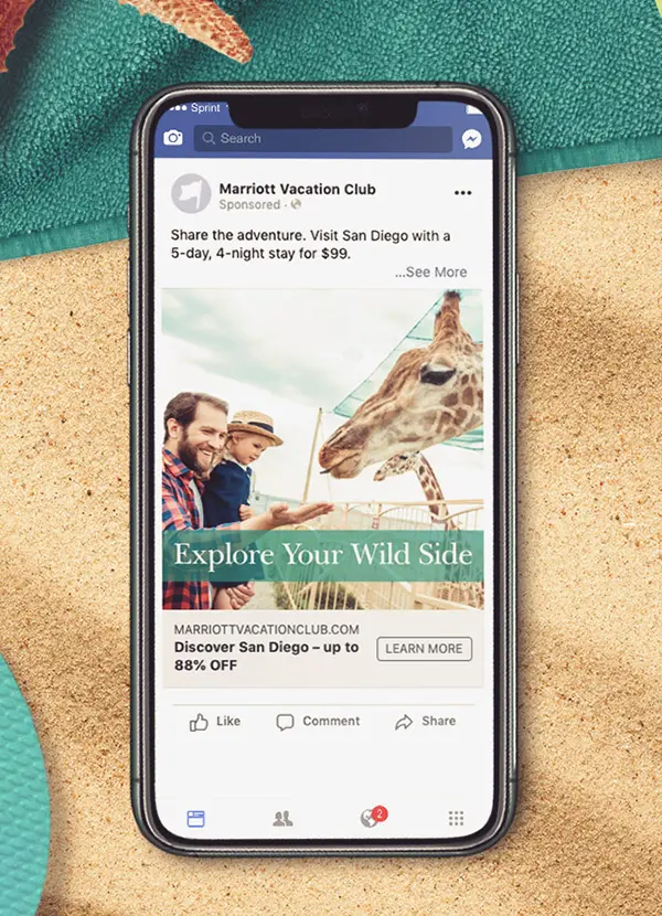
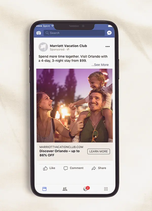
Mobile-Native Design System: Developed a gesture-driven interface that prioritized thumb-zone accessibility and one-handed operation.
Progressive Disclosure: Implemented a card-based user interface that revealed complexity gradually, reducing cognitive overload during booking.
Contextual Intelligence: Designed location-aware features that surfaced relevant property information, local activities, and time-sensitive offers.
Visual Breathing Room: Increased white space, simplified the typography hierarchy, and introduced photography-led storytelling to emphasize lifestyle over logistics.
Technical Execution
Developed native iOS and Android applications using a shared design system.
Created modular user interface components for Welcome/Dashboard, Arrival and Travel Planning, Resort Activities, and Food and Beverage discovery.
Implemented a notification system for room-ready alerts, activity reminders, and personalized recommendations.
Research & Discovery
Users valued speed and reassurance over visual flair.
Mobile experiences lacked continuity and compliance with accessibility standards.
The brand lacked a cohesive design language across teams and campaigns.
UX Strategy
The information architecture reduced navigation from 12 categories to three clear paths. The mobile redesign created a native experience optimized for thumb-zone use, rather than adapting a desktop layout. The visual system used a 12-column responsive grid with modular components that scaled across all touchpoints. Each component was designed to meet WCAG 2.1 AA standards from the outset. All efforts focused on one principle: eliminating barriers between members and their next vacation.
Process & Collaboration
Research & Discovery
Conducted heuristic audits across all digital touchpoints to identify usability barriers and brand inconsistencies.
Analyzed behavioral analytics to reveal user journey breakdowns and conversion obstacles.
Performed competitive benchmarking within luxury hospitality, timeshare, and travel booking sectors.
Facilitated stakeholder workshops to align business objectives with user needs.
Strategic Planning
Co-authored a five-year digital transformation roadmap with C-suite stakeholders.
Conducted usability testing with target demographics, including prospects, new members, and established owners.
Developed visual design systems and documented the rationale for strategic decisions.
Collaborated with development teams to ensure technical feasibility and optimize performance.
Implementation & Governance
Established design-to-development handoff protocols to minimize interpretation errors.
Created comprehensive component documentation and usage guidelines.
Trained internal teams on applying the design system and upholding brand standards.
Implemented continuous feedback loops to enable data-driven iteration.
Key Learnings
Systems Thinking Scales Impact
Individual screens are tactical, while design systems are strategic. By building reusable infrastructure, we ensured consistent quality across hundreds of touchpoints and allowed creative resources to focus on innovation rather than repetition.
Clarity Is Luxury in Complex Environments
In a category often marked by complexity, clarity became our competitive advantage. Users do not want to decode systems; they want to focus on planning vacations. Our role was to remove friction between aspiration and action.
Digital Strategy Requires Organizational Transformation
Technology and design are insufficient without aligned teams, clear governance, and a shared vision. The most impactful work focused on stakeholder alignment, ensuring that every department understood its role in delivering cohesive customer experiences.
Accessibility Is Brand Strategy
Meeting accessibility standards was not just about compliance; it was a strategy for market expansion. An accessible digital experience serves aging boomers, international users with varying English proficiency, and users with situational impairments such as bright sunlight or one-handed mobile use. Inclusion is good business.
Looking Forward
This project reinforced my belief that brand strategy and user experience are inseparable. Every visual choice affects usability, and every UX decision communicates brand value.
The most meaningful design work does not occur in isolated deliverables. It happens when systems, strategy, and execution align to create coherent experiences that drive measurable business outcomes and genuinely improve people's lives.