Creative Systems & Campaign Design
101 Days
of Because
Summer
200+ branded creative assets delivered across 101 consecutive days without a single brand consistency issue. Built a unified visual system centered on 'summer as sensation' that scaled across social, email, live activations, and Snapchat lenses, generating 60M impressions.
01 / The foundation
Research & Brand
Consistency Analysis
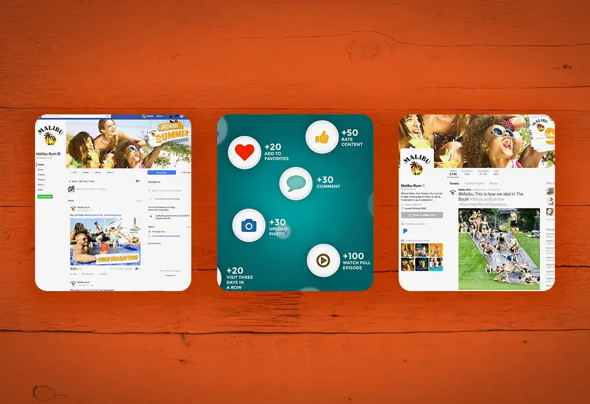
I audited Malibu's existing social archive across two prior summer seasons, cataloguing the specific points where brand consistency broke down: which asset types showed the most drift, which color treatments diverged most from the core palette, and which content categories generated the highest engagement despite being produced inconsistently.
High-performing content clustered around authenticity signals: real ingredients, real settings, low-production-value moments that felt unscripted. I reviewed the brand guidelines in detail, then stress-tested them against the asset types the campaign required. Several gaps became apparent: no rules for dark backgrounds, no motion treatment principles, and no defined hierarchy for co-branding moments.
02 / The visual system
Summer as
Sensation
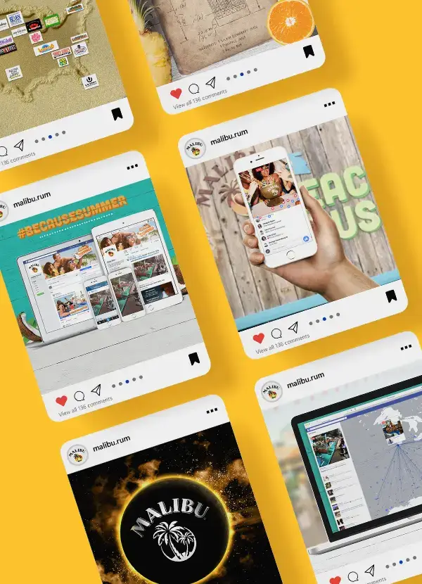
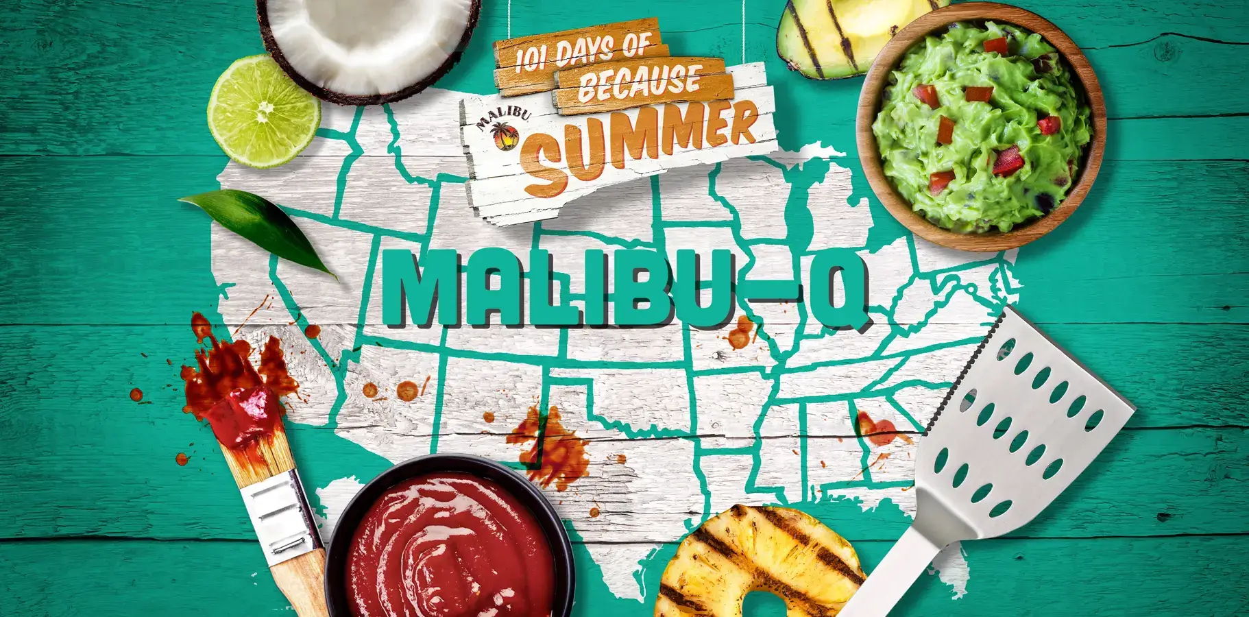
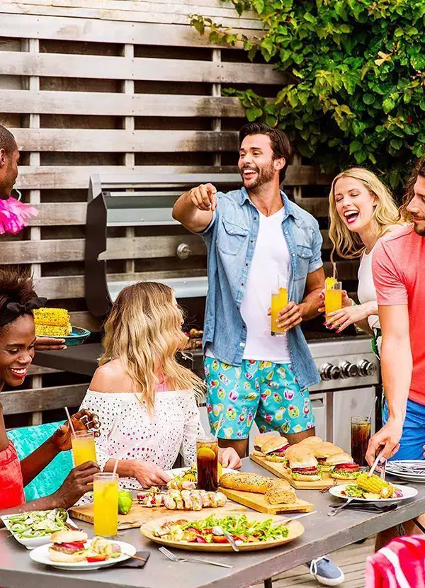
The design language centered on one idea: summer as a physical sensation. Aqua teals, sun-bleached oranges, and natural textures—woodgrain, lime peel, grill marks—were built into every asset category. Bold hand-painted headline fonts paired with rounded sans-serif body copy kept the tone friendly and unhurried.
Texture and depth layering used composited photography and vector overlays to simulate handcrafted quality at production speed. The system needed flexibility to support recipe graphics, live activation overlays, and Snapchat lenses—all recognizable as part of one cohesive campaign despite their different technical requirements.
03 / Production at scale
200+ Assets Built
for Production Speed
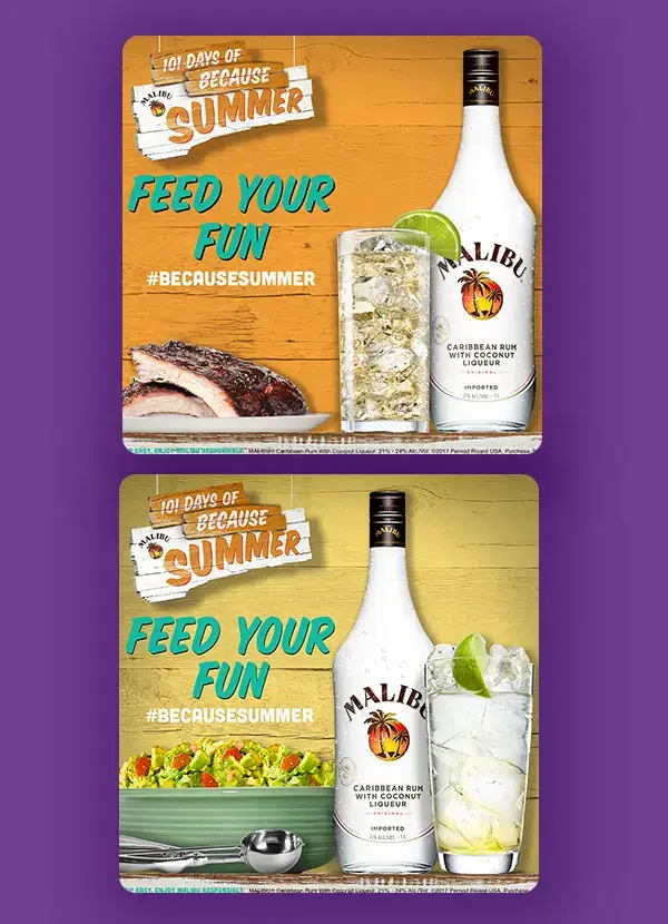
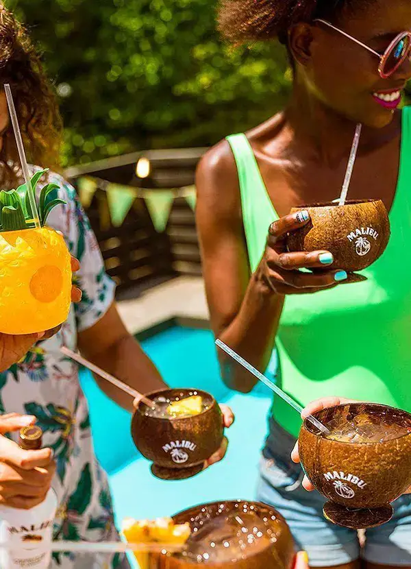
I delivered over 200 branded elements: logos, stickers, icons, and typographic treatments, all built as layered PSDs and vector assets that animation teams could work from directly. Export templates covered 16:9, 1:1, and 9:16 aspect ratios. Integrated grid systems handled both static and carousel posts.
Every asset in the toolkit was built so a designer unfamiliar with the campaign could pick it up and produce on-brand content within 30 minutes. Over 101 consecutive days I worked closely with the motion team on storyboard-to-final-cut consistency and coordinated with content strategists on the release schedule. The Bean Cam and #Shellfies activations were technically complex, requiring live-stream overlays and Snapchat lens integration while maintaining full brand consistency.
04 / Results
Results &
Multi-Market Adoption
25% increase in social engagement over the prior summer campaign baseline. 60M combined impressions across organic and paid placements over 101 days. 200+ branded elements produced without a single brand consistency escalation.
The creative system was adopted by regional marketing teams in 4 international markets, proving its scalability and clarity. 101 consecutive days of on-brand content across three platforms with zero missed publishing dates demonstrated both the system's robustness and the team's ability to execute at scale.