Disney Public Affairs
Digital Transformation

Role
Senior UX Strategist
Client
Walt Disney World Public Affairs
Agency
Voce Communications | Porter Novelli
Technology
Sketch, Adobe Creative Suite, Google Analytics, Heatmap testing tools
Decrease in Exit Rate 44% Visitors who previously abandoned the site now stayed and found what they came for, the direct result of restructured navigation and clear content hierarchy.
Bounce Rate Reduction 24% This improvement reduced the 77% category-page bounce rate caused by a mixed content structure that buried the most sought-after information.
Session Duration Increase 26% Users spent more time engaging with content once donation requests and community stories were surfaced through intentional IA decisions.
My Contribution

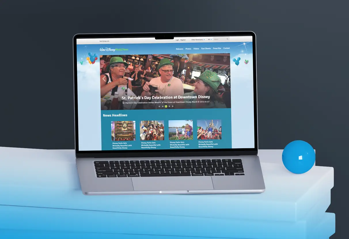
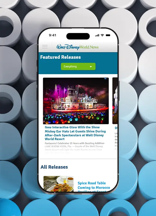
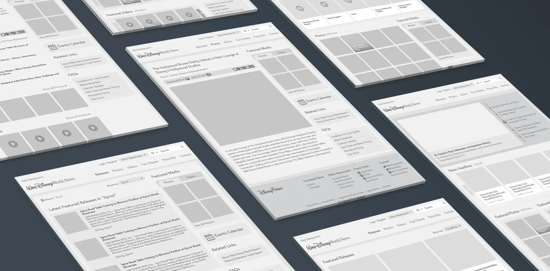
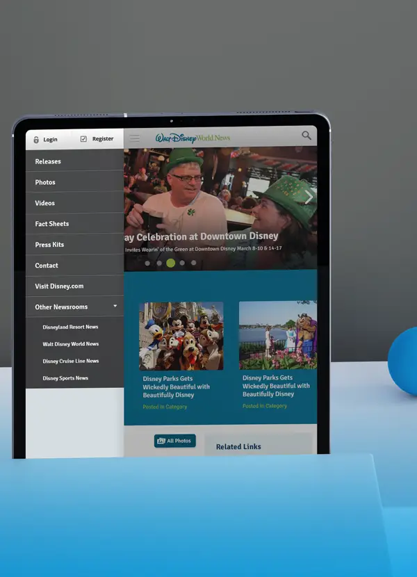
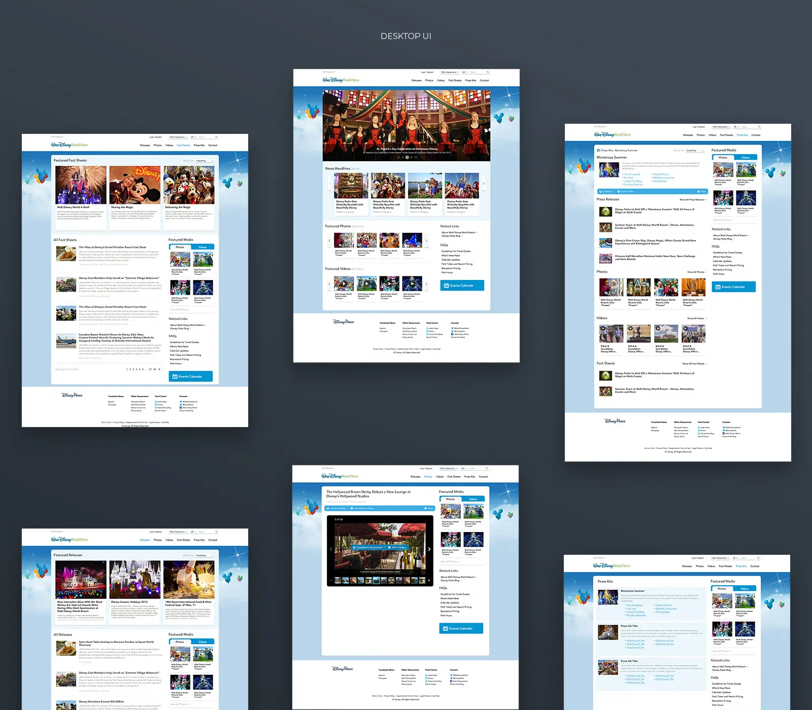
I led UX research, information architecture, and visual interface design across the full site redesign, from heatmap analysis and user testing through wireframes, IA restructuring, responsive layout design, and a new design language built on Disney's PEP brand guidelines.

Project
Overview

Walt Disney World is one of the most recognized brands on the planet. Its Public Affairs site, responsible for communicating community investment to journalists, nonprofit partners, and stakeholders, was invisible by comparison.

I was brought in as Senior UX Strategist to lead a full redesign: research, information architecture, visual design, and responsive implementation. The goal was not cosmetic. It was to make Disney's actual community impact, including charitable contributions, local partnerships, and environmental programs, findable, readable, and credible to the audiences who needed to see it most.

The
Challenge

The site had three compounding problems that research could no longer ignore.

Navigation was functionally invisible. Primary navigation placement left entire site sections unseen. During user testing, visitors couldn't distinguish between resort content and Public Affairs content. Many perceived the site as a single page because they never discovered the navigation.

The most sought-after content was the hardest to reach. Heatmap data showed that 43% of engaged traffic looked for donation request information. That content was buried behind five steps in a dense, undifferentiated feed. The people most motivated to engage were the most likely to leave without converting.

Mobile was not a degraded experience; it was a broken one. For community partners and nonprofit organizations browsing in the field, the site was essentially nonfunctional. That was not a mobile problem. It was a business problem.

Research &
Discovery

Conducted competitive analysis of Fortune 500 companies and Orlando theme parks, identifying effective public affairs communication strategies. Heatmap analytics showed users sought donation requests and community content but left due to navigation issues. User testing found visitors could not distinguish between resort and public affairs content, with many perceiving the site as a single page because of hidden navigation.

Information Architecture
Strategy

Restructured content hierarchy around three core user journeys: media seeking press materials, community organizations requesting support, and stakeholders tracking impact. Separated static informational pages from dynamic press releases, creating clear content types with distinct navigation paths. Introduced consistent taxonomy across sections, replacing the confusing mix of "Stories," "News," and "Releases" with unified nomenclature.

Wireframes &
Flow Optimization

Streamlined user flows, reducing donation request interactions from over five to two. Redesigned category browsing to separate content by type, such as releases, photos, and videos, instead of mixing them in a single feed. Developed modular homepage content blocks that adapt to current priorities while maintaining visual hierarchy.

Visual Design &
System Thinking

Developed a design language inspired by Disney Parks' PEP guidelines, establishing Public Affairs as a distinct, professional, and approachable voice. Applied generous whitespace, refined typography, and strategic photography to highlight community impact stories. Redesigned the carousel to shift from information overload to focused storytelling.

Responsive
Implementation

Designed fully responsive layouts for desktop, tablet, and mobile. The mobile experience prioritized donation requests and featured stories, recognizing that community partners often browse in the field. Navigation was streamlined into intuitive menus without sacrificing depth or discoverability.

Results &
Impact

The redesign produced measurable improvements across every tracked metric.

A 44% decrease in exit rate meant visitors who previously abandoned the site were now staying and finding what they came for. A 24% decrease in bounce rate confirmed that restructuring content, separating static pages from dynamic press content, and introducing consistent taxonomy across sections removed the confusion that had been sending users away. Session duration increased by 26%, reflecting genuine engagement with content now organized around real user intent rather than internal structure.

The donation request flow was reduced from 5 steps to 2. For the 43% of engaged traffic arriving to request community support, that reduction in friction was the clearest measure of the redesign's success.

Mobile went from nonfunctional to fully operational, giving community partners and nonprofits reliable access to the site they were already trying to use.

Reflection

Disney's community work was real and substantial. The design problem was that none of it was visible. Research showed exactly who was looking for what and what was stopping them from finding it. The work was about removing those obstacles with precision, not reimagining what the site could be.

That's what good information architecture does. It doesn't change the story. It makes the story possible to read.

Prev
Next