Research-Led UX & Information Architecture
Public Affairs
Digital
Transformation
Public affairs information architecture redesign that made Disney's community impact finally visible. Restructured navigation for three distinct user journeys, cut site-wide exit rates by 44%, and streamlined donation flow from 5+ steps to 2 interactions.

01 / Discovery
Three journeys.
One hidden service.
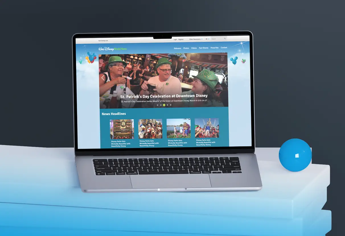
Competitive audit across 12 Fortune 500 Public Affairs sites and theme park properties. Heatmap analysis identified navigation invisibility issues. Moderated sessions with 8 participants showed users couldn't distinguish Public Affairs content from the main resort site.
This wasn't a copy or visual design problem—it was a fundamental positioning failure. Users arriving to donate or find media information couldn't tell they were in the right place. No amount of optimization could fix architecture-level confusion.
02 / Information architecture
Make the task
the entry point.
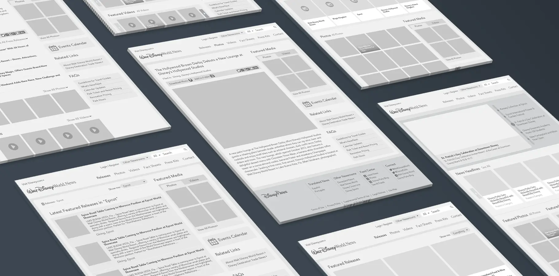
Restructured hierarchy for three distinct user journeys: media professionals, community organizations, and general stakeholders. Each audience received a dedicated entry point with content organized around their specific tasks rather than Disney's internal communication structure.
Navigation language was replaced with user-facing task descriptions. Press professionals found press releases organized by topic and date. Community organizations found donation information prominently at the top level. General stakeholders found company impact stories and community programs.
03 / Responsive delivery
Flow Optimization &
Visual Design

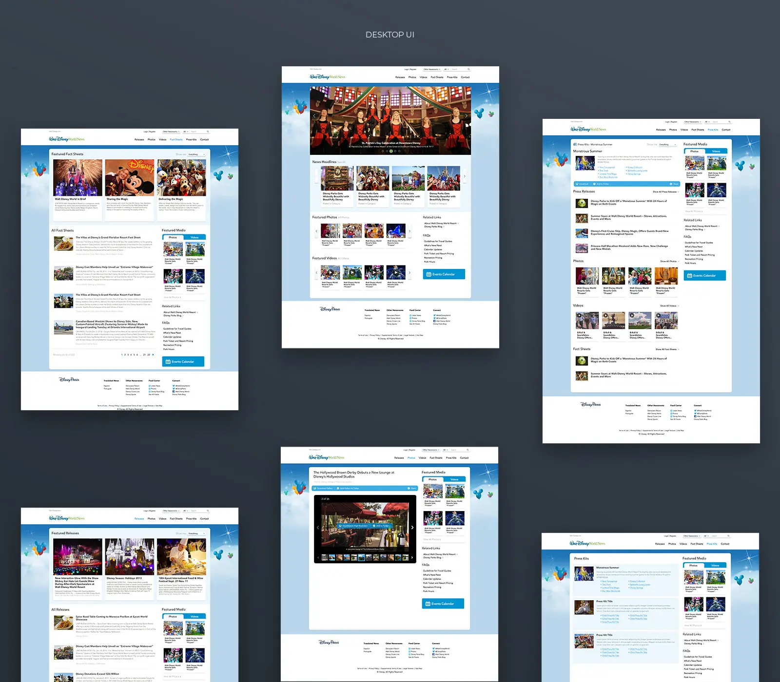
Donation flow was reduced from 5+ steps to 2 interactions with 5/5 task success in testing. Press content was separated into categorized feeds by topic and audience type, eliminating the single undifferentiated stream that had caused journalist abandonment.
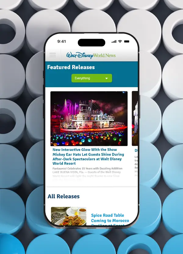
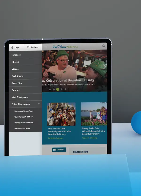
Visual design established clear distinction between Disney Public Affairs and the main resort brand while maintaining the organizational credibility required for media and community audiences. Fully responsive implementation across all breakpoints replaced a desktop-only experience that had failed mobile visitors entirely.
04 / Results
Results &
Impact Metrics
44% decrease in site-wide exit rate. 24% decrease in bounce rate across category pages. 26% increase in session duration. These improvements came directly from fixing the information architecture—users could finally find what they came for.
Donation flow success was now 5/5 in testing where it had previously been buried and invisible. Mobile usability improved from non-functional to fully operational across all breakpoints. The platform now properly represented Disney's commitment to community engagement.