Product Strategy & Mobile UX
ZzzQuil
Sleep
App
Dark mode design reimagined for sleep physiology rather than aesthetic preference. Rebuilt the color system from base saturation values up while maintaining brand recognition, proving context-appropriate design improves both usability and brand perception in wellness categories.
01 / The context
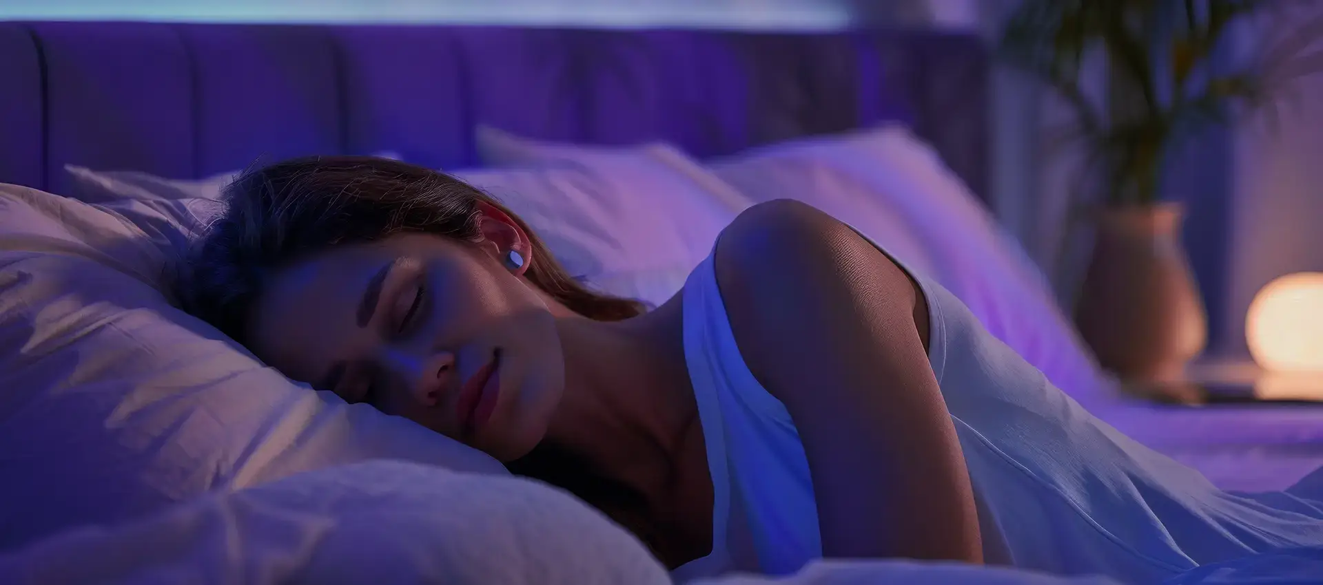
Dark mode has to
respect the body.
Analysis covered color contrast ratios for pre-sleep screen usage, dark mode accessibility standards, and competitor app audits across 14 comparable sleep and wellness apps. The critical insight: packaging design and app design serve fundamentally different purposes in different contexts.
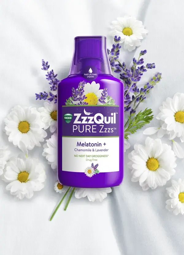
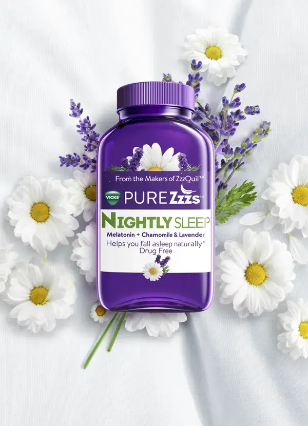
User journey mapping identified critical handoff moments between platforms. What works on a grocery shelf—vibrant, attention-grabbing—creates optical strain in a dark bedroom at 11 PM. The design had to prioritize the actual usage context over brand consistency expectations.
02 / A new visual language
Dark Mode as Core
Design Philosophy
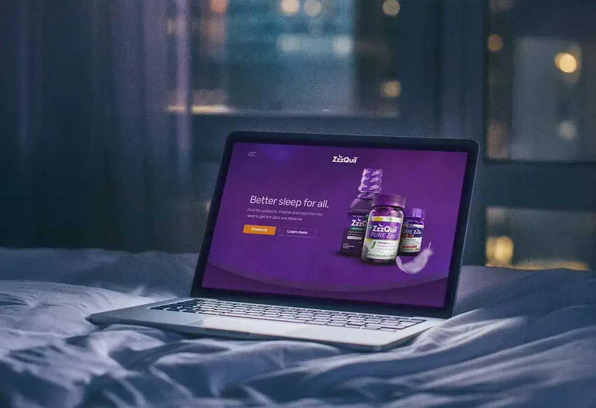
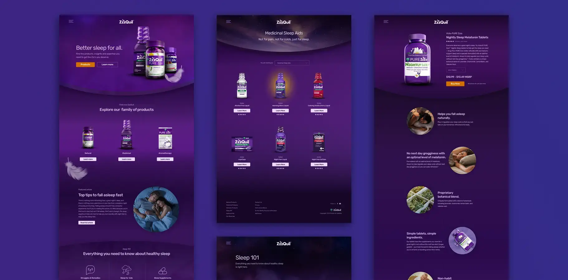
Rather than treating dark mode as a color swap, I rebuilt the ZzzQuil color system from the base saturation values up. The goal was a palette that maintained brand recognition while becoming genuinely comfortable for extended pre-sleep use—a fundamentally different design brief than most dark mode implementations.
The palette needed to feel like ZzzQuil while supporting sleep physiology. Reduced blue light, lower saturation, maintained legibility, but no longer caused the visual fatigue of bright purples and high contrasts. This required education with brand stakeholders about why visual impact mattered less than user comfort.

03 / Content first
Platform Architecture &
Design System
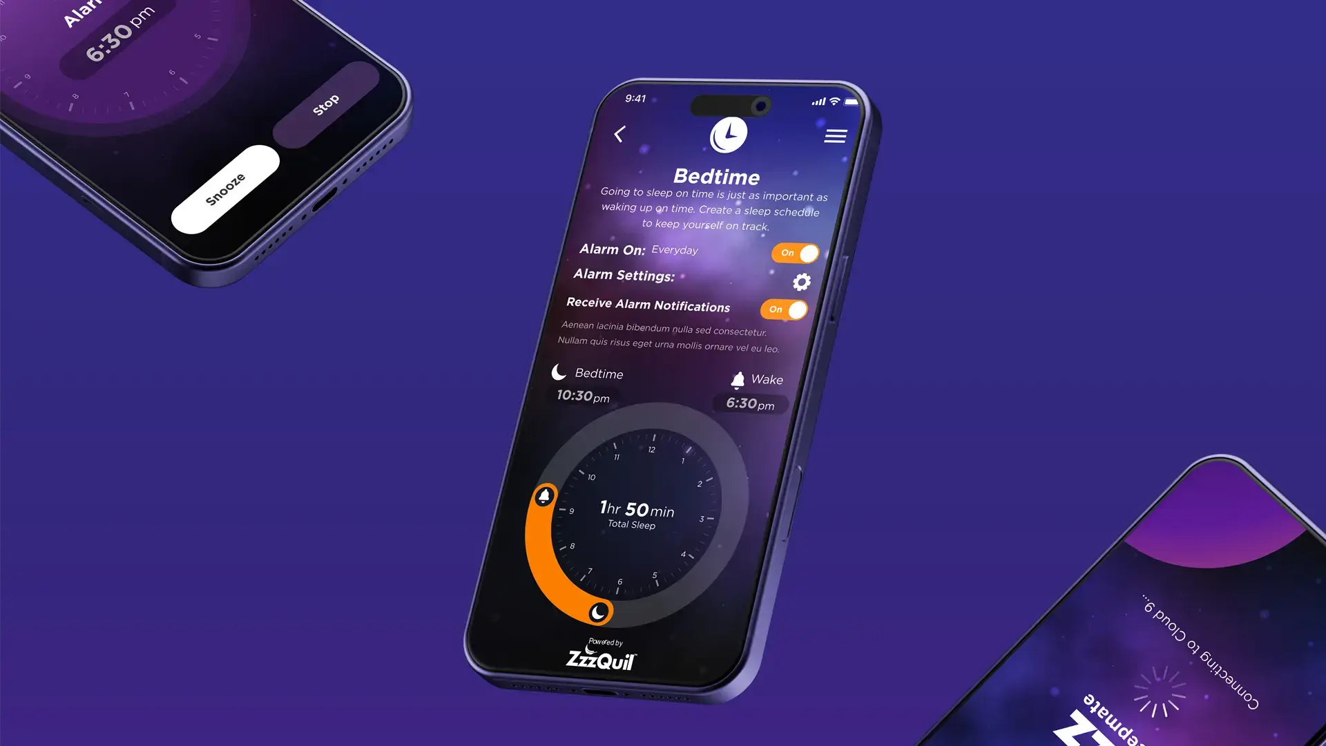
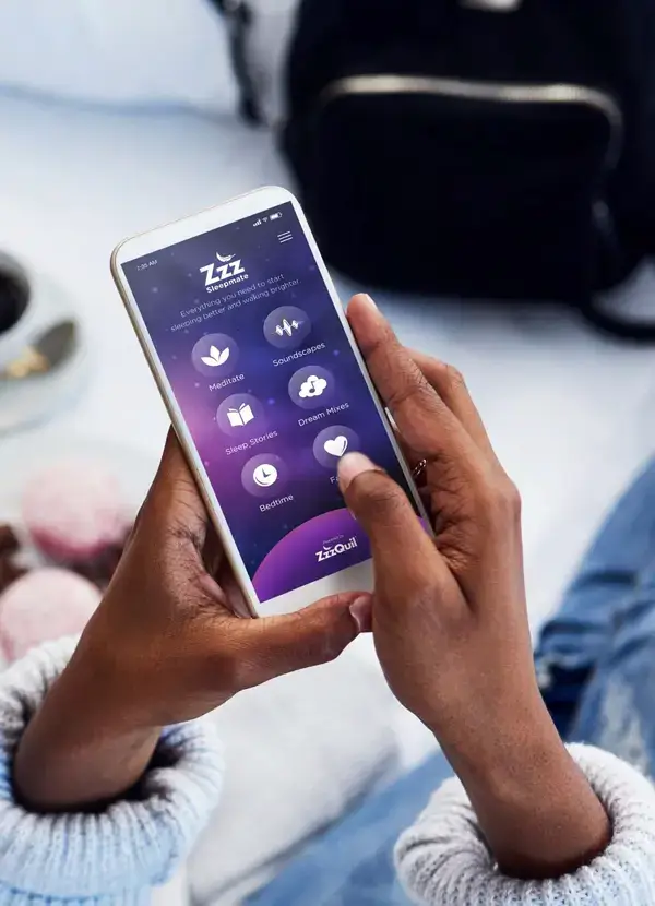
The app's navigation was designed to recede as users engaged with content. The soundscape mixer became the most-used feature post-launch—a direct result of surfacing it in the primary interaction layer rather than burying it in a sub-menu.
I built a modular design system that maintained brand integrity across mobile and web while respecting the different technical constraints and user expectations of each platform. Single design system deployed across iOS, Android, and responsive web with WCAG 2.1 AA compliance across all breakpoints.
04 / Results
Results &
Usage Patterns
Soundscape mixer became the most-used feature within 30 days of launch. System-default dark mode usage exceeded projections by significant margin. The app demonstrated that content-first architecture—surfacing the most-valuable feature prominently—directly influenced user behavior.
Platform consistency was maintained through single design system deployment across iOS, Android, and responsive web. Multi-coast team coordination with structured async protocols ensured quality delivery despite timezone separation. The project validated that context-appropriate dark mode improves both usability and brand perception in wellness categories.