Beat Saber - Beat Games (Meta)

Creative Systems & Brand Strategy

Client
Beat Games / Meta Reality Labs
Scope
Multi-phase engagement across three artist pack releases: Britney Spears, Monstercat, Metallica
Deliverables
3D environments, key art, in-game visuals, promotional assets, brand architecture framework

The
Problem

Each Beat Saber Music Pack launch is a product release and a cultural event simultaneously. The game had 4 million active players at the time of this engagement. Each artist pack introduced a globally recognized name, Britney Spears, Monstercat, and Metallica, to a VR environment built around Beat Saber's neon-charged visual identity. The design challenge was real: honor what each artist's audience already associated with them visually, without losing what made Beat Saber's identity coherent across three very different music genres.

Co-branding in a VR environment is harder than it sounds. The environments aren't decoration. They're functional: players need spatial depth cues for note timing, visual contrast between sabers and background, and consistent lighting that doesn't create motion discomfort. Any artistic choice that compromised gameplay readability was a UX failure, regardless of how it looked in a marketing render.

Research &
Discovery

I reviewed the documented player feedback from three prior Music Pack launches to understand which environmental decisions correlated with positive play experience versus complaints. The consistent success factors: strong spatial contrast between note objects and background surfaces, lighting that moved in sync with musical tempo rather than independently, and environmental storytelling that communicated genre before the first note was hit.

For each artist, I reviewed their visual history: album artwork, tour stage design, official merchandise, and fan community aesthetics going back at least five years. Britney's audience had strong associations with early 2000s club culture. Monstercat's brand centered on kinetic evolution and cross-genre fluidity. Metallica's visual language was rooted in analog weight, industrial texture, and analog-to-digital tension. Each informed a distinct design brief.

Strategic
Approach

Brand Architecture Framework

I developed a flexible visual system organized around three dimensions: Artist Authenticity, Beat Saber DNA, and Gameplay Readability. The system established what was fixed across all packs, the red/blue saber color system, note contrast requirements, and spatial depth standards, and what was variable: artist-specific palettes, materials, environmental narrative, and lighting choreography. Working from this framework meant each pack felt like its own world without any of them feeling foreign to a Beat Saber player.

Britney Spears
Music Pack

Pop Nostalgia Meets Neon Euphoria

Britney's fanbase spans generations, with deep emotional connections to early 2000s pop culture. The visual language needed to feel simultaneously nostalgic and modern honoring her legacy while positioning her music within Beat Saber's futuristic context.

Visual Strategy

User Experience Impact

The radiant, euphoric environment enhances the emotional accessibility of Britney’s music while preserving gameplay clarity. Players described feeling "inside the music" rather than simply playing to it.

Monstercat
Mixtape Vol. 2

Futuristic Bass-Driven Atmosphere

Strategic Insight

Monstercat embodies genre fluidity in electronic music, with a brand that thrives on evolution and cross-genre experimentation. Its visual identity must feel kinetic, innovative, and always in motion.

Visual Strategy

User Experience Impact

The environment serves as a responsive performance space. Metallic surfaces and a laser grid provide depth cues that enhance spatial awareness in VR, visually expressing Monstercat's brand philosophy: sound as structure, rhythm as architecture.

Metallica
Music Pack

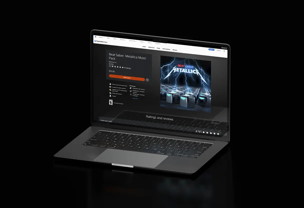
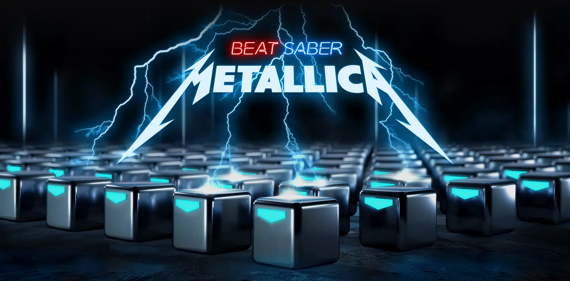
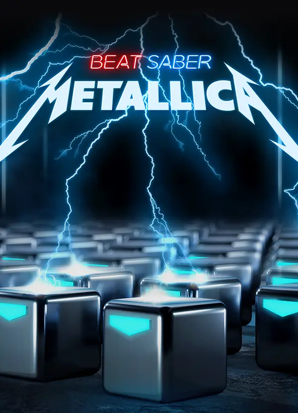
Power, Distortion, and Thunder

Strategic Insight

Metallica introduces its established audience to VR gaming. The primary design challenge was to translate the band's raw, analog energy—distorted guitars and thunderous drums—into Beat Saber's clean, digital visual style while preserving both brands' identities.

Visual Strategy

User Experience Impact

The environment translates aggressive sonic energy into a spatial experience. Lightning arcs offer directional cues, while metallic surfaces convey weight and impact. Players reported feeling the music's physicality more intensely, which is a critical success metric for rhythm-based VR experiences.

Results &
Impact

My
Contribution

I owned the brand architecture framework and the visual design of all three environments. 3D modeling and rendering execution was handled by the technical team at Beat Games, working from my design direction, reference materials, and asset specifications. The co-branding decisions, particularly the Metallica mark unification, involved alignment across multiple brand teams; my role was to make the design case for a solution that worked for everyone rather than defaulting to compromise. If I were revisiting this work, I'd push for in-headset prototype testing earlier in the process. Reviewing 3D environment designs on a 2D screen consistently understates the spatial experience, and there were a few lighting decisions that read differently in VR than they did in the reference renders.

Prev
Next