Three globally recognized artists. Three completely different fanbases. One visual system that had to hold all of them together without breaking the game.
That was the actual problem.
Context
The Engagement
Beat Games, operating under Meta Reality Labs, engaged ChrowmDesigns to lead brand strategy and visual design across three sequential Music Pack launches: the Britney Spears Music Pack, Monstercat Mixtape Vol. 2, and the Metallica Music Pack. My role was Senior UX Strategist and Creative Director on the visual systems side. The 3D modeling and rendering was handled by the technical team at Beat Games, working from my design direction, specifications, and art direction. This was a multi-phase engagement with distinct launch windows per pack, requiring both standalone identity work and a cohesive overarching framework that scaled across releases.
The Problem
More Than a Co-Branding Challenge
Each Beat Saber Music Pack is simultaneously a product release and a cultural event. With 4 million active players at the time of this engagement, every launch carried real stakes. But the harder problem was not audience scale. It was identity collision.
Beat Saber has a strong, proprietary visual language: red and blue sabers, neon geometry, spatial precision. Introduce an artist with equally strong visual equity and you immediately have competing brand signals. Do you prioritize the artist's fans who do not know Beat Saber? Or Beat Saber's existing base who might resist something that feels foreign to the platform?
The wrong answer to that question shows up as a bad player experience. In VR, environment design is not aesthetic decoration. Players depend on visual contrast between note objects and background surfaces to process incoming notes at speed. Lighting that competes with saber color creates confusion, not atmosphere. Environmental complexity that overwhelms spatial depth cues raises the chance of motion discomfort. Every artistic decision was also a functional one.
Three artist packs, each with distinct audience expectations and visual histories, each needing to feel fully realized without undermining Beat Saber's coherence as a platform. That was the design problem.
The Approach
Research and Discovery
Before touching any design tool, I reviewed documented player feedback from prior Music Pack launches to understand which environmental decisions correlated with positive play experience versus friction. The consistent success factors were: strong spatial contrast between note objects and background surfaces, lighting that moved in tempo with the music rather than independently, and environmental storytelling that communicated genre identity before the first note was hit. These became non-negotiable criteria across all three packs.
For each artist, I conducted a deep visual audit spanning at least five years: album artwork, tour stage design, official merchandise, and fan community aesthetics. Britney's audience carried strong associations with early 2000s club culture, tactile and emotionally warm. Monstercat's brand was built on kinetic evolution and cross-genre fluidity. Metallica's visual language lived in analog weight and industrial texture, with the added tension of introducing their established audience to a VR gaming context for the first time.
Brand Architecture Framework
Rather than designing each pack in isolation, I built a brand architecture framework that organized every visual decision across three dimensions: Artist Authenticity (what made each artist's identity legible to their audience), Beat Saber DNA (what had to stay constant to protect gameplay and platform coherence), and Gameplay Readability (the functional floor that no aesthetic decision could fall below).
The framework established what was fixed across all releases: the red and blue saber color system, minimum note contrast ratios, and spatial depth standards. It also defined what was variable per pack: artist-specific palettes, material treatments, environmental narrative, and lighting choreography. This structure meant each pack could pursue a fully distinct identity while remaining undeniably Beat Saber.
Britney Spears Music Pack
Pop Nostalgia Meets Neon Euphoria
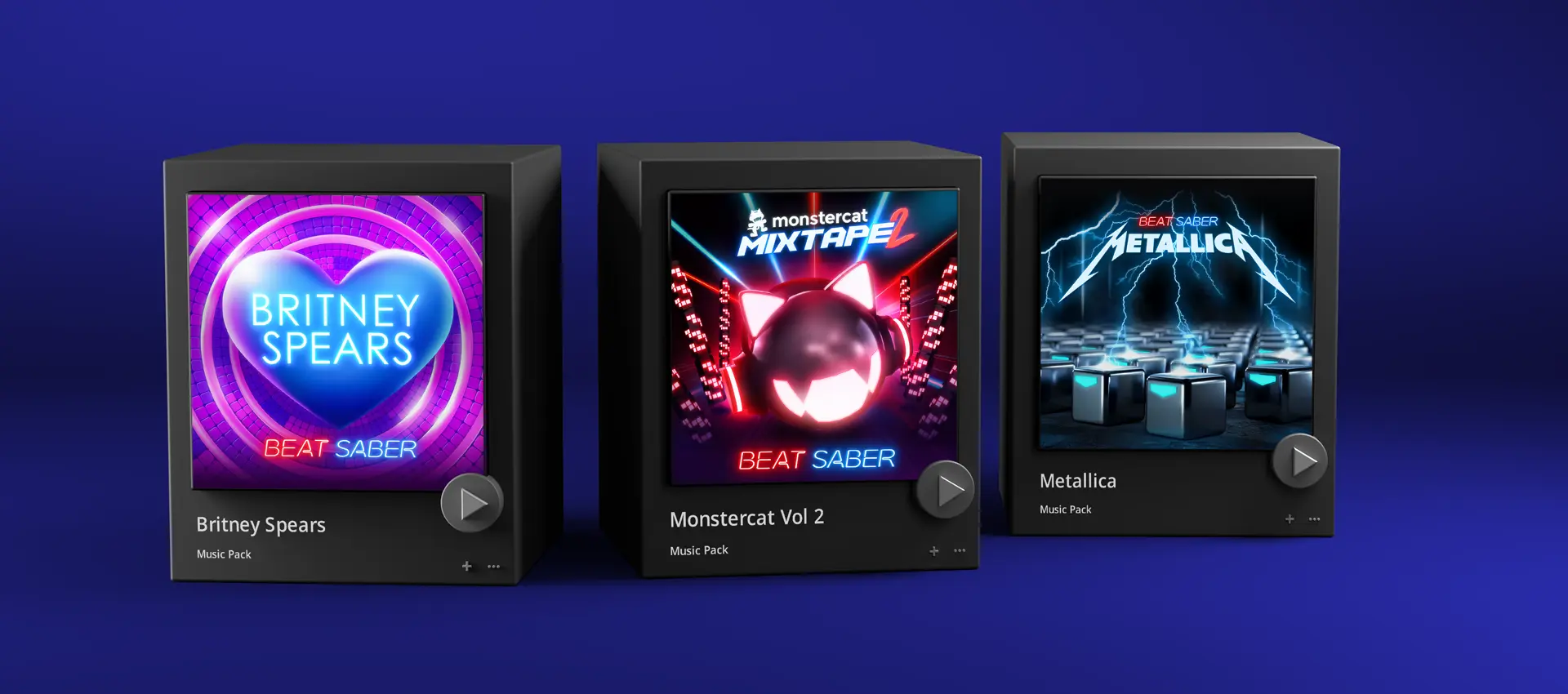
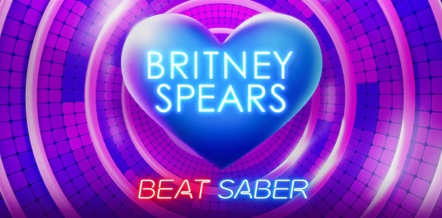
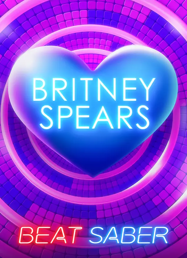
The design direction for Britney centered on translating emotional memory into a spatial experience. Her fanbase carries deep, multi-generational associations with early 2000s club culture, and the environment needed to feel simultaneously nostalgic and contemporary. A luminous 3D heart became the hero element, functioning as both an emotional signal and a central visual anchor within the VR space. The magenta-to-blue gradient palette drew from nightclub lighting energy while maintaining the saber contrast requirements set by the framework. The neon typographic treatment bridged Britney's pop legacy with Beat Saber's existing visual vocabulary without forcing the two identities to compete.
Post-launch community feedback reflected the intended experience. Players described feeling immersed in the music rather than simply playing to it, which was exactly the emotional register the environment was designed to produce.
Monstercat Mixtape Vol. 2
Futuristic Bass-Driven Atmosphere
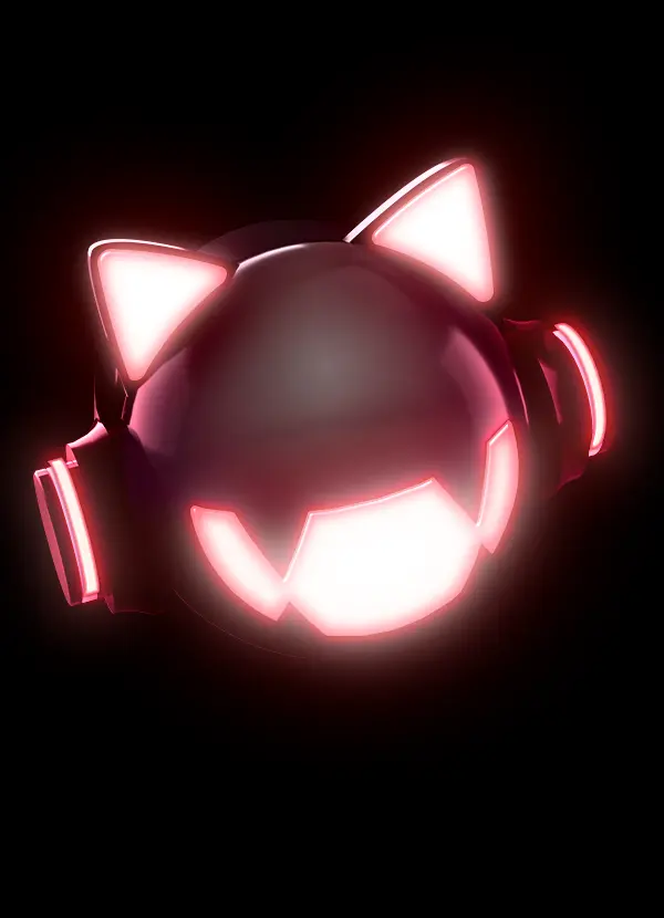
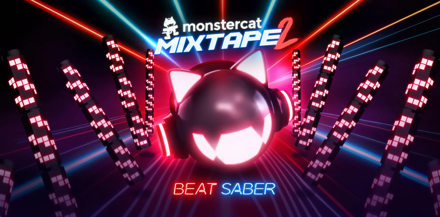
Monstercat's brand identity thrives on motion and cross-genre fluidity. The design challenge was giving that philosophy a spatial form. The 3D treatment of their mascot, rendered as a high-gloss metallic sculpture, elevated the 2D logo into a dimensional brand presence that functioned at VR scale. The environment design used reactive columns and volumetric laser beams to create what I described in the brief as sonic architecture: the idea that the space itself behaves like sound made visible.
The material palette (deep violets, bright reds, icy blues) was selected to signal Monstercat's genre range while giving players clear spatial depth cues through contrast. The metallic surfaces and laser grid served a dual purpose: they communicated Monstercat's brand philosophy and provided the depth perception cues that make VR environments playable at competitive speeds.
Metallica Music Pack
Power, Distortion, and Thunder
The Metallica engagement carried an additional layer of complexity. This was Metallica's entry into VR gaming, which meant the design had to simultaneously serve long-time Metallica fans unfamiliar with VR and Beat Saber players who might not have a strong prior connection to the band. Neither audience could feel like an afterthought.
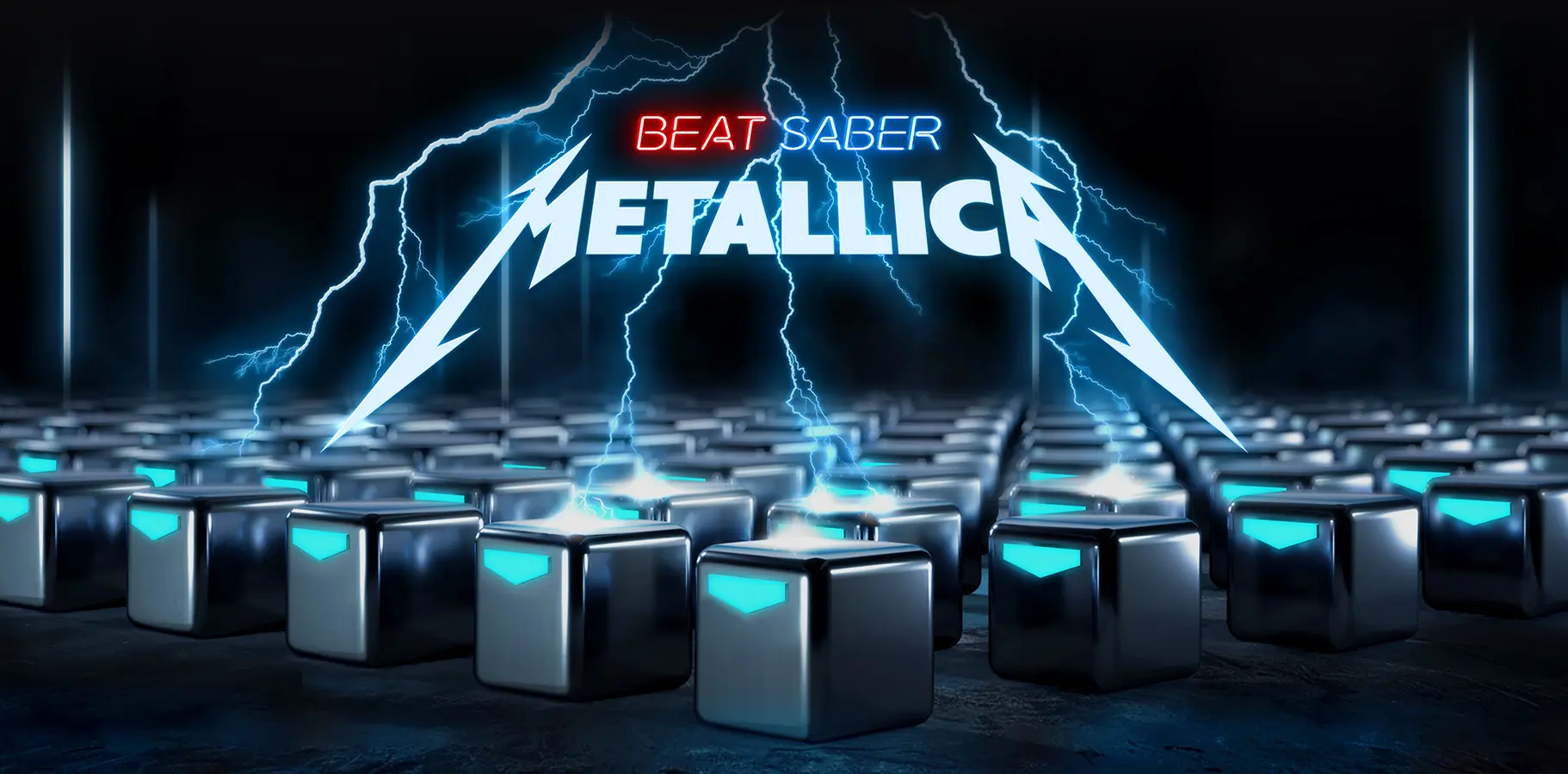
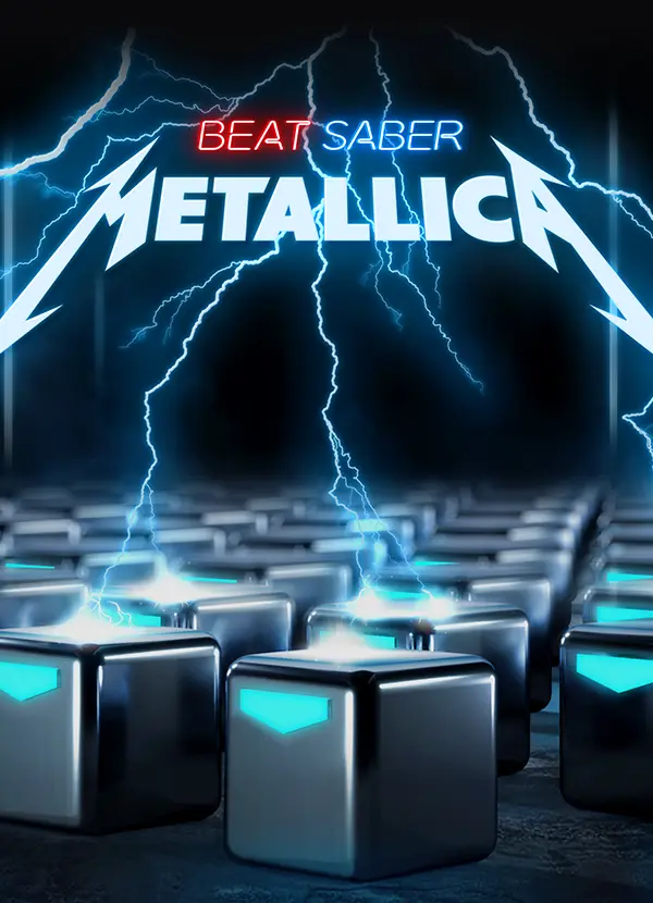
The industrial storm field environment, charged metallic note cubes, brushed steel shaders with emissive blue surfaces, and visible lightning arcs all worked together to translate the band's analog sonic weight into a digital spatial language. The lightning arcs served as directional depth cues: a functional decision that also reinforced the visual identity. The Metallica lightning bolt mark was unified with Beat Saber's red and blue logo identity. That co-branding decision required alignment across multiple brand teams and involved a significant amount of stakeholder negotiation. My role was to make the design case for a solution that served both brands' visual interests rather than arriving at a compromise that served neither.
Results & Impact
Player reach - 4M+ active players at time of engagement across all three pack launches
Launch execution - 3 simultaneous global launches with full asset delivery, zero timeline slips
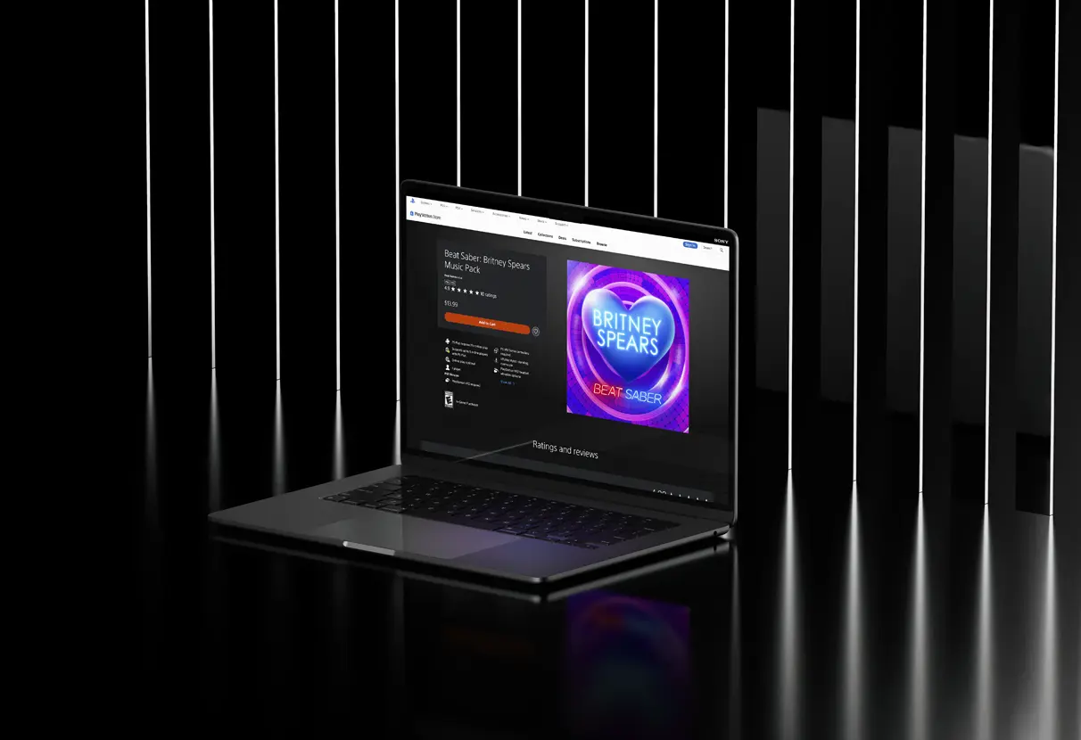
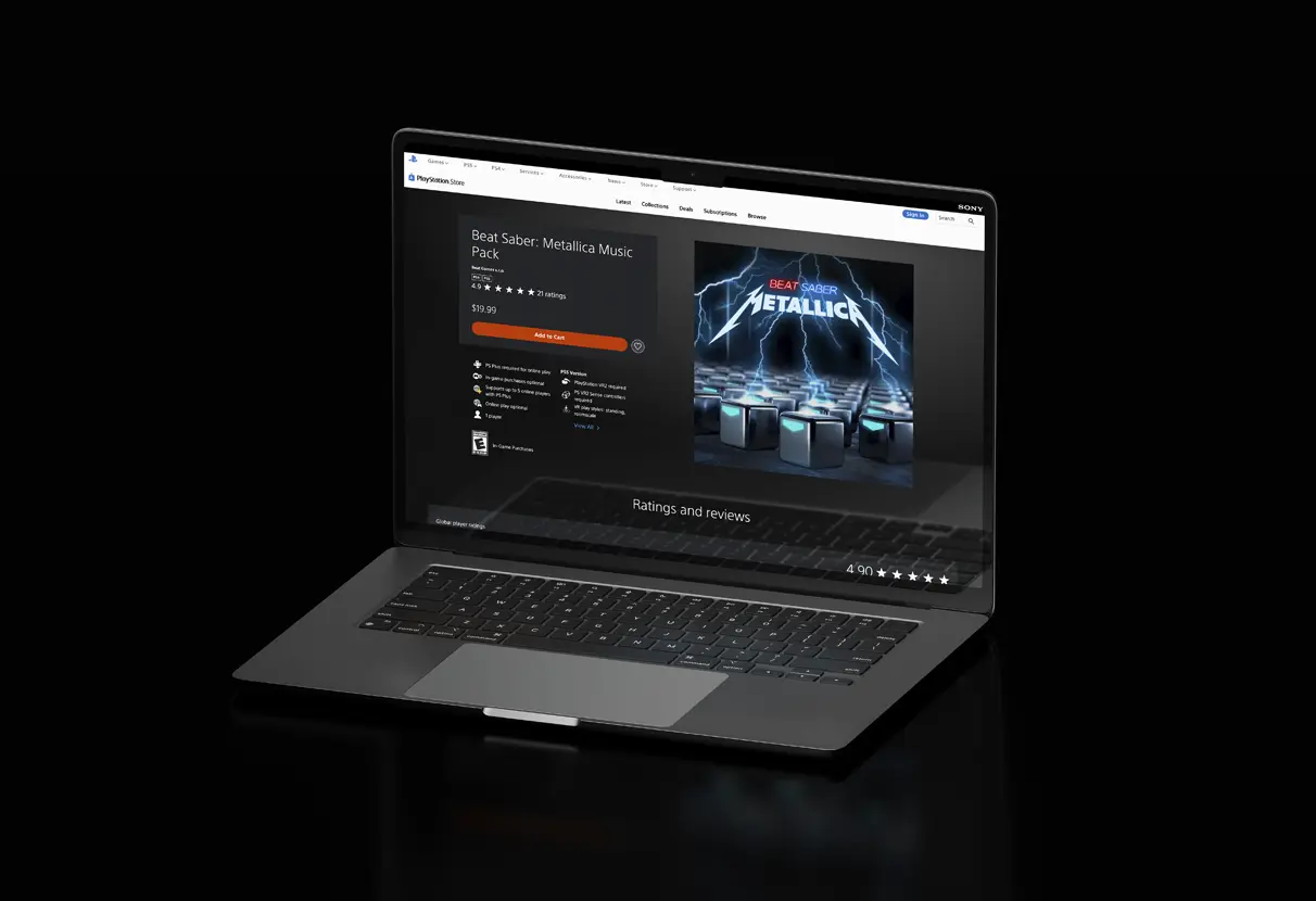
Player Rating - Metallica pack: 4.9 stars on PlayStation Store post-launch
Framework Adoption - Brand architecture system adopted by Beat Games as the reusable template for all future Music Pack releases
Asset Scalability - Scalable component library delivered, enabling future pack development without starting from scratch
My Contribution
I owned the brand architecture framework and the visual design direction for all three environments. The 3D modeling and rendering execution was handled by the technical team at Beat Games, working from my design specifications, reference materials, and art direction. The co-branding decisions, particularly the Metallica mark unification, required alignment across multiple brand stakeholders. My role was to make the design case for a solution that served both parties' brand interests rather than defaulting to a visual compromise. If I were revisiting this work, I would push for in-headset prototype reviews earlier in the process. Reviewing 3D environments on a 2D screen consistently understates the spatial experience, and several lighting decisions read differently in VR than they did in the reference renders.