More than 60% of browsing sessions were happening on mobile. Mobile conversion was 40% lower than desktop. The product worked. The experience didn't.
That gap was not a content problem, and it was not a traffic problem. It was a design problem with a paper trail.
Context
The Engagement
Marriott Vacation Club, part of Marriott International, engaged ChrowmDesigns through agency partner Pocket Made to lead a comprehensive digital transformation spanning information architecture, mobile app design, a unified design system, and a multi-brand booking platform. My role was Lead UX Brand Strategist and UX Designer across a multi-year engagement. The scope covered four brands: Marriott Vacation Club, Hyatt, Sheraton, and ILG. Each had existing digital products, internal design teams, and deeply entrenched stakeholder opinions about what the experience should be.
The Problem
A System Built for the Business, Not the Member
The numbers told a clear story before any research began. Analytics had mapped 47 distinct friction points across the core member journeys. Mobile conversion trailed desktop by 40%, despite mobile accounting for the majority of sessions. Refund requests were rising, and the driver was not product dissatisfaction. It was benefit confusion. Members were paying for a vacation ownership product they did not fully understand how to use.
The navigation reflected exactly that problem. Twelve top-level categories organized around internal business units, not around what a member actually needed to do. To book a stay, the primary reason anyone opened the app, a member had to navigate through a system that assumed prior knowledge they did not have. Prospects evaluating membership encountered the same structure, hitting the same walls. The experience was designed for someone who already knew how everything worked, which meant it was functionally designed for nobody.
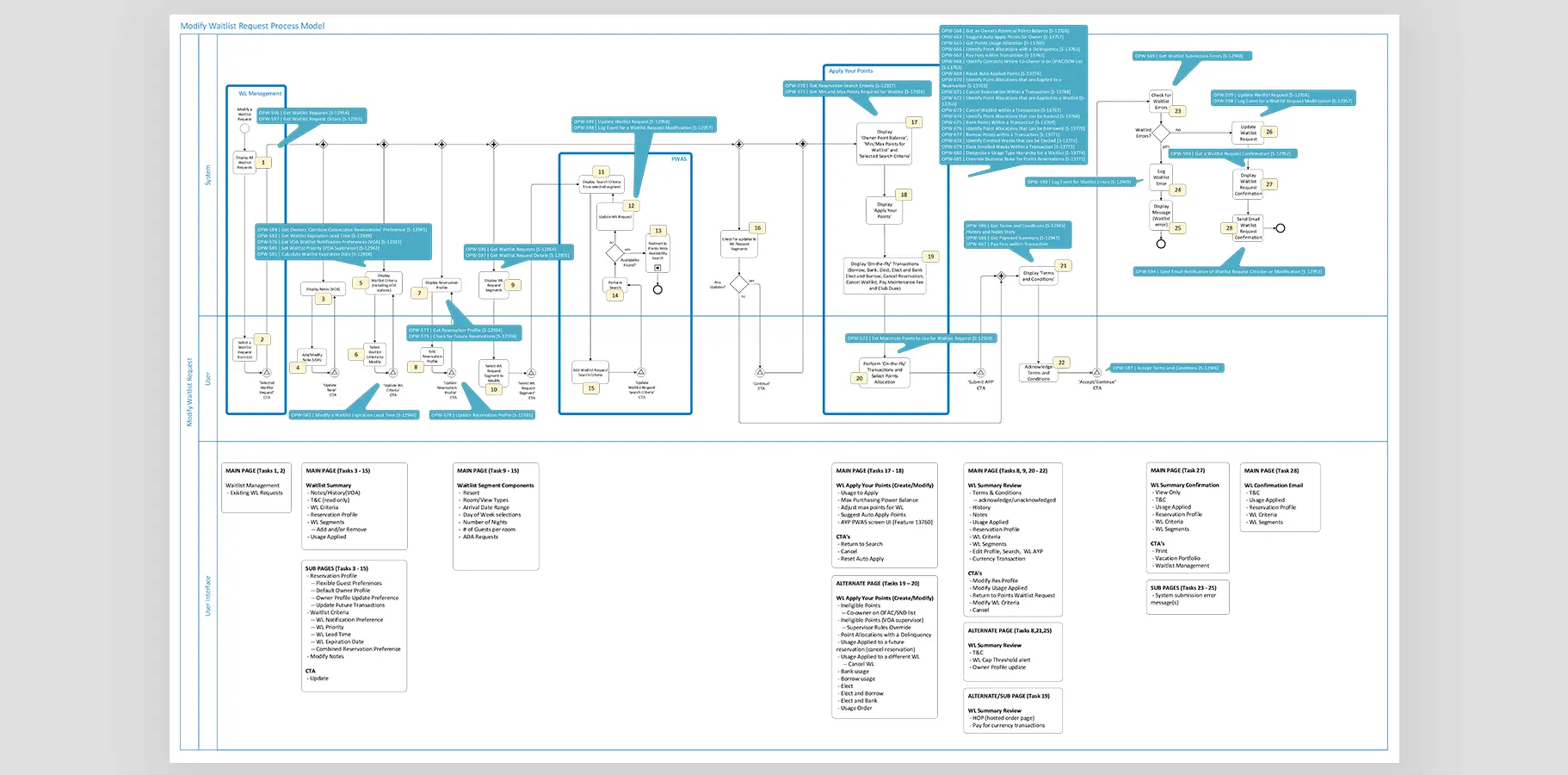
There was also a scale problem that the interface never addressed. Members managing complex vacation point portfolios needed to understand borrowing, banking, waitlisting, and expiration rules inside the same product that a first-year member used to book their first trip. Progressive complexity of that kind requires intentional design. What existed was a single undifferentiated structure that served neither group particularly well.
The Approach
Research and Discovery
I opened the engagement with heuristic audits across all digital touchpoints and facilitated stakeholder workshops with the executive team to map the gap between business objectives and user reality. Those workshops surfaced something important early: the business had been measuring engagement metrics that did not correlate with the outcomes members actually cared about. Getting stakeholders to agree on which metrics actually mattered was a prerequisite for everything else.
Behavioral analytics identified where journeys broke down at a system level. I then ran usability testing with three distinct user groups: prospects evaluating membership, new members in their first year, and established owners actively managing multi-property point portfolios. Each group had materially different mental models and different failure modes. The most consistent finding across all three: users needed reassurance more than they needed features. Members who understood their benefits booked more. That single insight became the strategic foundation for the redesign.
Navigation Restructure
The 12-category navigation was reduced to three primary entries: Explore Destinations, Manage Membership, and Book Your Stay. The categories were named for what users wanted to accomplish, not for how the business had organized its backend. That sounds straightforward. It was not.
Getting internal alignment on this change required co-authoring a five-year digital roadmap with C-suite stakeholders that repositioned UX clarity as a revenue strategy, not a design preference. The argument was not aesthetic. It was financial: members who understood their benefits used more of the product, booked more frequently, and generated fewer support escalations. The navigation restructure was the front door to that outcome.
Mobile-First Design System
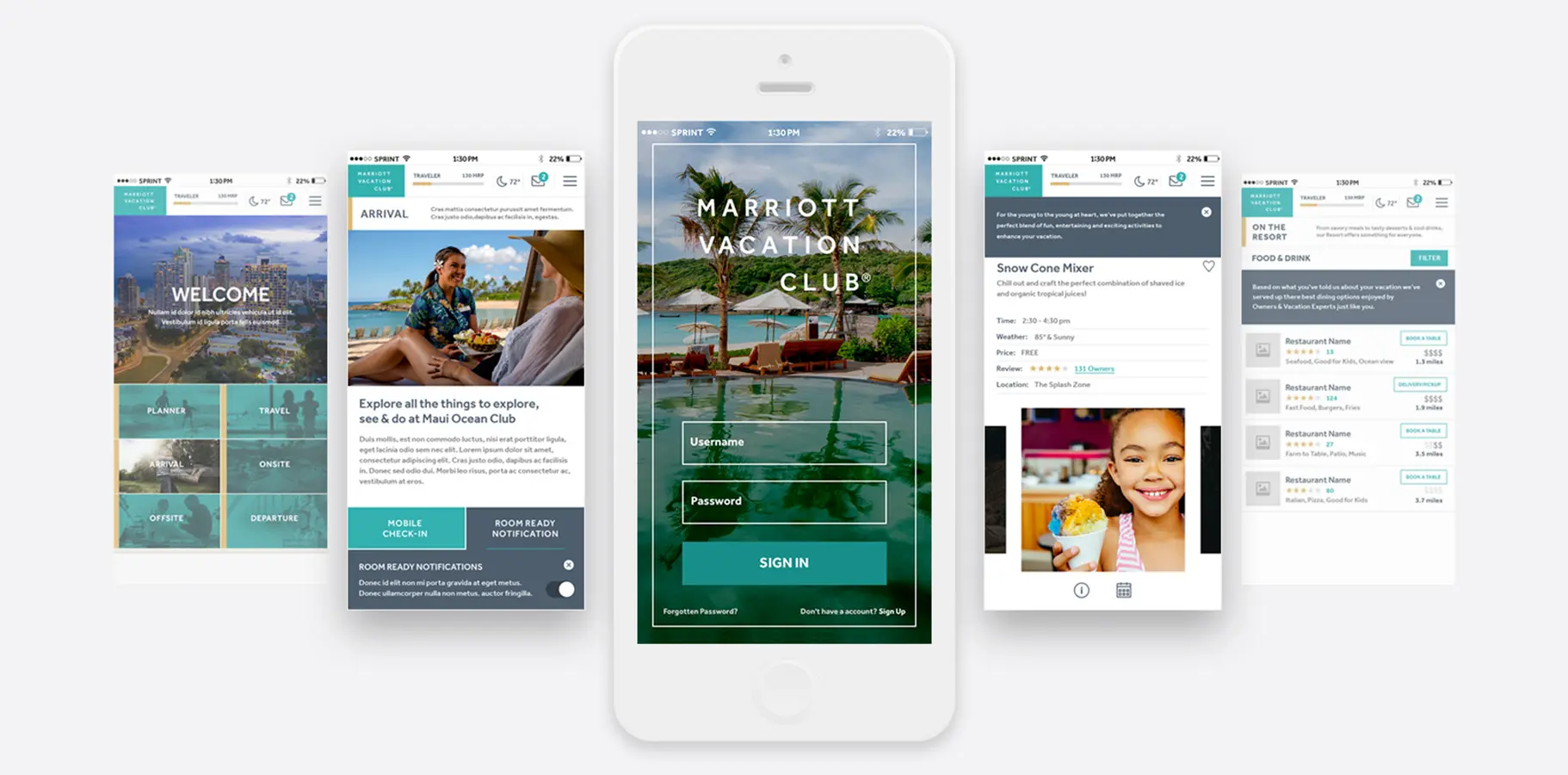
I developed a gesture-driven interface built for thumb-zone accessibility and one-handed use. Progressive disclosure through card-based UI revealed system complexity gradually, which was the key to serving both new members and experienced portfolio managers within the same product. A new member booking their first trip never needed to see the waitlist logic. An experienced owner managing point expiration could surface exactly that.
The design system covered native iOS and Android applications with shared components across six journey stages: Welcome and Dashboard, Arrival and Travel Planning, Resort Activities, and Food and Beverage discovery. All components were built to WCAG 2.1 AA standards, which served two business needs simultaneously: accessibility compliance and international usability for an aging member demographic that skewed toward users who found small targets and low contrast particularly difficult.
Brand Unification Across Four Properties
The engagement required establishing a unified design language across Marriott Vacation Club, Hyatt, Sheraton, and ILG without erasing the brand distinctions members already recognized and expected. Each brand had an internal team, existing visual equity, and legitimate reasons to protect their identity. My job was not to homogenize them. It was to create experiential consistency at the system level while allowing brand expression at the surface level.
I established design-to-development handoff protocols and trained internal teams on the design system to ensure quality held after the engagement ended. The governance documentation was as important as the component library. A design system that internal teams cannot maintain or extend is a snapshot, not a foundation.
Results & Impact
Mobile Gap - 40% mobile-to-desktop conversion delta identified; redesign targeted parity through mobile-first IA and progressive disclosure
Navigation Reduction - Primary navigation reduced from 12 categories to 3, reorganized by user intent rather than internal business structure
Friction Eliminated - 47 mapped friction points across core member journeys addressed through IA restructure and card-based progressive disclosure
Accessibility - WCAG 2.1 AA compliance achieved across iOS, Android, and responsive web, serving an international and aging member base
Brand Scope - Unified design system deployed across 4 brands (Marriott Vacation Club, Hyatt, Sheraton, ILG) with internal team training and governance documentation
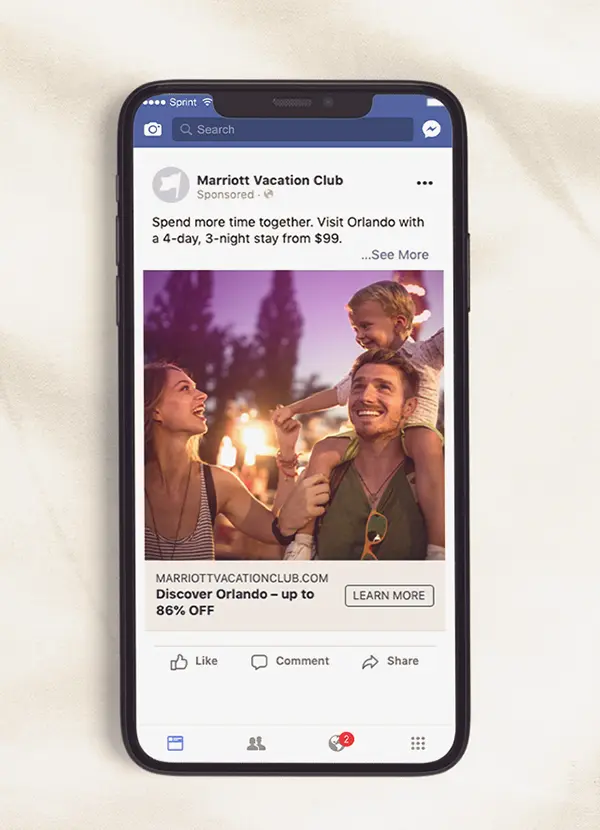
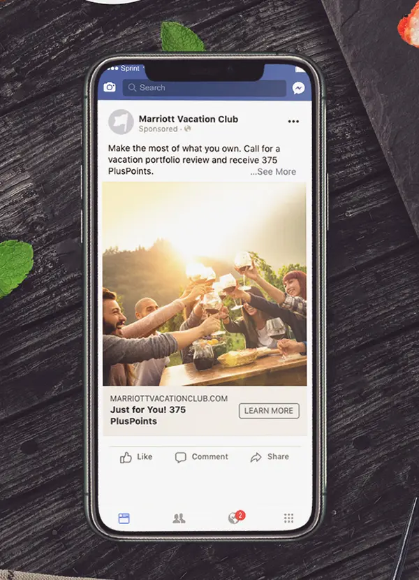
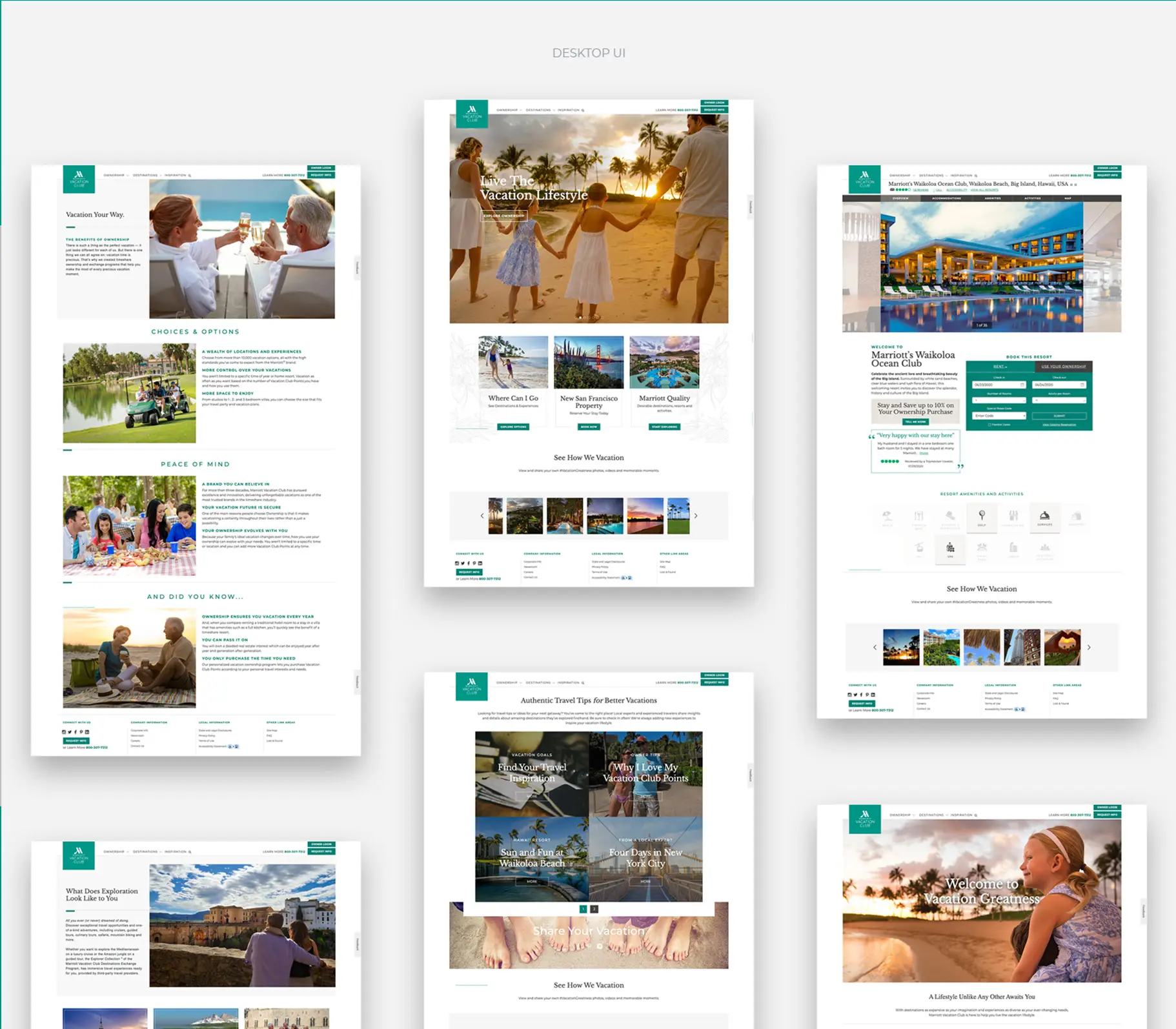
Platform Reach - Design system and component library scaled across booking platform, native mobile apps, desktop web, and paid social campaigns
My Contribution
I owned the research strategy, information architecture, interaction design, and design system architecture on this engagement. Visual identity work for individual brands involved close collaboration with each brand's internal team, with me establishing the component framework and accessibility standards they built within. The five-year digital roadmap I co-authored with C-suite stakeholders was as much a deliverable as the design system itself. It was the document that gave the UX work organizational permanence. If I were revisiting this project, I would push for longitudinal research with members over a 90-day period rather than point-in-time usability testing. The long-tail behavior of owners managing complex point portfolios, specifically the anxiety around expiration and borrowing decisions, is something we understood analytically but never directly observed at the behavioral level.