
That contradiction was not a branding problem. It was a UX problem with a physiological basis.
Procter & Gamble engaged ChrowmDesigns through agency partner Pocket Made to lead the UX strategy and design system for the ZzzQuil Sleepmate app and companion e-commerce website. My role was Senior UX Strategist, responsible for the color system, information architecture, interaction design, and cross-platform design system. The app needed to function as a content platform offering guided meditations, ambient soundscapes, sleep stories, and personalized sleep insights. The website needed to sell a product line across multiple SKUs while maintaining visual and experiential cohesion with the app. These were two different products with two different jobs, and both needed to feel like the same brand.
ZzzQuil's packaging identity was designed for retail: high saturation, strong contrast, immediate recognition under fluorescent light. Those qualities are liabilities at 11pm. High-saturation purple on a mobile screen stimulates the visual system rather than calming it. For a sleep product, that is not a minor inconsistency. It is a direct contradiction of the product's purpose.
The problem ran deeper than color. The app needed to deliver a complex feature set: guided meditations, layered soundscape mixing, sleep stories, bedtime scheduling, and personalized insights, to an audience in the process of winding down for sleep. Every additional decision the interface required was friction working against the product's core goal. The feature complexity was real and necessary. The interface had to absorb that complexity without making the user feel it.
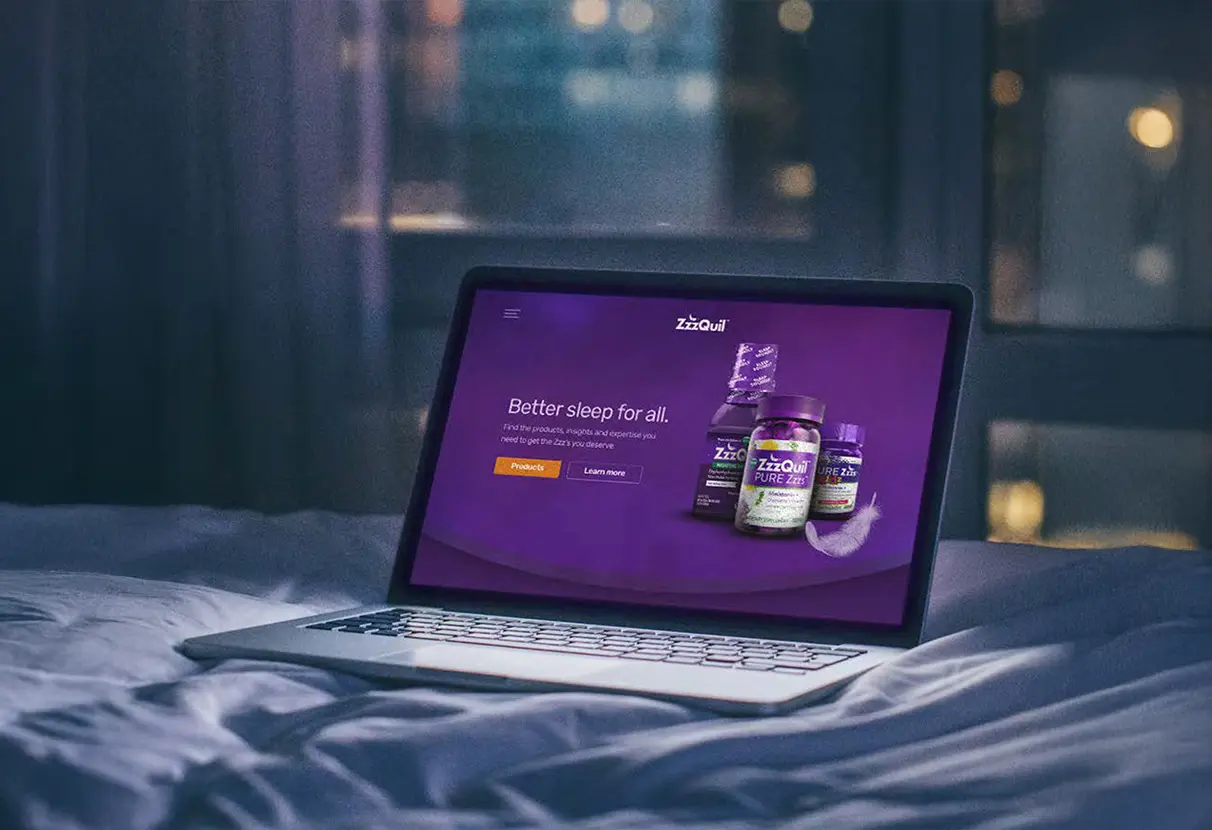
There was also a cross-platform continuity gap. The post-purchase flow from physical product to app download, and the replenishment flow from app back to the e-commerce site, were disconnected experiences. A user who felt the app was designed differently from the website was a user whose trust in the brand's coherence was quietly eroding. Those handoff moments were design problems the original scope had not fully accounted for.
I started with color contrast ratio analysis and reviewed eye strain research specific to pre-sleep screen usage, mapping ZzzQuil's existing brand palette against dark mode accessibility standards and low-light readability thresholds. The gap between what the brand had and what was viable for late-night screen use was significant enough that a surface-level dark mode inversion would not solve it. A full color system evolution was required.
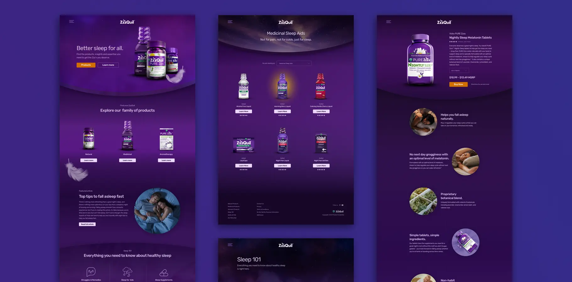
I audited 14 comparable sleep and wellness apps to understand how the category handled the tension between brand expression and low-stimulation UI. The consistent pattern in the best-performing apps: brand identity was carried by photography and illustration, while UI chrome pulled back to near-neutral, low-saturation surfaces. The brand set the emotional tone. The interface stayed out of its way. That insight became the organizing principle for the ZzzQuil design direction.
User journey mapping across both platforms identified the critical handoff moments where brand continuity was most at risk: the post-purchase app download prompt and the replenishment notification path back to the website. Mapping these explicitly made them design priorities rather than afterthoughts.
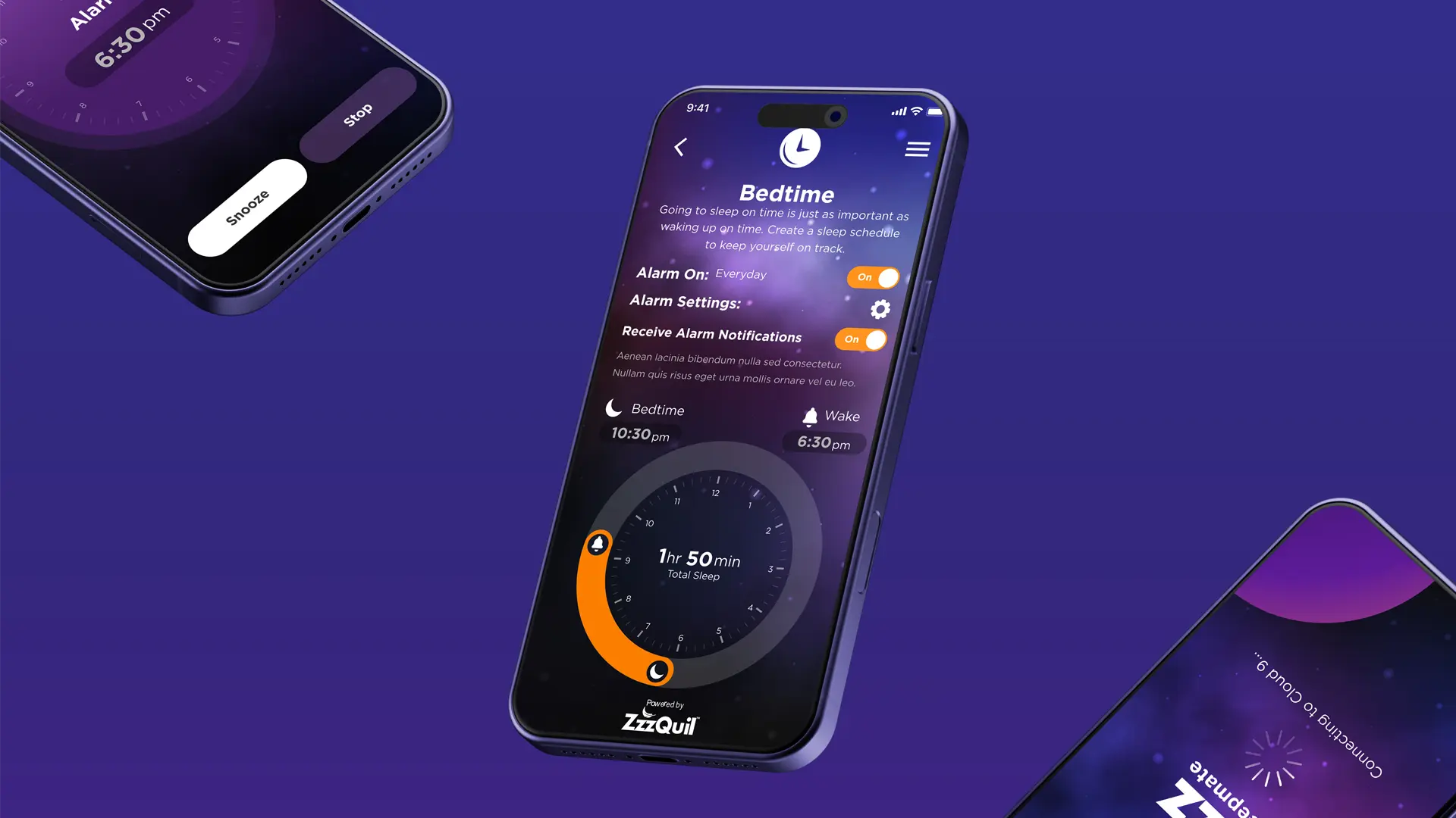
Rather than treating dark mode as a color inversion, I rebuilt the ZzzQuil color system from base saturation values up. The purple palette was rebalanced for screen viewing with adjusted saturation and luminance targeting readability in low-light conditions without sacrificing brand recognition. Gradients inspired by the product's liquid form became calming, receding background surfaces rather than visual focal points. The result was identifiably ZzzQuil and genuinely comfortable at bedtime, which was the only measure of success that mattered for this product.
The app's navigation was designed to recede as users moved into content, appearing when needed and disappearing when not. That structural decision reduced cognitive load during the exact moments users needed it most: when they were trying to fall asleep. The soundscape mixer allowed independent volume control for layered ambient sounds, which gave users meaningful personalization without requiring active decision-making. Post-launch analytics confirmed it became the most-used feature within 30 days of launch.
The bedtime management system used a visual clock interface with automatic sleep duration calculation. The complexity was real: the system tracked bedtime, wake time, total sleep duration, and notification preferences. But the interaction model kept that complexity beneath the surface, surfacing only what a user needed at each moment. First-time setup felt simple. Advanced configuration was available without being unavoidable.
I built a modular design system that maintained brand integrity across iOS, Android, and responsive e-commerce web while respecting the different technical constraints and behavioral expectations of each platform. Buttons, cards, typography, and interactive elements adapted across contexts while remaining visually coherent. The system was documented with enough specificity that the development team could build future features without returning to the design team for every decision, which was the real test of whether the system was genuinely scalable.
Photography art direction and product imagery compositing were handled collaboratively with P&G's brand team. My role was establishing the overall visual direction and reviewing all deliverables against the dark-mode design system to ensure the brand photography and the interface surfaces worked together rather than pulling against each other.


I led the UX strategy, color system evolution, information architecture, and interaction design for both the app and the website. Photography art direction and product imagery were handled collaboratively with P&G's brand team, with me setting the overall visual direction and reviewing deliverables against the dark-mode system. The color system work was the most consequential decision on this project: the choice to rebuild from base saturation values rather than invert the existing palette is what made the dark mode feel intentional rather than retrofitted. If I were revisiting this engagement, I would push for in-context usability testing with participants using the app in actual pre-sleep conditions. The physiological and emotional state a user is in at bedtime is genuinely different from any lab or remote testing environment, and for a product like this, that difference matters.