Grounded Climate
Solutions Summit

UX Strategy & Behavioral Design

Agency
Pocket Made
Studio
ChrowmDesigns
Stack
Figma, Photoshop, WordPress

Most climate platforms design for urgency. Urgency triggers anxiety. Anxiety triggers disengagement. The design problem was not how to make people feel the weight of the crisis. They already felt it. The problem was how to make them believe something could be done.

That distinction is the entire case study.

Context

The Engagement

Grounded is a climate solutions organization whose mission is to connect scientists, innovators, and environmentalists around actionable solutions rather than problem documentation. ChrowmDesigns engaged through agency partner Pocket Made as Senior UX Strategist, owning the UX strategy, visual design system, content architecture, and front-end WordPress development. The previous site had low content engagement, minimal event registrations, and a content team with no practical path to updating or expanding the platform after launch. The brief was to build something that converted urgency into action, and to build it in a way the Grounded team could maintain independently.

The
Problem

A Communication Pattern That Was Driving People Away

Climate communication has a design failure mode that most platforms do not recognize as a design problem. The conventional approach: alarming imagery, high-contrast crisis palettes, headline-level urgency. These choices are intuitive. They reflect how the people building these platforms feel about the subject matter. But behavioral research in high-stakes communication consistently shows that audiences exposed to sustained problem-framing alone disengage. The emotional load exceeds their sense of agency. They leave not because they do not care, but because the experience reinforces the feeling that nothing can be done.

Grounded's previous site was not an extreme case of this failure, but it was a mild version of it. The content was credible. The mission was clear. But the platform was not architected to do the specific emotional and informational work required to move someone from aware to engaged. Content engagement was low across all tracked types. Webinar registrations were minimal. And when the content team needed to publish new work, update event details, or add a solutionist profile, they needed developer support every time. The platform could not grow at the speed the mission demanded.

The brief to build something that converts urgency into action contained an embedded assumption worth questioning: urgency itself may not be the right fuel. The research said otherwise.

The
Approach

Research and Discovery

I reviewed behavioral research on emotional regulation and action-taking in high-stakes communication contexts before touching any design decisions. The consistent finding: audiences exposed to problem-framing paired with solution-framing show measurably higher intent to act than those exposed to problem-framing alone. Acknowledgment of the problem is necessary. But it has to be followed immediately by evidence that solutions exist and that the audience has a role in them. That finding became a structural principle: every crisis data point in the content architecture would be paired with a corresponding solution story at the component level.

I audited 10 climate and environmental nonprofit sites for UX patterns, then benchmarked against editorial platforms in adjacent spaces: TED, long-form science journalism, and science communication outlets that had built sustained engaged audiences around complex topics. The editorial model, content-forward, modular, built for reading depth rather than quick conversion, was the clear direction. Climate audiences are not converting at a checkout. They are deciding whether to invest attention, and that decision is made in the first thirty seconds of a visit.

Visual Language Built for Emotional Regulation

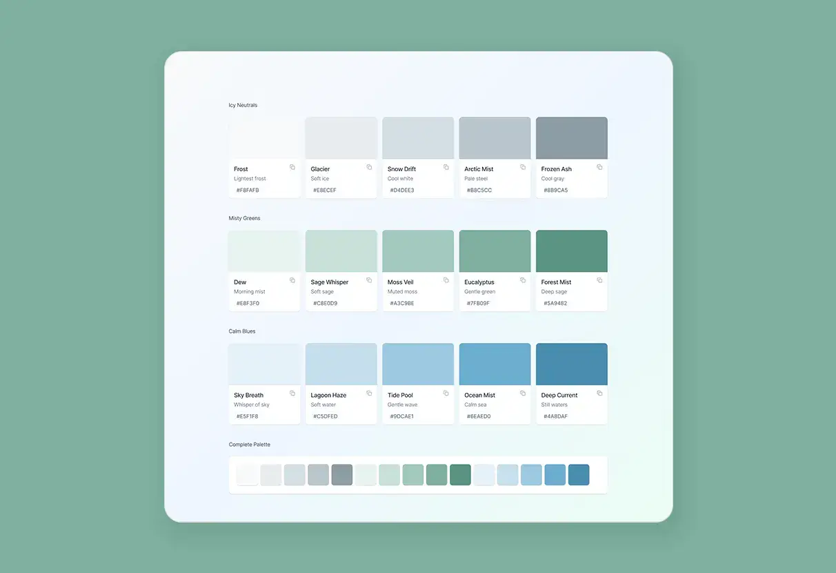
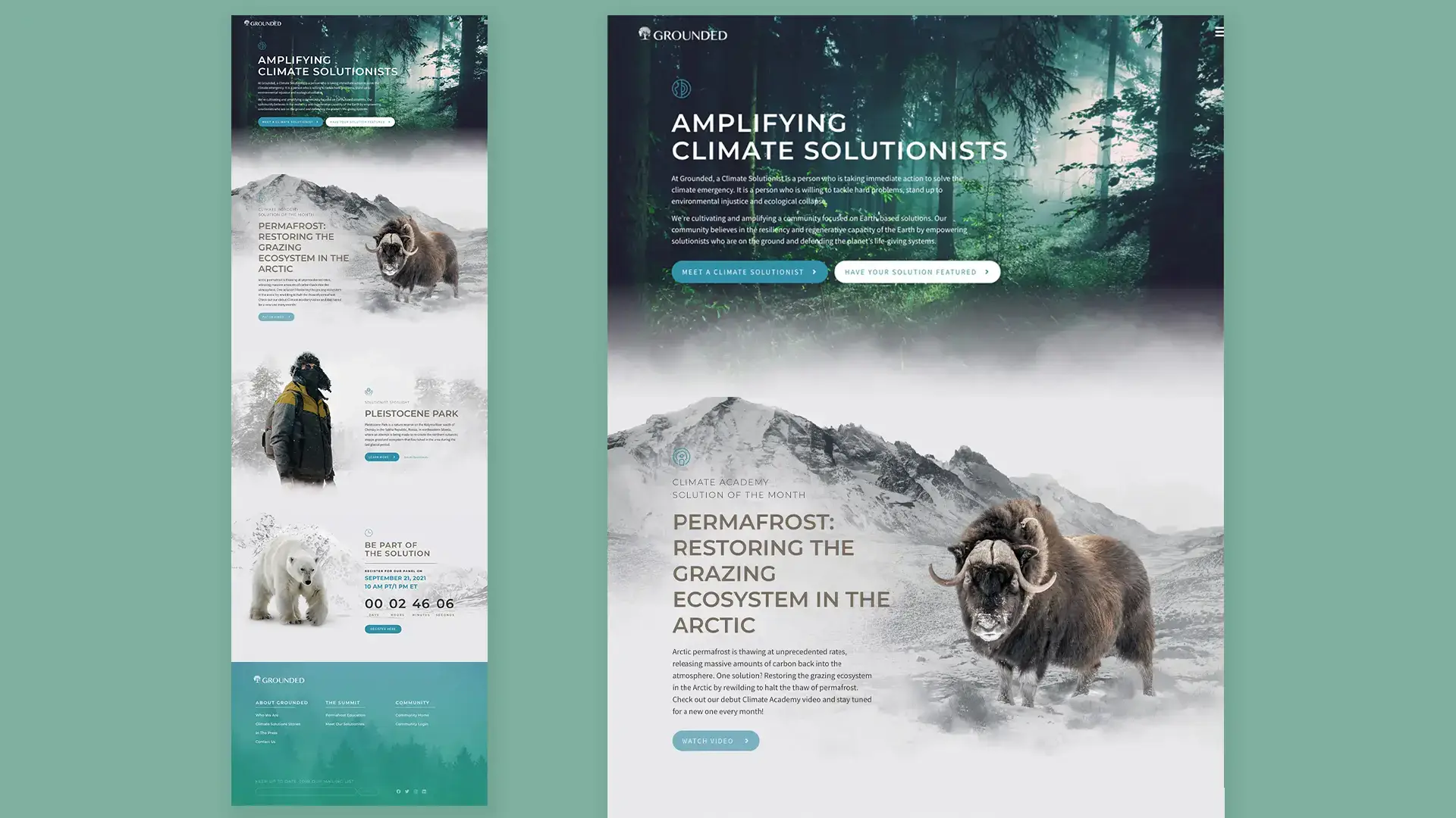
The color system was built from scratch using three families: icy neutrals drawn from Arctic photography, misty greens from old-growth forest imagery, and calm blues from open water. High-contrast crisis colors were deliberately excluded at the system level, not just in specific choices. This was not about making the platform feel soft or minimizing the seriousness of the subject. It was about removing the visual cortex activation that works against sustained attention and action-taking.

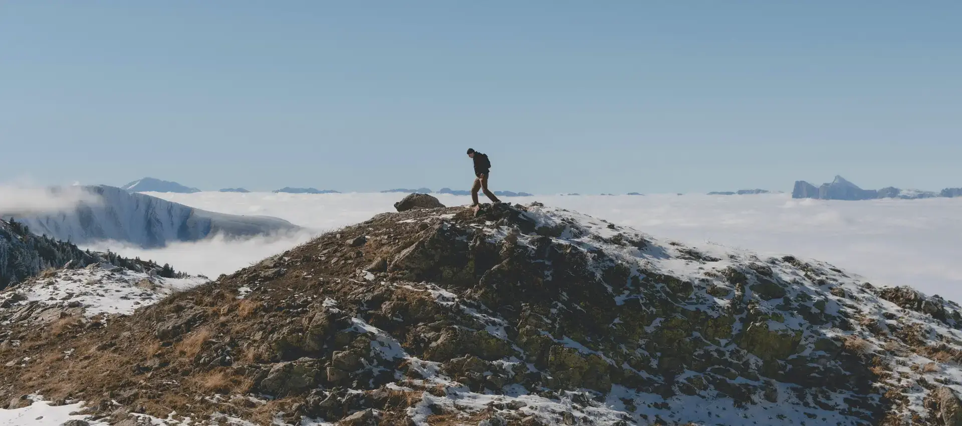
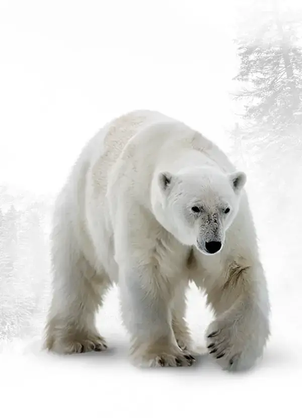
Photography direction reinforced the same principle. The brief I developed for image selection prioritized endurance and renewal over destruction: intact ecosystems, researchers in the field, moments of collaboration and discovery. The images visible throughout the platform, the field researcher in the snowstorm, the polar bear in clean white space, the lone figure climbing toward open sky, were all selected and composited to convey persistence and presence rather than threat. Parallax fades and slow scroll animations created a sense of unhurried depth rather than urgency.

Content Architecture and CMS

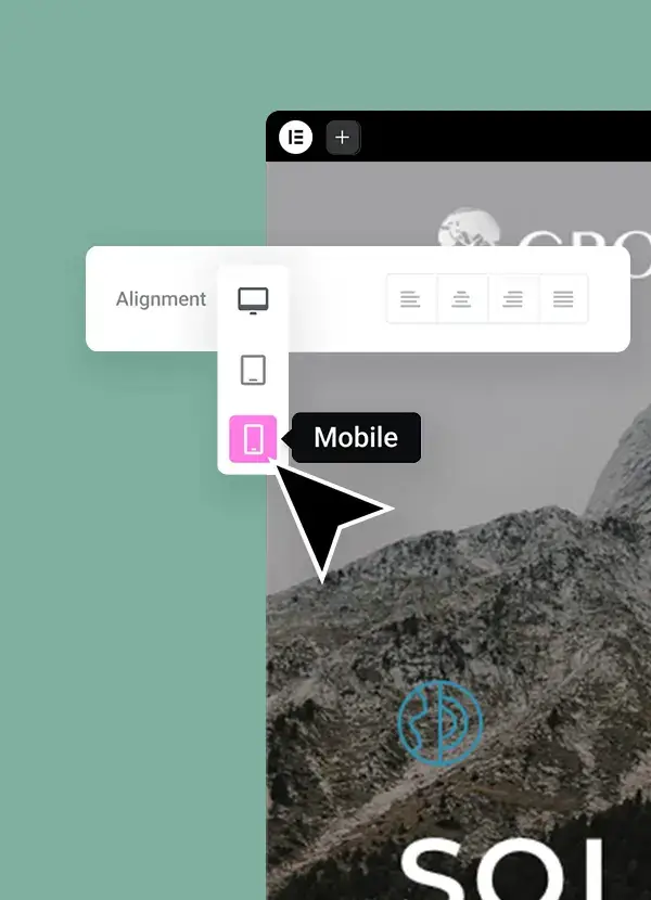
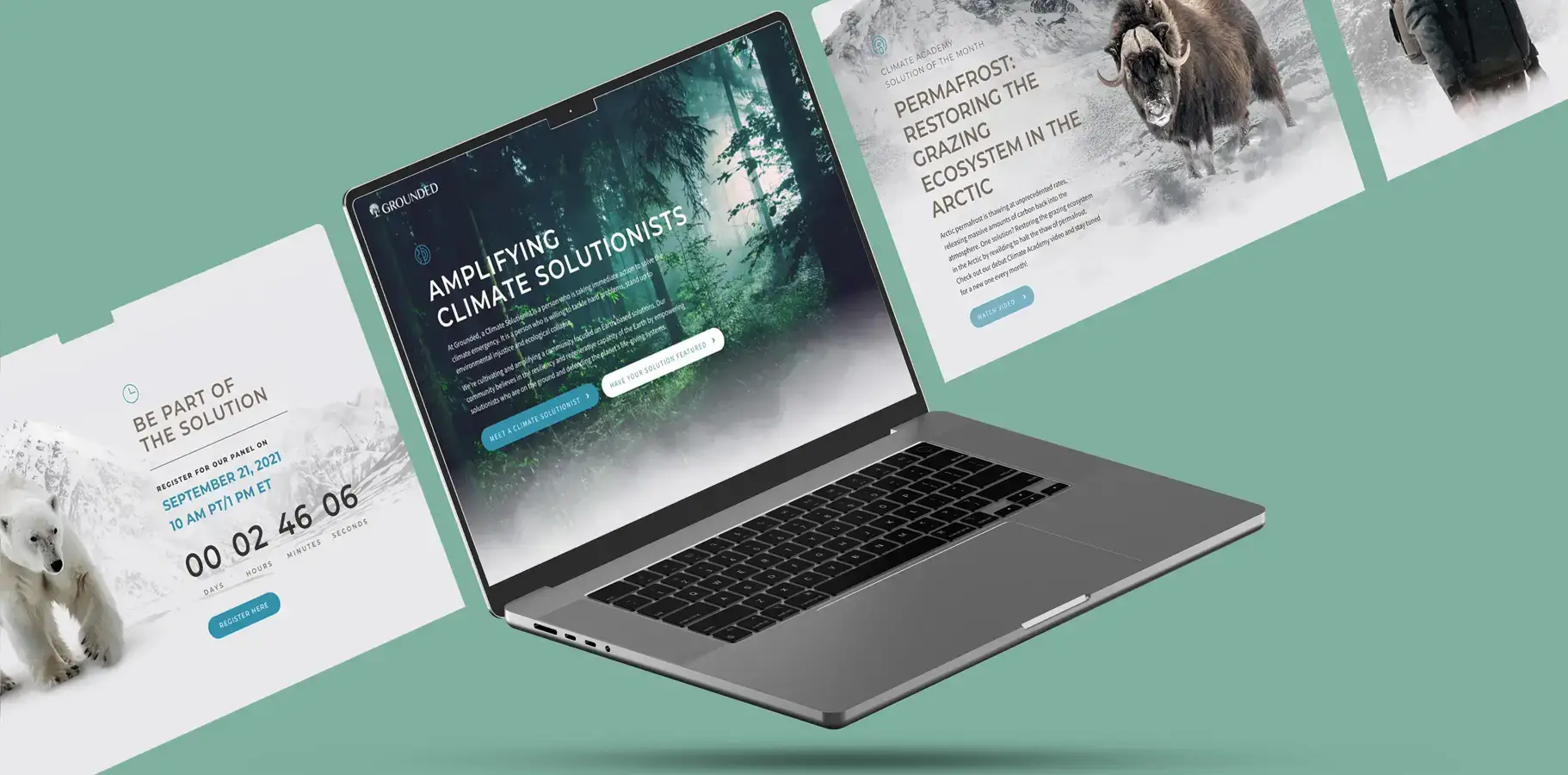
I designed modular story components that could surface research findings, feature individual solutionists, and announce live events without requiring developer involvement each time. A custom WordPress module handled live event countdowns with registration integration. Navigation used a three-level hierarchy with consistent iconography, allowing users to move through complex climate topics at their own pace rather than being guided through a conversion funnel that assumed they were ready to act before the platform had earned that.

The CMS build was treated as a deliverable equal in importance to the design. Grounded had a small content team that needed to publish and update independently. Every component was modular, documented, and tested for non-technical users. The development approach also prioritized responsive performance: cinematic motion on both mobile and desktop without load time penalties, which mattered because a meaningful portion of the target audience accessed the platform from regions with slower connections. Sub-3 second load time with full motion design was the performance target. It was met.

Results &
Impact

My
Contribution

I owned the UX strategy, visual design system, content architecture, and front-end WordPress development on this project. Content strategy was developed collaboratively with the Grounded team, with me defining the component architecture and emotional design principles their editorial approach was built around. The behavioral research framing was something I brought to the project independently, based on what I knew about climate communication's specific failure modes. It was not in the original brief. If I were revisiting this engagement, I would push for qualitative research with the target audience earlier in the process, before the visual system was established, to validate the emotional framing assumptions rather than relying on published research alone. The results suggest the direction was right, but the validation path would have been stronger.

ZzzQuil Sleep App UX DesignMalibu Rum 101 Days Campaign Design