Malibu Rum - Pernod Ricard

Creative Systems & Campaign Design

Role
Senior UX Strategist and Creative Lead
Agency
Pocket Made
Studio
ChrowmDesigns
Duration
101-day summer campaign

Multiple agencies. Daily publishing. Three platforms. One hundred and one consecutive days. The brand had no problem with awareness. It had a consistency problem, and consistency problems at that scale become brand problems fast.

The brief was not to create great individual pieces. It was to build a system that made inconsistency structurally impossible.

Context

The Engagement

Malibu Rum, under Pernod Ricard USA, engaged ChrowmDesigns through agency partner Pocket Made to lead the creative direction and design system architecture for the 101 Days of Because Summer campaign. The campaign ran daily content across Facebook, Instagram, and the main website for the full duration of summer, coordinating between multiple agencies, animators, and regional content teams. My role as Senior UX Strategist and Creative Lead was to define the visual language, build the toolkit these teams would produce from, and own quality review across the entire 101-day run.

The
Problem

A Brand Drift Problem Hidden Inside a Logistics Problem

Malibu Rum had a strong brand. The brief made that clear. The problem was not the brand itself. The problem was that multiple agencies were producing summer content simultaneously with no shared creative system, and the outputs were drifting apart. Color treatments varied. Typography choices diverged. The tone shifted depending on which team produced the asset. Individually, none of these variances were alarming. Cumulatively, over 101 days of daily publishing across three platforms, they were erosive.
The brand guidelines existed, but they had gaps that the campaign's specific demands exposed immediately. There were no defined rules for dark backgrounds. No motion treatment principles. No documented hierarchy for co-branding moments. The existing guidelines were built for stable marketing environments, not for a high-velocity campaign with a daily publishing cadence and multiple external teams operating simultaneously. The toolkit had to fill those gaps explicitly, not just reference the existing brand standards.
The content scope added another layer of complexity. Assets ranged from static recipe graphics to live-stream activation overlays to Snapchat lens integrations. These are not the same production contexts, not the same technical constraints, and not the same audience expectations. A visual system that worked for a clean Instagram post had to translate coherently to a Bean Cam live overlay and a #Shellfies Snapchat lens without requiring a different design rationale for each format.

The
Approach

Research and Discovery

Before building anything, I audited Malibu's existing social archive across the two prior summer seasons, cataloguing where brand consistency had broken down: which asset types showed the most drift, which color treatments diverged furthest from the core palette, and which content categories generated the highest engagement despite production inconsistency. That last question mattered. High-performing content across both seasons clustered around authenticity signals: real ingredients, real settings, low-production-value moments that felt unscripted. The system I built had to enable that quality, not suppress it in favor of polish.
I then reviewed the brand guidelines in detail and stress-tested them against every asset type the campaign required. The gaps were documented and addressed explicitly in the toolkit before a single production asset was started. A creative system that does not address known gaps is not a creative system. It is a starting point with the problems deferred.

Visual Language System

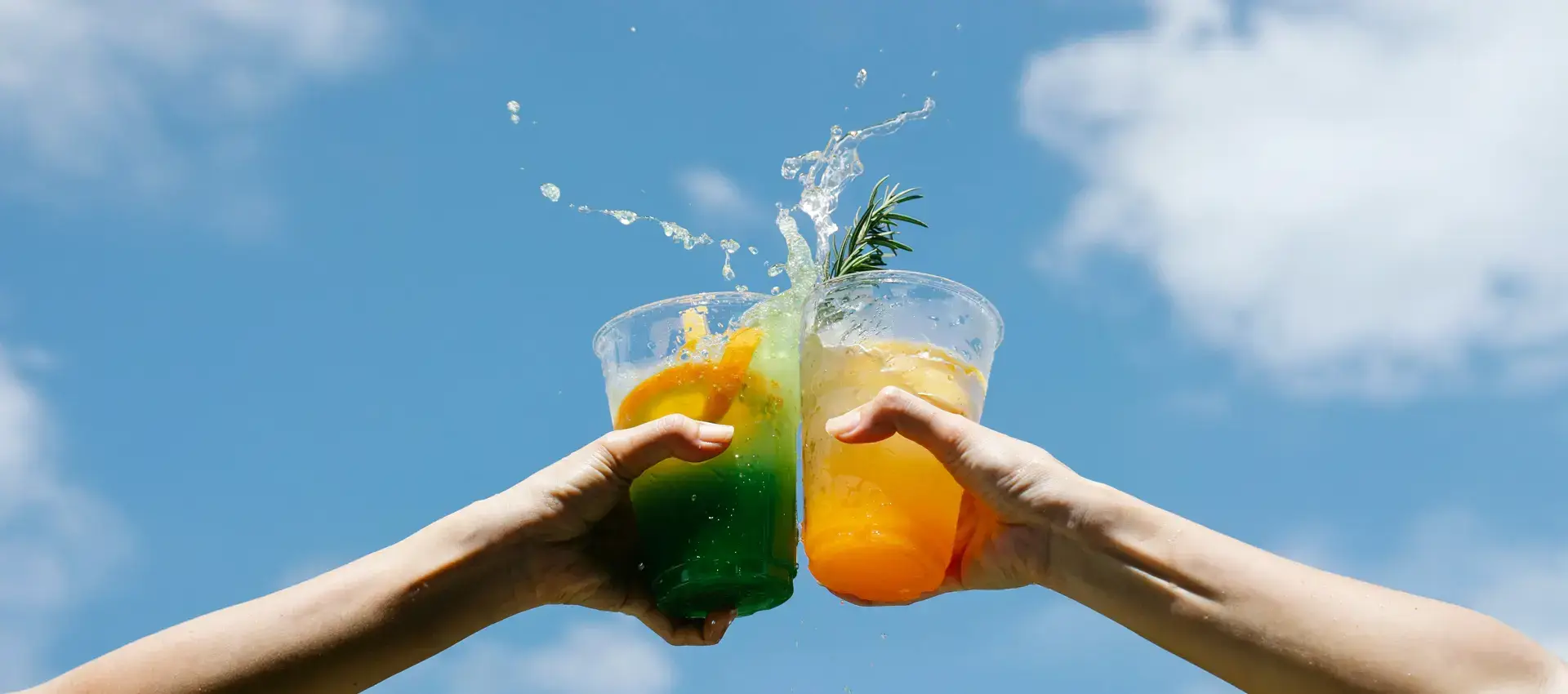
The design language was organized around a single central idea: summer as a physical sensation, not a season. Aqua teals, sun-bleached oranges, and natural textures including woodgrain, lime peel, and grill marks were built into every asset category as foundational surface treatments, not decorative options. Bold hand-painted headline fonts paired with rounded sans-serif body copy kept the tone warm and unhurried. The compositing approach used layered photography and vector overlays in Photoshop to simulate handcrafted quality at production speed, which was the specific balance the campaign volume required.
The visual language also established rules the existing guidelines had not. Dark background treatments for nighttime and event content. Motion principles for animated overlays that maintained the static visual language without requiring the animation team to re-interpret the brand for each format. Co-branding hierarchy documentation for the Snapchat and live activation moments. These additions were not refinements. They were structural requirements for the campaign to stay coherent.

Toolkit Architecture

I delivered over 200 branded elements: logos, stickers, icons, typographic treatments, template layouts, and composited background assets. All delivered as layered PSDs and vector files that animation and content teams could open and produce from directly. Export templates covered 16:9, 1:1, and 9:16 aspect ratios with integrated grid systems for both static and carousel posts.
The benchmark I set for the toolkit: a designer with no prior exposure to the campaign should be able to pick up the assets and produce on-brand content within 30 minutes. That standard shaped every decision about how the files were organized, labeled, and documented. Toolkits that require institutional knowledge to use correctly are not toolkits. They are files.

Campaign Execution and Quality Review

Over 101 consecutive days I worked closely with the motion team on storyboard-to-final-cut consistency and coordinated with content strategists on the release schedule. Quality review was a daily function, not a periodic check. The Bean Cam live-stream overlays and the #Shellfies Snapchat lens integration were the most technically complex deliverables in the campaign. Both required format-specific production approaches that had no direct precedent in the existing toolkit. Both maintained full brand consistency with the static asset library, which is a more meaningful measure of success than the individual deliverables themselves.

Results &
Impact

My
Contribution

I led the creative direction and visual systems architecture for this campaign. Individual asset production was a collaboration between ChrowmDesigns and the animation and content teams at Pocket Made. What I owned specifically was the visual language definition, the toolkit architecture, the gap analysis on the existing brand guidelines, and the daily quality review process that kept the campaign consistent from day one through day 101. The zero brand consistency escalations over that span is the metric I am most satisfied with. If I were approaching this again, I would advocate for a pre-campaign brand consistency audit with all participating agencies before the toolkit was finalized. Some of the interpretation gaps we discovered mid-campaign would have been surfaced earlier, and the system would have been more durable from launch.
Grounded Climate Summit UX DesignCarrabba’s Italian Grill Content UX Design