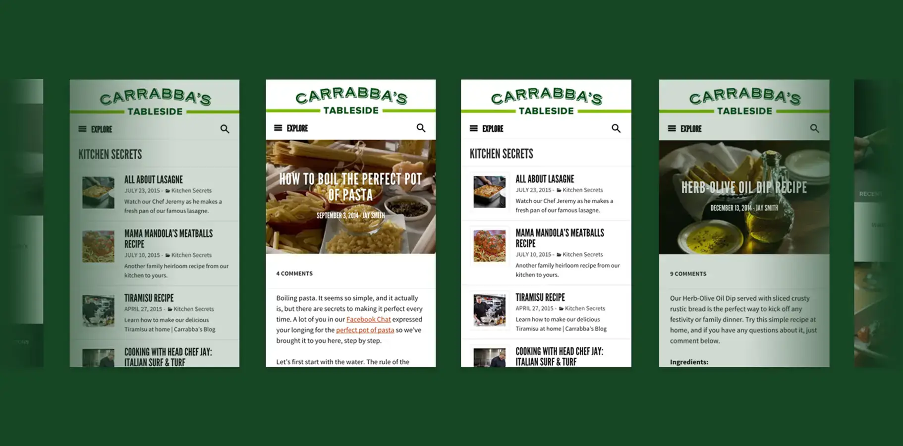
Too much brand and food enthusiasts bounce. Too little brand and Carrabba's gets no credit for the value it is delivering. The design had to earn trust first.
Carrabba's Italian Grill, under Bloomin' Brands, engaged ChrowmDesigns through agency partners Voce Communications and Porter Novelli to design and build 'Carrabba's Tableside,' a culinary content platform positioned as a genuine resource for home cooks wanting to learn authentic Italian technique. The platform's editorial anchor was the 'Secrets from Carrabba's Kitchen' series. My role was Senior UX Strategist, responsible for the information architecture, mobile UX, visual design system, editorial guidelines, and WordPress build. The platform needed to attract and retain an audience that had no existing relationship with the brand while building brand affinity through content utility rather than marketing messaging.
The strategic tension at the center of this project was not unusual for branded content, but it was unusually explicit. Carrabba's wanted to reach food enthusiasts who were not yet customers. The vehicle was a culinary blog. The problem was that the two goals these words implied, building an audience of engaged home cooks and converting that audience into restaurant guests, require UX decisions that pull in opposite directions.
A platform that feels like a marketing funnel loses food enthusiasts before they read a single article. Experienced home cooks are highly attuned to promotional intent. They navigate away from content that feels like it is selling to them rather than teaching them. But a platform that feels like a recipe site with no brand presence delivers value to users while giving Carrabba's nothing back. The information architecture, the content organization, the typography, the photography direction: every design decision was a judgment call about where that line sat.
There was a secondary problem the brief had not fully accounted for. Even if the UX was right at launch, the platform would degrade if the content team did not have clear guidance about how to write articles that served the UX strategy. Design quality that erodes as real content gets added is one of the most common and most preventable failures in content platform work. Preventing it required editorial guidelines that did not exist at the start of the engagement.
I ran moderated usability testing with 12 home cooks across three skill levels, observing how they navigated recipe and culinary content online. The finding that shaped the IA most directly: experienced home cooks browse by technique and ingredient, not by dish name. Novice cooks browse by outcome. These are fundamentally different organizational mental models, and the navigation structure had to serve both without forcing either group into an unfamiliar path.
I audited eight food-focused content platforms and three restaurant brand blogs to understand where the category had already solved the brand-versus-utility tension. The most successful examples shared a structural pattern: they separated the discovery browsing experience from the recipe execution layout. Browsing required content density and rich preview information. Execution required reading clarity and minimal interface chrome. A user scanning the homepage had different needs from a user standing at their kitchen counter following a recipe on their phone. Both states needed their own design logic.
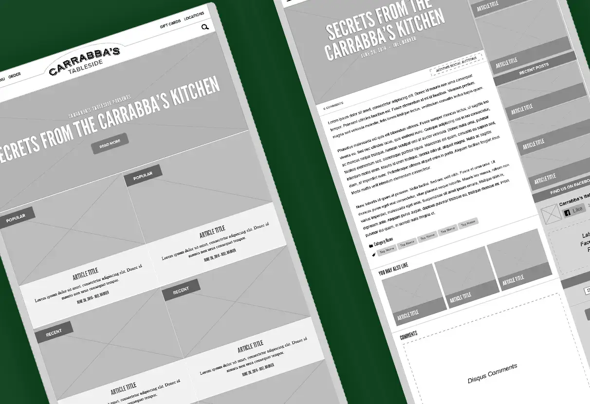
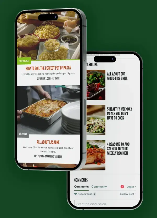
Content was organized around technique and ingredient categories rather than promotional themes. 'Kitchen Secrets' as the primary content category reflected how actual cooks describe what they want to learn, not how a marketing team would label it. Multiple navigation entry points, Popular, Recent, and topical filters, gave different user types parallel paths through the same content without requiring any of them to adapt to a structure built for someone else.
Restaurant promotion was handled through editorial association, not banner placement. The architecture assumed that a home cook who learned to make Mama Mandola's meatballs from Carrabba's own chef would develop a stronger brand relationship than any display ad could produce. That assumption informed every structural decision about where brand content appeared relative to culinary content.
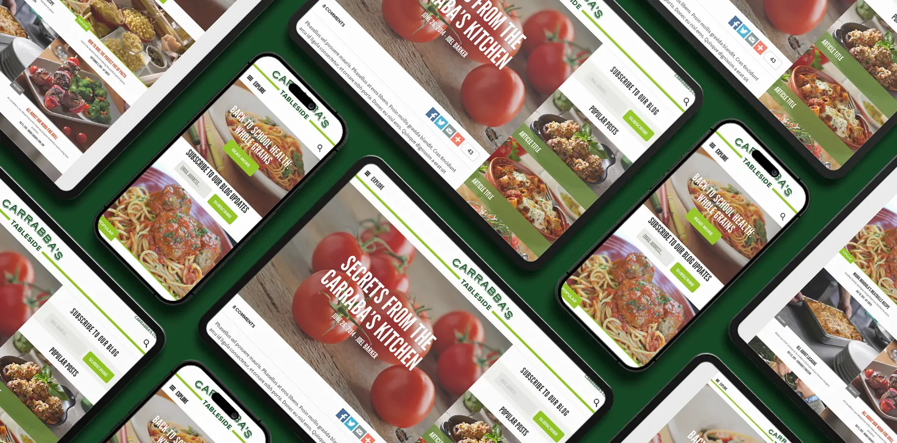
Article layouts used a scroll-optimized vertical flow with ingredient lists and instructions in a clear visual hierarchy, designed explicitly for someone standing at a kitchen counter with one hand occupied. That use context is specific and demanding: the interface had to be readable at arm's length, navigable with one thumb, and forgiving of the interruptions that happen in an active kitchen. Card-based article previews balanced content density with browsing clarity, giving enough information to make a relevance decision without requiring a click to discover whether the article was worth reading.
Action-oriented titles like 'How to Boil the Perfect Pot of Pasta' set explicit expectations before the click. The usability sessions had shown that descriptive headlines, the traditional recipe site convention, underperformed with the food enthusiast audience because they described content rather than promising a skill transfer. The editorial guideline I wrote formalized this pattern for the content team.
The visual system balanced Carrabba's brand warmth with the functional clarity culinary content requires. Rich food photography led the visual hierarchy. The 'Carrabba's Tableside' custom serif carried brand identity at title scale, paired with a clean sans-serif for body text that remained readable at small mobile sizes. Photography direction favored in-process cooking shots over finished-dish glamour photography, reinforcing the 'from scratch' positioning and aligning with what usability testing had shown food enthusiasts actually respond to.
The editorial guidelines I wrote were not part of the original brief. They came out of recognizing that a well-designed content architecture degrades quickly when content creators do not understand the UX logic behind it. The guidelines covered title conventions, content length principles, image selection criteria, and category tagging protocols. Within three weeks of handoff, the content team was producing on-spec articles independently, which was the practical test of whether the guidelines were usable rather than aspirational.

I led the UX strategy, information architecture, visual design, and WordPress build on this project. Coordination with the external agency building Carrabba's main website required establishing a shared design language that maintained brand consistency without duplicating the main site experience. The editorial guidelines were my addition to the scope: the brief did not include them, but the project clearly needed them to protect the UX quality over time. That decision, to deliver something the client did not know to ask for, is the kind of contribution I consider part of the role. If I were revisiting this engagement, I would push for a longer post-launch monitoring period with direct user feedback. The IA decisions were validated by the usability testing, but observing real users in real kitchens over a sustained period would have produced richer data than analytics alone.