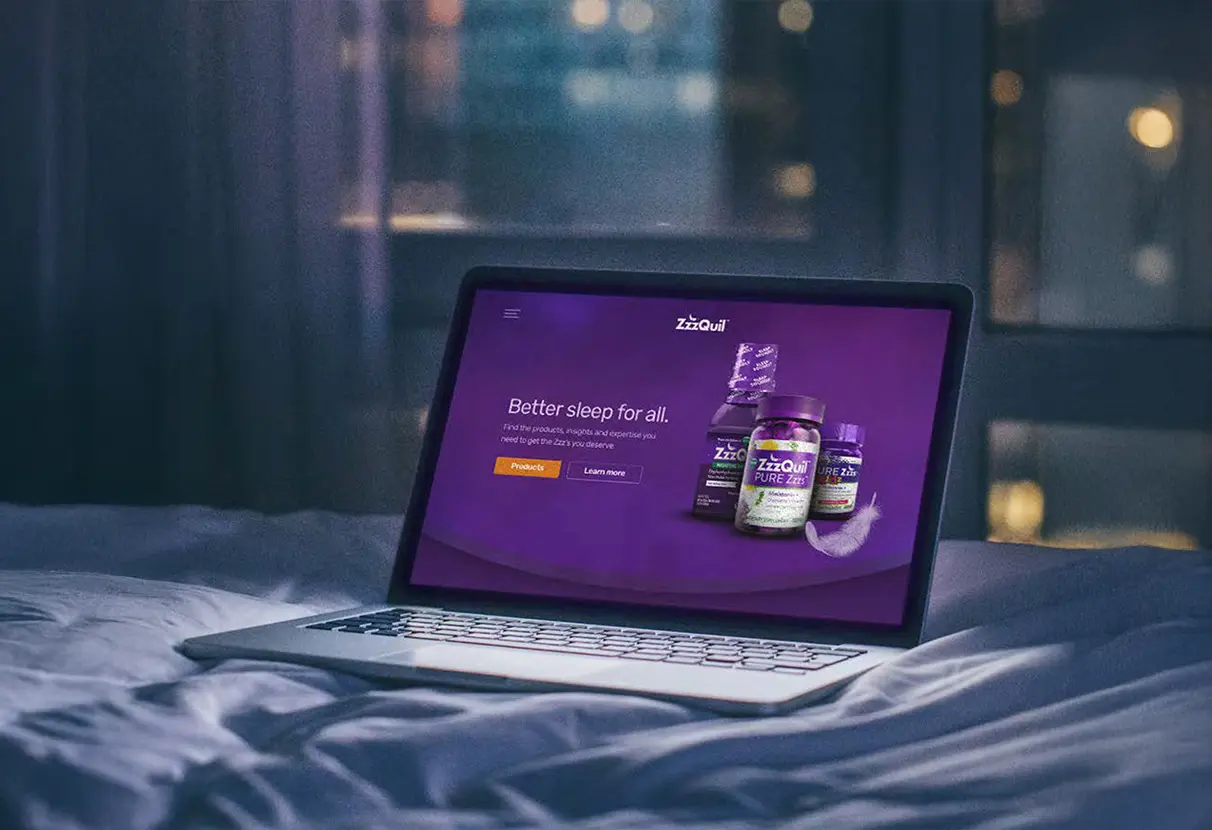
ZzzQuil's packaging worked. The brand's purple palette had strong shelf recognition. But that same palette, when translated directly to a mobile screen, created a high-saturation, high-contrast experience that was genuinely uncomfortable to look at in a dark bedroom. The product's core use case, someone settling in for sleep, was being actively undermined by the interface design.
The app also needed to function as a content platform: guided meditations, ambient soundscapes, sleep stories, personalized insights. That's a complex feature set for an audience whose primary goal is to feel less awake. Every additional decision the interface demanded was friction working against the product's purpose.
Research & Discovery
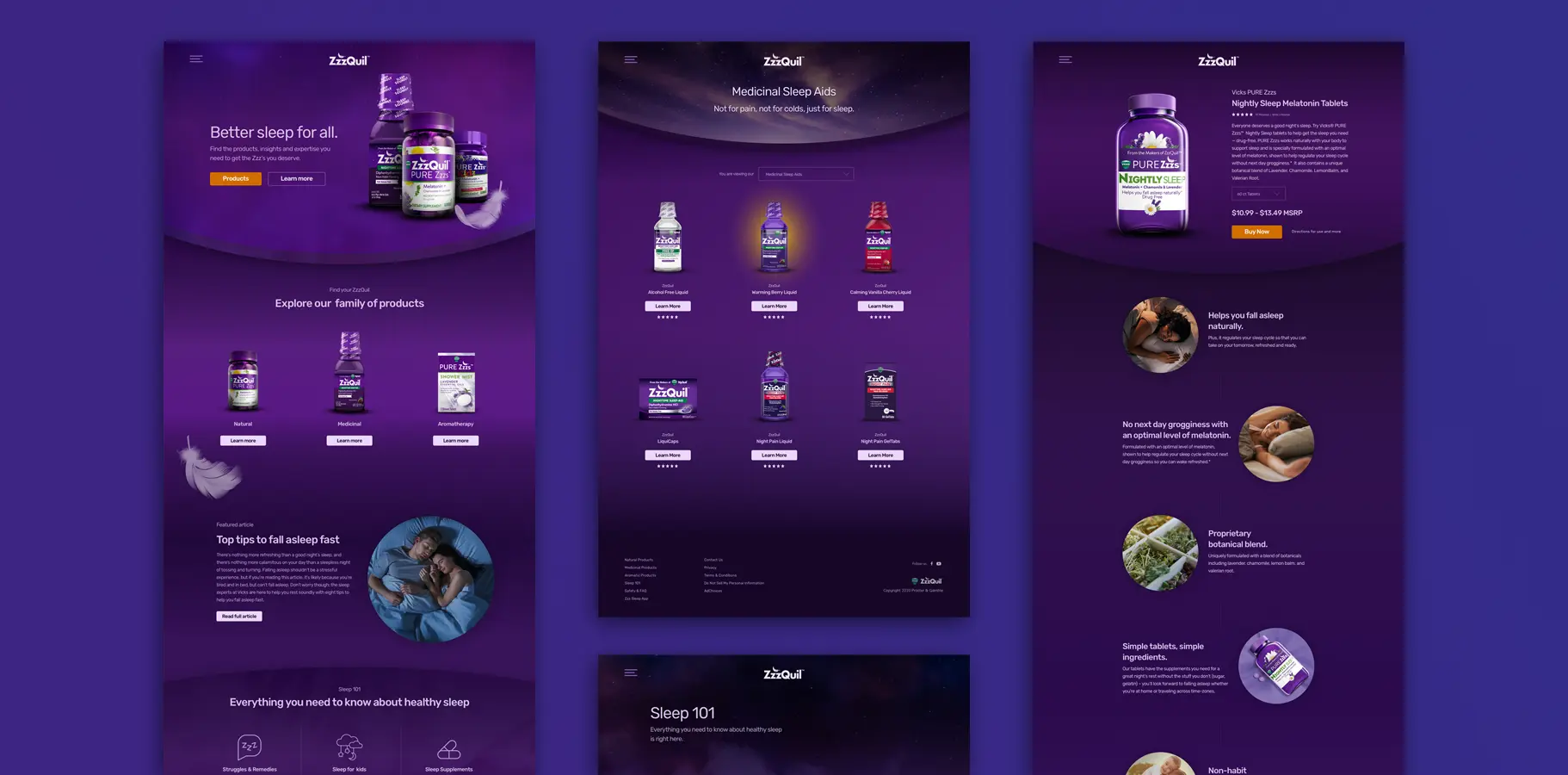
I analyzed color contrast ratios and eye strain research specific to pre-sleep screen usage, then mapped ZzzQuil's brand palette against dark mode accessibility standards. The gap between the brand's current palette and what was viable for late-night use was significant enough that a full color system evolution was required, not a surface-level inversion.
I audited 14 comparable sleep and wellness apps to understand how the category handled the tension between brand expression and low-stimulation interface design. The consistent pattern: apps that performed well in this category used the brand to set emotional tone in photography and illustration, then pulled back to near-neutral surfaces for UI chrome. That insight organized the design direction.
User journey mapping across both platforms revealed critical handoff moments, particularly the post-purchase app download prompt and the replenishment notification flow from app back to the website. Those transitions were design priorities because they were the moments most likely to break the sense of a unified experience.
Strategic Approach
Dark Mode as Design Philosophy
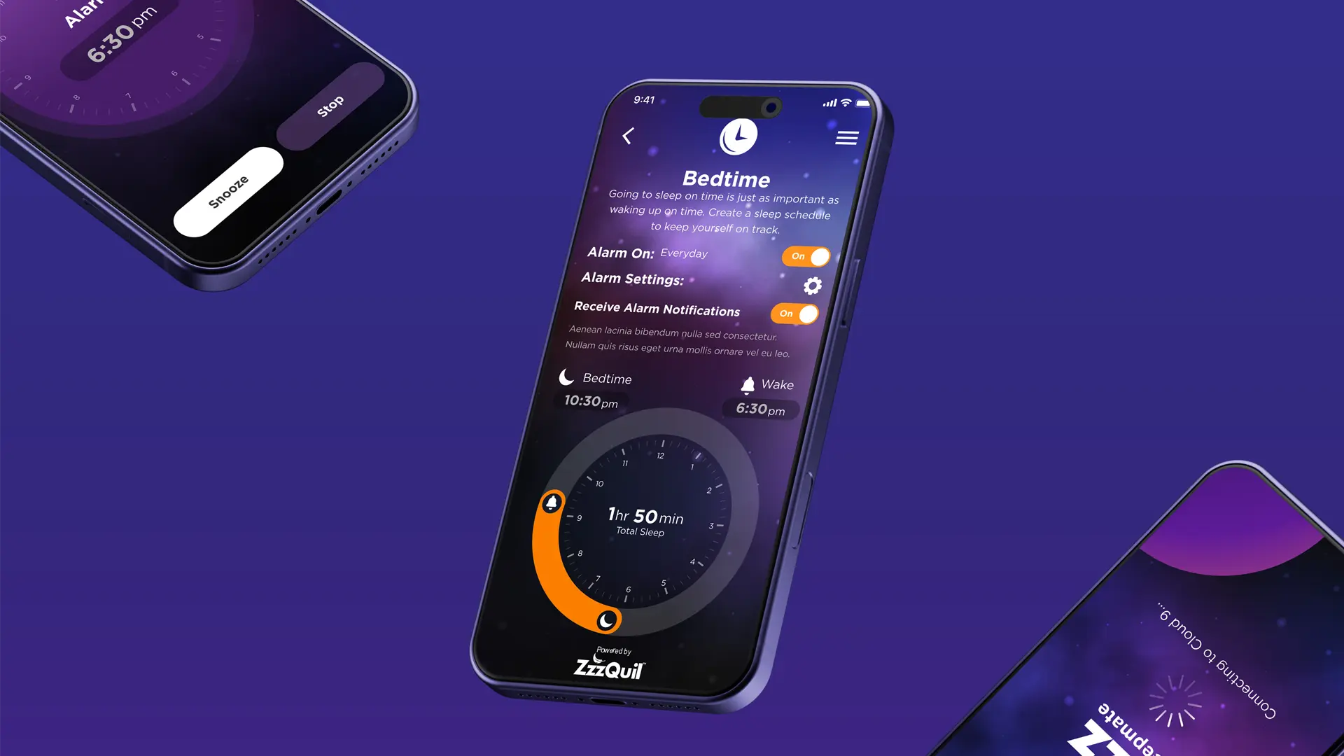
Rather than treating dark mode as a color swap, I rebuilt the ZzzQuil color system from the base saturation values up. The purple palette was rebalanced for screen viewing with adjusted saturation and contrast, targeting readability in low-light conditions without losing brand recognition. Gradients inspired by the product's liquid form became calming background surfaces. The result was distinctly ZzzQuil and genuinely comfortable to use at 11pm.
Content-First Architecture
The app's navigation was designed to recede as users engaged with content. Interface elements appeared when needed and disappeared when not. The soundscape mixer let users layer and balance individual sounds with independent volume controls, which became the most-used feature in post-launch analytics. The bedtime management system used a visual clock interface with automatic sleep duration calculation, keeping interaction complexity low while surfacing useful information.
Cross-Platform Design System
I built a modular design system that maintained brand integrity across mobile and web while respecting the different technical constraints and user expectations of each platform. Buttons, cards, typography, and interactive elements adapted across contexts while staying visually consistent. Clear component documentation reduced design debt and gave the development team a strong foundation for future feature work.
Results & Impacts
App engagement - Soundscape mixer became most-used feature within 30 days of launch per analytics
Dark mode adoption - System-default dark mode usage exceeded projections at first-week review
Platform consistency - Single design system deployed across iOS, Android, and responsive e-commerce web
Accessibility - WCAG 2.1 AA compliant across all breakpoints with dark mode contrast validation
Cross-timezone delivery - Multi-coast team with structured async protocols; zero launch delays
My Contribution
I led the UX strategy, color system evolution, information architecture, and interaction design for both the app and the website redesign. Photography art direction and product imagery compositing were handled collaboratively with P&G's brand team, with me setting the overall visual direction and reviewing all deliverables against the dark-mode design system. If I were revisiting this work, I'd push for in-context usability testing, participants using the app in actual pre-sleep conditions, rather than standard lab or remote sessions. The emotional and physiological state users are in at bedtime is genuinely different, and it matters for this product.